Quantcast
Channel: MoneyScience: MoneyScience's news channel - Musings on Markets
Viewing all 146 articles
Browse latest View live

The Privatization of Tesla:

$
0
0

After my last two posts in Tesla, I was planning to take a break from the company, since I had said everything that I had to say about the company. In short, I argued that Tesla, notwithstanding its growth potential, was over valued and that to deliver on this potential, it would need to raise significant amounts of capital in the next few years. In an even earlier post, I described Tesla as the ultimate story stock, both blessed and cursed by having Elon Musk as a CEO, a visionary with a self destructive streak.  Even by Musk's own standards, his tweet on August 7 that Tesla would be going private, adding both a price ($420) and a postscript (that funding had been secured), was a blockbuster, pushung the stock price up more than 10% for the day. The questions that have followed have been wide ranging, from whether Tesla is a good candidate for  "going private" to the mechanics of how it will do so (about funding and structure) to the legality of conveying a market-moving news story in a tweet. 

1. Public to Private - The Why
When we talk about transitions between private and public market places, we generally tend to focus on private companies going public. That is because it is natural and common for a small, privately owned business, as it grows larger, to move to public markets, with an initial public offering. That said, there are publicly traded companies that seem to move in reverse and go back to being privately run businesses, as Tesla may be proposing to do. 

The Trade Off
To understand both transitions, the more-common private to public and the less-frequent pubic to private, let us consider the trade off between being a private business and a publicly traded company, from the perspective of the business:
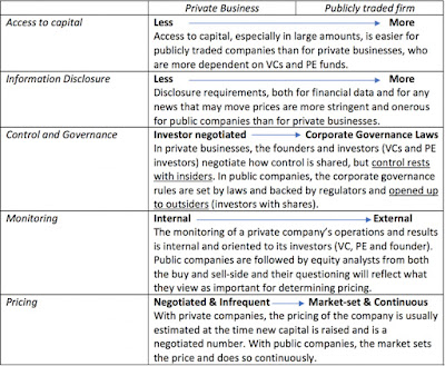
Private versus Public: Business Perspective

The simple summary is that as a private company's need to access capital increases, it will accept more information disclosure and a more outsider-driven corporate governance structure, and make the transition to being a public company.  In recent years, the market for private equity has broadened and become deeper, allowing companies to stay private for far longer; Uber, for instance, is worth tens of billions of dollars and is still a private company. To fully understand the transitions, though,  we also have to look at the choice from the perspective of investors:
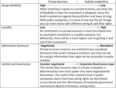
Private versus Public: Investor Perspective
In the classic structure of going public, private firms raise money from venture capitalists who accept less liquidity, but structure their equity investments to often get more protection and a bigger say in how the company is run. It is the desire for liquidity that makes venture capitalists push private companies to go public, so that they can cash out their investments. To be able to negotiate better disclosure and control, private company investors have to be investing larger amounts, and it is one reason that regulatory authorities have been wary of allowing small investors to invest in private companies, since they may end up with the worst of all worlds: illiquid investments in businesses, where they have no say in how the company is run, and no information about how well or badly it is doing.

The Public to Private Transition
With this trade off in mind, why would a public company choose to go back to being a private business? This transition makes sense if a company feels that the easier access to capital and a continuously set market price (which delivers liquidity), two features of public markets, no longer provide it with sufficient benefits, and/or the costs of disclosure and outsider intervention (from activist investors), that also come with being a public company, increase. In short, it has to be a company:
  • that does not need access to large amounts of new capital to continue operating,
  • where the market is under pricing the company, relative to its intrinsic value ,
  • that feels the actions that it needs to take in its best long term interests will either create public backlash (layoffs and plant closures) or adverse market reactions (because of the effect that they will have on metrics that investors are focused upon).
It should come as no surprise that most companies that have gone through the public-to-private transition have been aging companies (no growth, no capital needed), trading at prices that are below their peer group (lower multiples of earnings or cash flows) and that need to shrink or slim down to keep operating.

The Tesla Case
As I look at the list of criteria for a good buyout company, I see nothing that would bring Tesla onto my radar as a potential candidate:
  1. It is a growing company and it needs new capital to not only deliver on its growth promise but to survive for the next few years. If you are more optimistic than I am about Tesla, you may disagree with how much cash the company will have to raise to keep going, but I challenge even the most hardened optimist to tell me how the company will be able to increase production to a million cars or more without investing mind blowing amounts in new capacity.
  2. If markets are punishing Tesla by under pricing the company, they are doing so in a very strange manner, giving it a higher market capitalization than much larger, more profitable automobile companies, ignoring large losses and generally tolerant of Elon Musk's errant behavior. In fact, if the critique of markets is that they are short term and focused on profits, Tesla would be the perfect counter example.
  3. It is true that there was substantial drama and market volatility around the 5000 cars/week production target, and there may be some in the company who have the drawn the lesson that since there will be more production targets to come in the future, the company needs to operate out of market scrutiny. That would be the wrong lesson, since almost all of the drama in this episode, from setting the target (5000 cars/week) to the constant tweets about whether the targets would be met, was generated by Elon Musk, not the market. In fact, a cynic would argue that by focusing the market's attention on this short term target, Tesla has been able to avoid answering much bigger questions about its operations.
There are, of course, the short sellers in Tesla and Musk's frustration with them was clearly a driver of his "going private" tweet. His argument, which many of his supporters buy into, is that short sellers in public markets make money from seeing stock prices go down, and that some of them may do real damage to companies, because of this incentive. I will not dismiss this complaint, but I will come back to it later in this post, since I do think it is playing an outsized role in this process.

Public to Private - The Funding
When you decide to take a publicly traded company into the privately owned space, you have to replace the public capital (public equity and debt) with new capital that can be either private equity or new debt. 

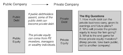
The key questions then become what mix of debt and equity to use, how to raise the private equity needed to get the deal done and what the ultimate end game is in the transaction. Specifically, you may take a company private, because you want to control its destiny fully, and keep tit a private business in perpetuity. More often, though, the end game is to make the changes that you think will make the company more attractive to investors, and either take it back public or sell it to another public company.

The Analysis
If the company in question fits the buyout mold, i.e., it is an aging company with a lower market capitalization, relative to earnings and cash flows, than its peers, the going private transaction can be funded with a high proportion of debt, explaining why so many buyouts have leverage attached to them, making them leveraged buyouts. 

Given that the equity investors in the transactions have to give up public market governance tools, it should come as no surprise that in many of these deals, the private equity comes from a single firm, like KKR or Blackstone, with top managers holding some of the private equity, to align interests, after the deal goes through. Success in these deals comes from taking the reconfigured company public again, at a much higher value, leaving equity investors with outsized gains.

The Tesla Case
Tesla is a money-losing company, burning through significant amounts of cash. Not only is the company in no position to borrow more, I have argued before that it should not even carry the debt that it does. If this deal is to make sense, it has to be predominantly equity funded, but that does create some challenges. 
1. The No-pain solution: Musk, in his Tuesday tweets, seems to offer a solution, which, if feasible, would be relatively painless. In his set up, existing shareholders will be allowed to exchange their shares in Tesla, the public company, for shares in Tesla, the private business, and those shareholders who are unwilling to take this offer will sell their shares back to the company at $420/share. In the extreme case, where every existing shareholder takes this offer and if existing debt holders are willing to continue to lend to the new private enterprise, Tesla will need no new funding:

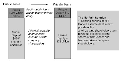
This would be magical, if you can pull it off, but there are two significant impediments. The first is that the deal may not pass legal muster, since the SEC restricts private companies to having less than 2000 shareholders, and Tesla has far more than that number. It is true that you might be able to create a fund that has individual shareholders, which then holds equity in the private company, like Uber has, but that fund is restricted to very wealthy, big investors, and the SEC may be unwilling to go along with a structure where there are thousands of small stockholders in the fund. The second is that even if Tesla manages to get regulatory approval for this unconventional set up, many shareholders may choose to cash out at $420, if the company goes private, even if they think that the shares are worth more, because they value liquidity.
2. A Deep-pocketed Outsider: The announcement that the Saudi Sovereign fund had invested $2 billion in Tesla shares came just before Musk's "going private" tweet, setting up a second possibility, which is the a large private equity investor (or several) would step in to fund the deal. Here, Tesla's large market capitalization and cash burning status work against it, reducing the number of potential players in the game. At the limit, if all existing shareholders, other than Musk, cash out at $420/share, you would need about $55-$60 billion in funding. No sovereign fund or passive investment vehicle can afford to have that much money tied up in one company, and especially one that is illiquid and will need more capital infusions in the future. Even the biggest private equity and venture capital investors, generally more willing to hold concentrated positions, will be hard pressed to put this much capital, for the same reasons. In fact, the only name that you can come up with that has even the possibility of pulling this off is Softbank, for three reasons:
  • They may be big enough to make the investment. As a publicly traded company with a market capitalization of $103 billion, making a $55-60 billion additional investment in Tesla would be a reach, but Softbank is capable of drawing other investors of its ilk into the funding.
  • They have and are invested in young, growth companies: Unlike traditional PE investors whose focus has been on doing leveraged deals of cash-rich companies, Softbank has invested successfully in growth companies, many of whom continue to burn through cash.
  • They have a history with Tesla: There were rumors last year that Tesla and Softbank had talked about taking the company private, but control disagreements caused negotiations to break down.
That said, I am not sure that Elon Musk and Masayoshi Son (Softbank's CEO) can co-exist in the same company. Both value control, and both are unpredictable, and I have to confess that watching the two tango would make for great entertainment.
3. A Corporate Investor:  There is one final possibility that I considered and it is that a corporation with deep pockets would provide the money needed to take Tesla private. Given how much money is needed, the list of potential buyers is small and perhaps restricted to the large tech companies - Apple and Google. While they have the cash and perhaps may even have the interest, Musk's follow up that he would continue to run the company and hold on to his ownership stake strikes me as a poison pill that no corporation will want to swallow.

It is at this point that the "secured funding" claim that Musk made in his initial tweet comes into question. If the statement is true, he has either found an inept bank that will lend tens of billions to a money losing company with an undisciplined CEO, or a private equity investor who is willing to make the largest PE investment in history, while allowing Musk to continue running the company, with no checks and balances. If the statement is false, we will be seeing lawyers debating the meaning of the words "secured" and "funding" for a while.

Occam's Razor: A simpler explanation
This entire post has been premised on the notion that Elon Musk had done his homework and that he intended to send a serious signal to markets about a future buyout. Given Musk's history of impetuous and personal tweets, that premise might be completely wrong, in which case the explanation for this episode may be far simpler and rooted in the war with short sellers that Musk has been fighting for a while.  Musk is convinced, rightly or wrongly, that short sellers in Tesla are conspiring to bring not just the stock price, but the entire company, down. While there are short sellers in every publicly traded company, including the most successful in market capitalization (Apple, Facebook, Google, Amazon), Tesla is an outlier in terms of the short selling on two fronts:
  • It has a CEO who is obsessed with short selling and spends a disproportionate amount of his time and attention on bringing them down. So, it is true that short sellers are a distraction to the company, but only because Elon Musk has made it so. 
  • On the other side, many of the short sellers in Tesla seem to be just as obsessed with Musk and  are convinced that he is a scam artist. I have a sneaking feeling that for many of them, winning will mean not just making money on their Tesla positions, but seeing the company cease to exist (and taking Musk down with it). On my Tesla valuation from a few weeks ago, it is telling that the most heated responses that I got were not from Tesla bulls, accusing me of being too pessimistic, but from Tesla short sellers, arguing that I was being over valuing the company, even though my assessed value per share was half the prevailing price.
Investing is a difficult game, to begin with, but it becomes doubly so, when it becomes personal. Just as it is dangerous to fall in love with a company that you have invested in, it is just as dangerous to bet against a company because you hate its management and want it to fail. I think both sides of the Tesla short selling game are so infected with personal bias that they may do or say things that are not in their best long term investing interests. That is why I hope, for Tesla's sake, that Musk's personal dislike of short sellers did not lead him to tweet out that Tesla would go private. with both the price ($420) and the "secured funding" being spur of the moment inventions. In his zeal to make short sellers pay, he may have handed them the weapon they need to bring him down. I know that Tesla's board has backed Musk, saying that he had opened a discussion about going private with the board, but since no mention is made of a price or funding, and given how ineffective and craven this board has been over the last few years, I cannot attach much weight to this backing.

Bottom Line
There are publicly traded companies where going private is not only an option, but a value-increasing one, but Tesla is not one of them. As with so much else that the company has done over its history, from its acquisition of Solar City to borrowing billions of dollars to this talk of going private, it is not the action per se that is inexplicable, it is that Tesla is not the company that should be taking the action. The drama will undoubtedly continue, and in a world where we get much our entertainment from reality shows, the Elon Musk show is on top of my list of must-watch shows.

YouTube Video

Blog Posts on Tesla
Paper on Going Private

Deja Vu In Turkey: Currency Crisis and Corporate Insanity!

$
0
0

This has been a year of rolling crises, some originating in developed markets and some in emerging markets, and the market has been remarkably resilient through all of them. It is now Turkey's turn to be in the limelight, though not in a way it hoped to be, as the Turkish Lira enters what seems like a death spiral, that threatens to spill over into other emerging markets. There is plenty that can be said about the macro origins of this crisis, with Turkey's leaders and central bank bearing a lion's share of the blame, but that is not going to be the focus of this post. Instead, I would like to examine how Turkish business practices, and the willful ignorance of basic financial first principles, are making the effects of this crisis worse, and perhaps even catastrophic. 

The Turkish Crisis: So far!
The Turkish problem became a full fledged crisis towards the end of last week, but this is a crisis that has been brewing for months, if not years. It has its roots in both Turkish politics and dysfunctional practices on the part of Turkish regulators, banks and businesses, and has been aided and abetted by investors who have been too willing to look the other way. The most visible symbol of this crisis has been the collapse of the Turkish Lira, which has been losing value, relative to other currencies, for a while, capped off by a drop of almost 15% last Friday (August 10):
Yahoo! Finance
While it is undoubtedly true that the weaker Lira will lead to more problems, currency collapses are symptoms of fundamental problems and for Turkey, those problems are two fold. One is a surge in inflation in the Turkish economy, which can be seen in graph below:

While it easy to blame the Turkish central bank for dereliction of duty, it has been handicapped by Turkey's political leadership, which seems intent on making its own central bank toothless. Rather than allow the central bank to use the classic counter to a currency collapse of raising central bank-set interest rates, the government has put pressure on the bank to lower rates, with predictable (and disastrous) consequences.

Corporate Finance: First Principles
I teach both corporate finance and valuation, and while both are built on the same first principles, corporate finance is both wider and deeper than valuation since it looks at businesses from the inside out. i.e., how decisions made a firm's founders/managers play out in value. In my introductory corporate finance class, I list out the three common sense principles that govern all businesses and how they drive value:
The financing principle operates at the nexus of investing and dividend principles and choices you make on financing can affect both investment and dividend policy. It is true that when most analysts look at the financing principle, they zero in on the financing mix part, looking at the right mix of debt and equity for a firm. I have posted on that question many times, including the start of this year as part of my examination of global debt ratios, and have used the tools to assess whether a company should borrow money or use equity (See my posts on Tesla and Valeant). There is another part to the financing principle, though, that is often ignored, and it is that the right debt for a company should mirror its asset characteristics. Put simply, long term projects should be funded with long term debt, convertible debt is a better choice than fixed rate debt for growth companies and assets with cash flows in dollars (euros) should be funded with dollar (euro) debt. The intuition behind matching does not require elaborate mathematical reasoning but is built on common sense. When you mismatch debt (in terms of maturity, type or currency) with assets, you increase your likelihood of default, and holding debt ratios constant, your cost of debt and capital.
In effect, your perfect debt will provide you with all of the tax benefits of debt while behaving like equity, with cash flows that adapt to your cash flows from operations.

There are two ways that you can match debt up to assets. The first is to issue debt that is reflective of your projects and assets and the second is to use derivatives and swaps to fix the mismatch. Thus, a company that gets its cash flows in rupees, but has dollar debt, can use currency futures and options to protect itself, at least partially, against currency movements. While access to derivatives and swap markets has increased over time, a company that knows its long term project characteristics should issue debt that matches that long term exposure, and then use derivatives & swaps to protect itself against short term variations in exposure.

Turkey: A Debt Mismatch Outlier?
The argument for matching debt structure (maturity, currency, convertibility) to asset characteristics is not rocket-science but corporations around the world seem to revel in mismatching debt and assets, using short term debt to fund long term assets (or vice versa) and sometimes debt in one currency to fund projects that generate cashflows in another. In numerous studies, done over the decades, looking across countries, Turkish companies rank among the very worst, when it comes to mismatching currencies on debt, using foreign currency debt (Euros and dollars primarily) to fund domestic investments. 

Lest I be accused of using foreign data services that are biased against Turkey, I decided to stick with the data provided by the Turkish Central Bank on the currency breakdown of borrowings by Turkish firms. In the chart below, I trace the foreign exchange (FX) assets and liabilities, for non-financial Turkish companies, from 2008 and 2018:
Central Bank of Turkey
The numbers are staggeringly out of sync with  Turkish non-financial service companies owing $217 billion more in foreign currency terms than they own on foreign currency assets, and this imbalance (between foreign exchange assets and liabilities) has widened over time, tripling since 2008.

I am sure that there will be some in the Turkish business establishment who will blame the mismatching on external forces, with banks in other European countries playing the role of villains, but the numbers tell a different story. Much of the FX debt has come from Turkish banks, not German or French banks, as can be seen in the chart below:
Central Bank of Turkey
In 2018, 59% of all FX liabilities at Turkish non-financial service firms came from Turkish banks and financial service firms, up from 39% in 2008. The mismatch is not just on currencies, though. Looking at the breakdown, by maturity, of FX assets and liabilities for Turkish non-financial service firms, here is what we see:
Central Bank of Turkey
In May 2018, while about 80% of FX assets are Turkish non-financial firms are short term, only 27% of the FX debt is short term, a large temporal imbalance.

It is possible that the Turkish government may be able to put pressure on domestic banks to prevent them from forcing debt payments, in the face of the collapse of the lira, but looking at when the debt owed foreign borrowers comes due (for both Turkish financial and non-financial firms), here is what we see.
Central Bank of Turkey
From a default risk perspective, though, the debt maturity schedule carries a message. About 50% of debt owed by Turkish banks and 40% of the debt owed by Turkish non-financial service companies will be coming due by 2020, and if the precipitous drop in the Lira is not reversed, there is a whole lot of pain in store for these firms.

Rationalizing the Mismatch: The Good, The Dangerous and the Deadly
Turkish firms clearly have a debt mismatch problem, and the institutions (government, bank regulators, banks) that should have been keeping the problem in check seem to have played an active role in making it worse. Worse, this is not the first time that Turkish firms and banks will be working through a debt mismatch crisis. It has happened before, in 1994, 2001 and 2008, just looking at recent decades. If insanity is doing the same thing over and over, expecting a different outcome, there is a good case to be made that Turkish institutions, from top to bottom, are insane, at least when it comes to dealing with currency in financing. So, why do Turkish companies seem willing to repeat this mistake over and over again? In fact, since this mismatching seems to occur in many emerging markets, though to a lesser scale, why do companies go for currency mismatches? Having heard the rationalizations from dozens of CFOs on every continent, I would classify the reasons on a spectrum from acceptable to absurd.

Acceptable Reasons
There are three scenarios where a company may choose to mismatch debt, borrowing in a currency other than the one in which it gets its cash flows.
  1. The mismatched debt is subsidized: If the mismatched debt is being offered to you (the borrower) at rates that are well below what you should be paying, given your default risk, you should accept that mismatched debt. That is sometimes the case when companies get funding from organizations like the IFC that offer the subsidies in the interests of meeting other objectives (such as increasing investment in under developed countries). It can also happen when lenders and bondholders become overly optimistic about an emerging market's prospects, and lend money on the assumption that high growth will continue without hiccups.
  2. Domestic debt markets are moribund: There are emerging markets where the only option for borrowing money is local banks, and during periods of uncertainty or crisis, these banks can pull back from lending. If you are a company in one of these markets and have the option of borrowing elsewhere in the world to fund what you believe are good investments, you may push forward with your borrowing, even though it is currency mismatched.
  3. Domestic debt markets are too rigid: As you can see from the debt design section, the perfect debt for your firm will often require tweaks that include not only conversion and floating rate options, but more unusual tweaks (such as commodity-linked interest rates). If domestic debt markets are unwilling or unable to offer these customized debt offerings, a company that can access bond markets overseas may do so, even if it means borrowing in a mismatched currency.
In all three cases, though, once the money has been borrowed, the company that has mismatched its debt should turn to the derivatives and swap markets to reduce or eliminate this mismatch.

Dangerous Reasons
There are two reasons that are offered by some companies that mismatch debt that may make sense, on the surface, but are inherently dangerous:

  1. Speculate on currency: Mismatching currencies, when you borrow money, can be a profitable exercise, if the currency moves in the right direction. A Turkish company that borrows in US dollars, a lower-inflation currency with lower interest rates, to fund projects that deliver cashflows in Turkish Lira, a higher-inflation currency, will book profits if the Lira strengthens against the US dollar. Since emerging market currencies can go through extended periods of deviation from purchasing power parity, i.e., the higher inflation emerging market currency strengthens (rather than weakening) against the lower inflation developed market currency, mismatching currencies can be profitable for extended periods. There will be a moment of reckoning, in the longer term, though, when exchange rates will correct, and unless the company can see this moment coming and correct its mismatch, it will not only lose all of the easy profits from prior periods, but find its survival threatened. Currency forecasting is a pointless exercise, even when practiced by professional currency traders, and I think that companies should steer away from the practice.
  2. Everyone does it: I have argued that many corporate finance practices are driven by inertia and me-tooism rather than good sense, and in many countries where currency mismatches are common, the standard defense is that everyone does it. Many of these companies argue that the government cannot let the entire corporate sector slide into default and will step in to bail them out, and true to form, governments deliver those bailouts. In effect, the taxpayers become the backstop for bad corporate behavior.
Bad Reasons
I am surprised by some of the arguments that I have heard for mismatching debt, since they suggest fundamental gaps in basic financial and economic knowledge.

  1. The mismatched debt has a lower interest rate:  I have heard CFOs of companies in emerging markets, where domestic debt carries high interest rates, argue that it is cheaper to borrow in US dollars or Euros, because interest rates are lower on loans denominated in those currencies. After all, it is cheaper to borrow at 5% than at 15%, right? Not necessarily, if the 5% rate is on a US dollar debt and the 15% debt is in Turkish Lira, and here is why. If the expected inflation rate in US dollars is 2% and in Turkish Lira is 14%, it is the Turkish Lira debt that is cheaper.
  2. Risk/Reward: There are some companies that fall back on the proposition that mismatching debt is like any other financial choice, a trade off between higher risk and higher reward. In other words, their belief is that they will earn higher profits, on average and over time, with mismatched debt than with matched debt, but with more variability in those profits. This argument stems from the misplaced belief that markets reward all risk taking, when the truth is that senseless risk taking just delivers more risk, with no reward, and mismatching debt is senseless.
The Fix
It is too late for Turkish companies to fix their debt problem for this crisis, but given that this crisis too shall pass, albeit after substantial damage has been done, there are actions that we can take to keep it from repeating, though it will require everyone involved to change their ways:
  • Governments should stop enabling debt mismatching, by not stepping in repeatedly to save corporates that have mismatched debt. That will increase the short term pain of the next crisis, but reduce the likelihood of repeating that crisis. 
  • Bank Regulators should measure how much the banks that they regulate have lent out to corporates, in mismatched debt, and require them to set aside more capital to cover the inevitable losses. That, in turn, will reduce the profitability of lending out money to companies that mismatch.
  • Banks have to incorporate whether the debt being taken by a business is mismatched in deciding how much to lend and on what terms. The interest rates on mismatched debt should be higher than on matched debt.
  • Companies and businesses have to consider what currency a loan or bond is in, when evaluating interest rates, and in their own best interests, try to match up debt to assets, either directly (in debt design) or using derivatives.
  • Investors in companies should start breaking down the profitability of firms with mismatched debt, especially in good periods, into profits from debt mismatch and profits from operations, and ignore or at least discount the former, when pricing these companies.
I don't think any of these changes will happen overnight but unless we change our behavior, we are designed to replay this crisis in other emerging markets repeatedly. 

YouTube Video


Data

  1. FX Assets & Liabilities of Turkish non-financial corporations (from Turkish Central Bank)
  2. Loans from Abroad to Turkish Private Sector

Papers

  1. Financing Innovations and Capital Structure Choices

Trillion Dollar Toppers: Market Triggers, Value Drivers and Pricing Catalysts!

$
0
0

In the last few weeks, the market capitalization of Apple and Amazon each hit a trillion dollars, a threshold not seen before in public markets. Predictably, that has drawn press attention and commentary about what this moment means for markets, investors and the companies themselves. As readers of this blog know, I have followed both companies and valued them for more than two decades, and this is as good a time as any to see how they got to where they are today, and what the future holds for each company. I will do that in my next post, but in this one, I want to look at the far more basic question of whether hitting a trillion dollar value (or a hundred billion or a billion or any other number) should matter to investors.

Market Triggers
Does the market capitalization rising above a trillion dollars change Amazon or Apple as companies? After all, $1,000,000,000,000 is only a dollar higher than $999,999,999,999 and nothing is changed fundamentally in either company by the event. That said, as human beings, we do make more of a fuss around some numbers than others, especially with age and birthdays. In some cases, the fuss is merited, as when you turn eighteen, since you will be able to vote and be treated as an adult in the legal system, or sixty five, since you may be entitled to your pension and social security benefits. In others, it is a concocted milestone, as is the case when you turn thirty or forty or fifty years old, since little changes in your life, as a consequence.

Investors also seem to endow some numbers with more weight than others, sometimes with reason, and sometimes without. When a publicly traded company’s stock price drops below a dollar, it is often punished, often because it risks being delisted, putting liquidity at risk. When the stock prices rises above $1,000, the company may come under pressure to do a stock split, because it has become “too expensive” for retail investors to buy. With young, privately owned companies, getting a pricing of more than a billion dollars gets you unicorn status, though it not clear what that branding entitles you to, other than a little public attention. Within corporate finance, there are similar triggers built around revenues and profits, with management contracts tied to revenues reaching a billion dollars or EBITDA cresting one hundred million. Collectively, I will call these market triggers, and the focus of this post is to examine how much attention we should pay to them, if any.

The Market Reaction to Triggers
Before we embark on the discussion on whether, and if yes, how much attention to pay to market triggers, note that the degree to which these triggers matter varies widely across investors. While some investors view them as side games, there are others who build much of their investing around market triggers. Value investors, and especially those raised on the classics, scoff at price triggers as distractions from their focus on earnings and moats but they often have their own triggers, based upon earnings or book value. In contrast, a great deal of technical analysis, as an investment philosophy, is built on triggers, many built around price per share. Support and resistance lines, the cresting of which have long been viewed as an indicator of future price movements, are based upon prices that may reflect the company’s past history but often have no intrinsic basis. Similarly, chartists often pay heed to historical high and low prices for the stock, arguing that cresting either number could have consequences for future returns. Many technical indicators are built around price or volume metrics with rules of thumb that often have no fundamental justification. 

At this stage, by making this a contest between value investors and chartists, I have probably already forced you to pick a side, and that would be a pity, since I think that both sides have something to learn from the other. For those who believe in efficient markets, it remains an enduring frustration that markets seem to move in response to what looks like, at least on the surface, to be a cosmetic change in the company. In particular, there is research that stock prices seem to react to stock splits, 
  • With stock splits, where the share count changes in proportion to existing holdings, and nothing fundamentally changes about the company, the market not only reacts positively to the split but these stocks continue to do better than expected in the months after.
  • When a stock approaches its 52-week high, there is some evidence that the high price acts as a barrier, making it more likely that the stock will go down than up.
  • There is some evidence that support and resistance lines have price effects; one study focusing on exchange rates concluded that pricing trends in currency rates are more likely to be interrupted at support and resistance lines. 
  • A general study of technical analysis (and price patterns) concludes that technical indicators, such as head-and-shoulders and double bottoms do have a price impact, though it is unclear that you can make money of these price movements.
In short, much as you may be inclined to dismiss technical research as baseless, there is evidence that past price paths can drive future returns.

Some researchers have managed to convince themselves that the market behavior is consistent with an efficient market, with the rationale that these actions operate as signals about future fundamentals, thus explaining the price changes. A stock split, we are therefore told, is a signal to markets that companies feel that they have the cash flows to sustain higher dividends in the future, translating into higher value. I find most signaling stories to be unconvincing, reflecting almost desperate attempts to reconcile a belief in efficient markets with market behavior that is not consistent with that belief. In my experience, market triggers often affect stock prices, sometimes substantially, and it has little to do with signals. Rather than dismiss these triggers as irrational and useless, I need to understand them better, with the intent of separating ones that may be able to incorporate into my investing from those that I am better off ignoring.

Value Drivers and Pricing Catalysts
In the pursuit of understanding why market triggers matter, I find it useful to go back to a contrast between pricing and value that I have talked about before, and draw a distinction between value drivers and price movers.

In short, the value of a business is driven by its fundamentals, but the pricing of a business is determined by demand and supply, and the two processes can yield different numbers, resulting in a gap between price and value. In this framework, market trigger effects can be classified into three groups:
  1. Value effects: If a market trigger has an effect on one or more of the three drivers of value, which are cash flows, growth and business risk, it can affect value. Revenue or earnings triggers set by companies can have an effect on value, if management compensation is tied to them. With some corporate borrowings, there are covenants tied to stock prices or earnings, the violation of which may lead to consequences for the firm, sometimes taking the form of higher interest expenses and sometimes a change in control. With convertible bonds and preferred shares, the conversion price can become a trigger for a change in value, if it results in a significant increase in shares outstanding and in debt ratios. Consider the grant that Tesla’s board of directors gave Elon Musk in March 2018, where he will get billions of dollars in shares and options in the company, if he can deliver on a variety of targets, some related to market capitalization and some to operating performance. Specifically, the board of directors has listed 12 market capitalization tiggers, each of which can result in shares being granted to Mr. Mush, and 16 operating triggers, with eight relating to revenues and  eight to EBITDA. For a Tesla investor, meeting each of these thresholds will be a cause for mixed feelings, joy that revenues, EBITDA and capitalization are increasing, tempered by dilution occurring at the same time. 
  2. Pricing effects: If a market trigger has an effect on market mood or momentum, it can affect prices, even though it has no effect on fundamentals. For instance, the argument that technical analysts use for paying attention to support lines, often based upon historical prices, is that when a company’s stock price drops below its support line, it creates a negative psychological effect that can cause more selling, with prices falling even further. A pricing trigger can also have a liquidity effect, which can affect prices. This has often been the rationale used by some companies, especially those with high priced shares, for stock splits, arguing that retail investors are more likely to trade a $100 stock than a $1000 stock, and that the increased liquidity can translate into higher prices. The liquidity story can also be used the push by many start-ups to get to unicorn status, since doing so may attract more venture capital money, which, in turn, can push up pricing. Finally, there is the herd effect, where crossing a pricing or value trigger can lead people who have been sitting on the sidelines to act, pushing up prices if they decide to buy and pushing down prices when they sell.
  3. Gap (Catalyst) effects: There is a third and more subtle effect from market triggers, which comes from the attention garnered by crossing even an arbitrary threshold. This is especially the case with smaller and lower profile companies, which can often be ignored by investors and analysts, in a market where larger and higher profile companies garner the bulk of coverage. To the extent that these companies are being mispriced, the attention leading from hitting a trigger can lead to a reassessment of the company and perhaps a closing of the gap. Note that this reassessment can cut in both directions, with unnoticed strengths coming to the surface, and increasing the prices of some companies, and unnoticed weaknesses being unearthed in other companies, resulting in prices dropping. 
This framework can be used to judge whether and why market triggers can affect prices. Some do so, because they have value consequences, some because they affect mood and liquidity, some because they are attention gatherers and some because they have all three effects. Most pricing and volume indicators used by technical analysts, for instance, are pure pricing effects, but since the name of the game in pricing is to gauge shifts in mood and momentum, that is understandable. With companies that have management options and convertibles outstanding, crossing some price barriers can create value effects, by diluting share ownership. With companies that have been operating under the radar, a market trigger can lead to more attention being paid to the company, leading to a closing in gaps between value and price.

So, what effect will crossing the trillion-dollar threshold have on Apple and Amazon? Neither company has options or convertibles that will unlock at the trillion dollar capitalization and thus there should be no value effect. There may be a pricing effect, but it is not clear in which direction. On the one hand, you can argue that for some long term holders of the stock, crossing the trillion dollars may be a culmination of a long and successful journey, leading to selling. On the other hand, there are others who may have resisted both stocks as overpriced, who may decide that this is the time to capitulate and buy the stock. As two of the most widely tracked and followed companies in the world already, it is not likely that there will be any major reassessments in either company, on the part of stockholders, nullifying the gap effect. There is one potential black cloud that comes with the increased attention, at least for Amazon, which is that the company's success may be drawing the attention of anti-trust and regulatory authorities, perhaps putting a crimp on its future growth plans globally. I will return to that issue in my next post.

Market Triggers and Investment Philosophies
If market triggers can have value, price and gap effects, how do you incorporate them into investing? The answer depends upon your investment philosophy:
  1. If you are a trader: The essence of trading is that you are playing the pricing game, and to the extent that you are, your success will depend upon how well you can ride the trend and how quickly you spot changes in momentum. Thus, it does not surprise me that charting and technical indicators are built heavily around these triggers. If you are a good trader, and I believe that they are some, your strength is in assessing how these triggers change mood  and getting ahead of the market on these shifts.
  2. If you are a value investor: As someone focused on value, your first instinct may be to ignore market triggers, viewing them as a distraction from your central mission of valuing companies based upon their fundamentals, and then buying undervalued stocks and selling overvalued ones. While I understand that focus, I think that you should consider incorporating pricing triggers into your value mission for two reasons. The first is that a few of these triggers have value effects and ignoring them will mean that you are mis-valuing companies. The second is that to make money as a value investor, you not only have to get value right, but you have to trust the market to correct its mistake, by moving price towards value. Since the latter is often out of your control, I believe that one of the keys to being a good value investor is finding catalysts that can cause the price correction. If market triggers can operate as catalysts, incorporating them into your investment process can unlock the value mistake that you have found. 
I am a value investor, albeit one with perhaps a broader definition of what comprises value than some old time value investors, but I do look at pricing triggers, especially with small cap, lightly followed and emerging market companies. Thus, if I value a stock at $6 a share and it is trading at $4.10/share, but its historical low price is $4 (the support line), I may wait to buy it, hoping for one of two outcomes. The first is that it hits the support line and does not drop below it, signaling a positive shift in momentum, indicating that this would be a good time to buy. The second is that it drops below its support line, resulting in a negative shift in momentum and more selling, allowing me to buy the stock at an even lower price. Thus, while my primary decision of whether to buy or sell a stock is driven by value judgments, the question of when to do it can be affected by market triggers.

My Bottom Line
I own shares in Apple and I don’t own any (right now) in Amazon, and I have explained why in prior posts on both companies.  With my Apple shares, I have been rewarded well over my almost three-year holding period, and the question then becomes whether the trillion dollar market capitalization should make a difference in whether I continue to hold the shares. With Amazon, I saw little reason to buy the stock a few months ago, as I noted in this post, where I argued that it was a great company but not a great investment. The question then becomes whether market capitalization crossing trillion dollars changes that assessment. The final judgment has to wait until the next post, where I will revalue both companies, and look at whether the trillion-dollar trigger has made a difference.

YouTube Video

Apple and Amazon at a Trillion $: Looking Back and Looking Forward!

$
0
0

For most of us, even envisioning a trillion dollars is difficult to do, a few more zeros than we are used to seeing in numbers. Thus, when Apple’s market capitalization exceeded a trillion on August 2, 2018, it was greeted with commentary, and when Amazon’s market capitalization also exceeded a trillion just over a month later on September 4, 2018, there was more of the same. I have not only admired both companies, but tracked and valued them repeatedly over the last twenty years. There is much that I have learned about business and finance from both companies, and I thought this would be a good occasion to look at how these two companies got to where they are today, as well as their similarities and differences. In the process, I will make my assessment of where Apple and Amazon stand today, and update my valuations and investment judgments on both companies. I am sure that your assessments will be different, but it is of these differences that markets are made.

The Road to a Trillion Dollars

Markets give and markets take away, and this is true not just for the laggards in the market, but even the most successful companies. Apple and Amazon have had amazing runs, but without taking anything away from their success, it is worth noting that during their march towards trillion dollar market capitalizations, each has had to endure periods in the wilderness, and the way they dealt with market adversity is what has made them the companies that they are today.

Apple is the older of the two companies, founded in 1976, and igniting the shift away from mainframe computers to personal computers, first with its Apple computers and later with its Macs. My first personal computer was a Mac 128K, which I still own, and I have been an investor in the stock off and on, for decades. In the chart below, I graph the market capitalization of the company from 1990 to September 2018:

After its auspicious beginnings, Apple endured a decade in the wilderness in the 1990s, after the departure of Steve Jobs, its visionary but headstrong co-founder, in 1975, and a series of inept successors. As testimonial that there are sometimes second acts for both people and companies, Apple found its mojo in the first decade of this century, headed again by Steve Jobs but this time with a stronger supporting cast. That success has continued into this decade, with Tim Cook stepping in as CEO, after the untimely demise of Jobs. In the last few years, the company has also chosen to use its capacity to borrow money, increasing its debt ratio from close to nothing to just over 10% of equity (in market value terms).

Just as Apple presided over one major change in our lives, Amazon’s entrée into markets reflected a different shift, one that has changed the way we buy goods, and, in the process, and has upended the retail business. Amazon's sprint from start-up to trillion dollar value is captured below:
From a barely registering market capitalization in 1996, Amazon zoomed to success during the dot-com boom, but as that boom turned to bust, the company lost more than 80% of its market capitalization in 2000. After its near-death experience in 2000, Amazon spent the bulk of the following decade, consolidating and getting ready for its next phase of growth, increasing its market capitalization almost eight-fold between 2012 and 2018.

Along the way, both companies have had their detractors, who have not only scoffed at the capacity both companies to scale up, but have also sold short on the stock, making both stocks among the most shorted in the market. Little seems to have changed on that front, since Apple and Amazon remain among the most heavily shorted stocks in September 2018, though neither Jeff Bezos nor Tim Cook seems to be paying any attention to the short sellers. (Elon Musk, Please take note!)

The Back Story: Revenues and Operating Income

We can debate whether Amazon and Apple are worth a trillion dollars, but there can be no denying that both companies have been successful in their businesses, and that it is these operating success that best explain their high market values. That said, as we will see in the section following, the way these companies have evolved over time have been very different, and looking at the pathways that they used to get to where they are,  I will lay the foundations for valuing them today.

Revenue Growth and Profitability
Every investigation of operations starts with revenues and operating income, and with Apple, the picture of revenues and operating income over the last three decades illustrates the transformation wrought by its decision to shift away from personal computers to hand held devices, starting with the iPod and then expanding into the iPhone and iPad, in the the last decade:


The revenue growth rate, which languished in the 1990s, zoomed in 2000-08 time period, and operating margins almost doubled. However, it was in the 2009-13 period that Apple saw the full benefits of its rebirth, with operating margins almost quadrupling, with the iPhone being the primary contributor. During the 2014-18 period, the good news for Apple is that margins have stayed mostly intact but it has seen a fairly dramatic drop off in growth, as the smart phone market matures.

The Amazon operating story also starts with revenue growth, but the company's evolution on operating margins has followed a different path from Apple's:
The company's growth was stratospheric in the early years, partly because it was a start-up, scaling up from less than a million dollars in revenues in 1995 to $2.76 billion in 2000. While scaling up did slow down growth, the company weathered the dot com bust to grow revenues at 28.61% a year from 2000 to 2010, with revenues reaching $34.2 billion in 2010. The most impressive phase for Amazon has been the 2011-2018 period, because it has been able to continue to grow revenues at almost the same rate as in the prior decade, but this time with a much larger base, increasing revenues to $208.1 billion in the last twelve months, ending June 2018. On the income front, the story has not been as positive. While the initial losses in try 1990s can be explained by Amazon's status as a young, growth company, it becomes more difficult to justify the continuation of these losses into 2002 (six years after its public listing) and the trend lines in operating margins since then. Rather than improving over time, as economies of scale kick in, which is what you would expect in growth companies, Amazon's margins have not only stayed low but have often headed lower, suggesting either that the company is not reaping scaling benefits or that it is playing a very different game, and my bet is on the latter. 

The Cash Flow Contrast
If you are a value investor, I know that you will probably be taking me to task at this point by noting that you don't get to collect on revenues or operating income and that you invest for the cash flows. That is true, and it is on this dimension the the difference between Apple and Amazon becomes a yawning gap.  With Apple, the evolution of the company from a has-been in the 1990s to a disruptive force in the 2001-2010 period to its more mature phase between 2011 and 2018 plays out in its cash flows. Using the free cash flow to equity, which measures cash left over for equity investors after reinvestment and taxes, as the measure of cash that can potentially be returned to shareholders, here is what I see:

I have described Apple as the greatest cash machine in history and you can see why, by looking at the cumulative cash flows generated by the firm. After getting a start in the 2000-08 time period, the cash machine kicked into high gear between 2009 snd 2013, with $124 billion in free cash flow to equity generated cumulatively over the period. You can also see the company's initial reluctance to return the cash, both in the fact that only about a third of the cash flow during this period was returned in dividends and buybacks and in the increase in the cash balance of just over $122 billion. Prodded by activist investors (Einhorn and Icahn, in particular), the company switched gears and began returning more cash, increasing dividends and buying back more stock. Between 2014 and 2018, the company returned an astonishing $277 billion in cash to investors ($61 billion in dividends and $216 billion in buybacks), which is higher than the $242 billion that the firm generated as free cash flows to equity. While it was returning more cash than any other company has in history, Apple pulled off an even more amazing feat, increasing its cash balance by $96 billion, as it used it dipped into it debt capacity, to borrow almost $100 billion.

Amazon's cash flows are a distinct contrast to Apple's, though you should not be surprised, given the lead up. As noted in the earlier section, it is a company that has gone for higher revenue growth, often at the expense of profit margins, and has been willing to wait for its profits. The graph below looks at net income and free cash flows to equity at the company over its lifetime:

It is not the negative FCFE in the early years that is the surprise, since that is what you would expect in a high growth, money losing company, but the evolution of the FCFE in the later years. Initially, Amazon follows the script of a successful growth company, as both profits and FCFE turn positive between 2001 and 2010, but in the years since, Amazon seems to have reverted back to the cash flow patterns of its earlier years, albeit on a much larger scale, with huge negative free cash flows to equity. During all of this period, Amazon has never paid dividends and bought back stock in small quantities in a few years, more to cover management stock option exercises than to return cash to stockholders.

Story and Valuation

With the historical assessment of Apple and Amazon behind us, it is time to turn to the more interesting and relevant question of what to make of each company today, since Apple and Amazon are clearly are on different paths, with very different operating make ups and at different stages in the life cycle. Apple is a mature company, with low growth, and is behaving like one, returning large amounts of cash to stockholders. Amazon is not just a growing company, but one that seems intent on continuing to grow, even if it means delayed profit gratification. In the section below, I will lay out my story and valuation for each company, with the emphasis on the word "my", since I am sure that you have your own story for each company. I will leave my valuation spreadsheet open for you to download, with the story levers easily changed to reflect different stories. 

Apple: The Smartphone Cash Machine
Apple's success over the last two decades has been largely fueled by one product primarily, the iPhone, and that success has come with two costs. The first is that Apple is now predominately a smart phone company, generating almost 62% of its revenues and an even higher percentage of its profits from the iPhone. The second is that the smart phone business has not only matured, with lower growth rates globally, but is intensely competitive, with both traditional competitors like Samsung and new entrants roiling the business. While there remains a possibility that Apple will find another market to disrupt, I think it will be difficult to do so, partly because with Apple's size, any new disruptive product has to not only be of a big market, but one that is immensely profitable, to make a difference to Apple's cash flow stream.

My story for Apple is therefore relative unchanged from my story last year, though I am a little bit more optimistic that Apple will be able to use its immense iPhone owner base to sell more services
Download spreadsheet
I am valuing Apple as a mature company, growing at the same rate as the economy in perpetuity, while seeing its operating margins decline from their current level (30%) to about 25% over the next 5 years, and with these assumptions, I estimate a $200 value per share, roughly 9% lower than the $219 stock price on September 18, 2018.

Amazon: The Disruptive Platform
In my earlier valuations of Amazon, I called it a Field of Dreams company, because investing in it required investors to buy into its vision of "if we build it (revenues), they (profits) will come". In my most recent valuation of Amazon, I noted that the company was finally starting to deliver on the second half of the promise, increasing its profits margins, with its cloud business contributing large profits, and significant investments in logistics keeping shipping costs in check. Along the way, and especially since 2012, the company has also moved from being predominantly a retailer of goods and services to one that is unafraid to enter any new business, where it can use its disruptive platform to good effect. In effect, it has seemed to have transitioned from being a disruptive retail company to a disruption platform that can be aimed at other businesses, with an army of Prime members at its command.

My story is that will continue to do more of the same, with high revenue growth coming from new businesses and markets and a continued growth in margins, as established businesses start to find their footing. 
Download spreadsheet
My revenue growth rate of 15% may seem modest, given Amazon's growth rate in the last decade, but note that if this growth rate can be delivered, Amazon's revenues will be $626 billion in 2027, and if it can improve its overall operating margin to 12.5%, its operating profit will be $78 billion in that year. With this story, I estimate a $1,255 value per share for Amazon, well below its market price of $1,944 a share, making it over valued by almost 35%. I will admit, with no shame, that Amazon is a company that I have consistently under estimated, and it is entirely possible, perhaps even plausible, that the real story for Amazon is even bigger (in terms of revenue growth) and more profitable. 

End Game
I have always operated on the premise that if you value companies, you should be willing to act on those valuations. In the case of Apple and Amazon, that would suggest that the next step that I should be taking with each company is to sell. With Apple, a stock that I have held for close to three years and which has served me well over the period, that would be accomplished by selling my holding. With Amazon, a stock that I have not held for more than five years, that would imply joining the legions of short sellers. Like an Avengers' movie, I am going to leave you in suspense until my next post, because I have two loose ends to tie up, before I can act. The first is to grapple with the uncertainties that I have about my own stories for the two companies, and the resulting effects on their valuations. The second is what I will mysteriously term "the catalyst effect", which I believe is indispensable, especially when you sell short. 

YouTube video

Valuation Spreadsheets

Amazon and Apple at a Trillion $: A Follow-up on Uncertainty and Catalysts!

$
0
0

In my last post, I looked at Apple and Amazon, as their market caps exceeded a trillion dollars, tracing the journey that they took over the last two decades to get to that threshold and valuing them  given their current standing. While you can check out the stories that I told and the details of my valuation in that post, I valued Apple at $200, about 9% less than the market price, and Amazon at abut $1255, about 35% lower than its market price. I concluded the post with a teaser, promising to come back with my decisions on whether I would sell my existing Apple shareholding and/or sell short on Amazon, after reviewing two loose ends. The first is to lay bare the uncertainties inherent in both valuations, to see if there is something in those uncertainties that I can use to make a better decision. The second is to evaluate whether there are catalysts that will convert the gap that I see between value and price into actual profits.

Facing up to Uncertainty
One of the recurrent themes in this blog is that we (as human beings) are not good at dealing with uncertainty. We avoid, evade and deny its existence, and in the process end up making unhealthy choices. When valuing companies, uncertainty is a given, a feature and not a bug, and traditional valuation models often give it short shrift. In fact, looking at my valuations of Apple and Amazon, you can see that the only place that I explicitly deal with uncertainty is in the discount rate, and even that process is rendered opaque, because I use betas and equity risk premiums to get to my final numbers. My cash flows reflect my expectations, and even in my moments of greatest hubris, I don't believe that I know, with precision, what will happen to Apple's revenue growth over time or how Amazon's operating margin will evolve in the future. So, why bother? In investing, you have no choice but to make your best estimates and value companies, knowing fully well that you will be wrong, no matter how much information you have and how good your models are. 

That said, it is puzzling that we still stick with point estimates (single numbers for revenue growth and operating margins) in conventional valuation, when we have the tools to bring in uncertainty  into our valuation judgments. While our statistics classes in college are a distant (and often painful) memory for most of us, there are statistical tools that can help us. While these tools may have been impractical even a decade ago, they are now more accessible, and when coupled with the richer data that we now have, we have the pieces in place to go beyond single value judgments. It is with this objective in mind that I recently updated a paper that I have on using probabilistic and statistical techniques to enrich valuation online, and you can get the paper by going to this link. Consider it a companion to another paper that I wrote a while back, dealing more expansively with uncertainty and healthy ways of dealing with it in investing and valuation.

Summarizing the probabilistic techniques that may help in valuation, I suggest three: (1) Scenario Analysis, for valuing companies that may have different valuations depending upon specific and usually discrete scenarios unfolding (for example a change in regulatory regimes for a bank or telecommunications company), (2) Decision Trees, for valuing companies that face sequential risk, i.e., you have to get through one phase of risk to arrive at the next one, as is the case with young drug companies that have new drugs in the regulatory pipeline and (3) Monte Carlo Simulations, the most general technique that can accommodate continuous and even correlated risks that you face in valuation, as is the case when you forecast revenue growth and operating margins for Apple and Amazon, in pursuit of their values.

Simulated Values: Apple and Amazon
Before delving into the simulations for Apple and Amazon, it is important that we set up the structure of the simulations first by first deciding what variables to build distributions around. While you may be tempted by the power of the tool to make every input (from risk free rates to terminal growth rates) into a distribution, my suggestion is that you focus on the variables that not only matter the most, but where you feel most uncertain. With Apple, the three inputs that I will build distributions around are revenue growth, operating margins and cost of capital. With Amazon, I will add a fourth variable to the mix, in the sales to invested capital, measuring how efficiently Amazon can deliver its revenue growth.

Apple: A September 2018 Simulation
I build around my core story for Apple, which is that it will be a slow growth, cash machine, deriving the bulk of its revenues, profits and value from the iPhone, but allow for uncertainty in each of my key inputs:
  1. Revenue growth: While my expected growth rate stays 3%, I allow for a range of growth rates from no growth (flat revenues) , if the iPhone's higher prices cost it signifiant market share) to 6% growth, which would require that Apple find a new growth source, perhaps from services or a new product.
  2. Operating Margin: In my story, I assumed that operating margin would decline to 25% (from  the current 30%) over the next five years. While I still feel that this is the best estimate, I allow for the possibility that competition will be stronger than expected (with margins dropping to 20%), at one end, and that Apple will be able to use its brand name to keep margins at 30%, at the other. 
  3. Cost of capital: My base case cost of capital is 8.20%, reflecting Apple's mix of businesses, but allowing for errors in my sector risk measures and changes in business mix, I build a distribution centered around 8.20% but with a small standard error (0.40%).  
Since I want to stay market neutral, taking no stand on either the level of interest rates or overall stock prices, I am leaving the ten-year bond rate and equity risk premium untouched. The results of the simulation are below:

Valuation & Simulation Output
Note that the median, mean and base case valuations are all bunched up at $200 and that the range in value, using the 10th and 90th percentiles, is tight ($176 to $229).

Amazon: A September 2018 Simulation
Moving from Apple to Amazon, my uncertainties multiply partly because my story is of a company that will move into any business where it believes its disruptive platform can deliver results, and there are very few businesses that are immune. Consequently, every input into the valuation is much more volatile, but I will focus on four:
  1. Revenue Growth: I used an expected growth rate for Amazon of 15% a year for the next 5 years, tapering down to lower levels in the future, to push revenues to $626 billion, ten years from now. While that is an ambitious target, Amazon has proved itself capable of beating sky high expectations before and it is plausible that the growth rate could be as high as 25% (which would translate to revenues of $1.13 trillion, ten years out). There is also the possibility that regulators and anti-trust enforcers may step in and restrain Amazon's growth plans, which could cause the growth rate to drop significantly to 5% (resulting in revenues of $330 billion in year 10).
  2. Operating Margin: While Amazon's margins have been on a slow, but steady, climb in the last few years, much of that improvement has come from the cloud services business, and the future course of margins will depend not only on how well Amazon can bring logistics costs under control but also on what new businesses it targets. I will stay with my base cash assumption of a target operating margin of 12.5%, but allow for the possibility that Amazon's margins will stay stagnant (close to today's margins of about 7%), at one extreme, and that there might be a new, very profitable business that Amazon can enter, pushing up the margins above 18%, at the other.
  3. Sales to Invested Capital: Currently, Amazon is an efficient utilizer of capital, generating $5.95 in revenues for every dollar of capital invested. While this will remain my base case, there may be future businesses that Amazon is targeting that may be more or less capital intensive than its current ones, leading to a significant range (3.95 for the more capital intensive - 7.95 to the less  capital intensive).
  4. Cost of Capital: I will stick with my base case cost of capital of 7.97%, with the possibility that that it could drop as Amazon's older businesses become profitable (but not by much, since the current cost of capital is close to the median for global companies) as well as the very real chance that it could go up significantly, if Amazon targets risky businesses in emerging markets for its growth.
Valuation & Simulation Output
The median value across the simulations is $1242, close to the base case valuation of $1,255. The range on value, using the 10th and 90th percentiles is $705 - $2,152, much wider than the range for Apple.

Lessons from Apple and Amazon Simulations
Simulations yield pretty pictures and if that is all you get out of them, it is time and energy wasted. There are lessons that we can eke out of the Apple and Amazon simulations that may help us in making more informed judgments:
  1. This is not about getting better estimates of value: If you are running simulations because you think they will give you more precise or better estimates of value than point estimate valuations, you will be disappointed. Since my input distributions are centered around my base case assumptions, and they should be, the median values across 100,000 simulations are close to my base case valuations for both Apple and Amazon.
  2. If it is a risk proxy, it is a very noisy and dangerous one: It is true that the spread of the distributions provides a measure of estimation uncertainty that you bring into your valuation. Using the Apple and Amazon simulations to illustrate, I face far greater uncertainty with my Amazon story than with my Apple story, and you can see it reflected in a larger range of value for the former. You may be puzzled that my cost of capital is lower for Amazon than for Apple, but that reflects the fact that much of the uncertainty that I face with Amazon is company-specific and should be buffered by other stocks in my portfolio. As a diversified investor, the variance in simulated values is a poor proxy for risk. However, if you are an investor who prefers concentrated portfolios, you can use the variance in simulated value as a measure of risk. 
  3. There can be no one margin of safety for all companies: I have written about the margin of safety before, often with skepticism, and one of my critiques has been with the way it is used in practice, where it is set at a fixed number for all companies. Thus, you will find value investors who use a margin of safety of 15% or 20% for all stocks, and the Apple and Amazon simulations show the danger in this practice. A 15% margin of safety for Apple may be too large, given how tightly values are distributed for the company, whereas the same 15% margin of safety may be too small for Amazon, with its wider band of values.
  4. Tails matter: Symmetry or the lack of it in distributions may seem like an inside statistics topic, but with simulated values, it has investment consequences. You can see that Apple's value distribution is  much more symmetric than Amazon's distribution, with the latter having a significant positive skew, reflecting a greater likelihood of big positive surprises in value, than negative ones. With companies with exposure to large and potentially catastrophic news stories (a large lawsuit or debt covenants), you can have value distributions that are negatively skewed.  In general, positive skewed distributions are better for (long) investors than negatively skewed ones, and the reverse is true for investors who are shorting a company.
I ran the simulations after my base case valuations suggested that Apple and Amazon were over valued, to see how they might affect my decision on whether to sell short on either company. The results are mixed.
  • While the simulations confirm my over valuations (no surprise there), with both companies, the current stock price is well within the realm of possibilities. While my base case valuation suggested that Apple was far less over valued (10%) than Amazon (55%), there is roughly a 15-20% chance that both companies are under valued, not over valued.
  • In addition, with Amazon, there is the added risk, if you are selling short, given the long positive tail on the distribution, that if I am wrong, the price I will pay will be much greater than if I am wrong with Apple.
The bottom line is that while Amazon seemed like a much better short selling target, after my base case valuations, because it was far more over valued than Apple, the simulations that I did on the two companies even out the scales, at least marginally. Apple is more over valued, but the probability of making money, assuming my valuations are on target is about the same with both stocks, and the downside of being wrong is far greater with Amazon than with Apple.

Value and Price: The Search for Catalysts
In the post that initiated this series, I looked at why crossing a trillion-dollar threshold may matter to investors, using the contrast between the value process and the pricing process. In effect, I argued that there can be a gap between value and price, and that even if you are right about your value judgment, you will make money only if the gap between the two closes:

Investment success thus rides not only on the quality of your value judgment, and how much faith you have in it, but on whether there are catalysts that can cause the gap to change. With companies, these catalysts can take different forms:
  1. Earnings reports: In their earnings reports, in addition to the proverbial bottom line (earnings per share), companies provide information about operating details (growth, margins, capital invested). To the extent that the pricing reflects unrealistic expectations about the future, information that highlights this in an earnings report may cause investors to reassess price. 
  2. Corporate news: News stories about a company's plans to expand, acquire or divest businesses  or to update or introduce new products can reset the pricing game and change the gap.
  3. Management Change/Behavior: A change in the ranks of top management or a managerial misjudgment that is made public can cause investors to hit the pause button, and this is especially true for companies that are bound to a single personality (usually a powerful founder/CEO) or derive their value from a key person. 
  4. Macro/ Government: A change in the macro environment or the regulatory overlay for a company can also cause a reassessment of the gap.
With all of these catalysts, there may be value effects (because the cash flows, growth and risk) as well, and it should also be noted that when the gap changes, it may not always close. In fact, these catalysts can sometime make a gap bigger, by feeding into pricing momentum.

As an investor, I look for catalysts when I invest, but I am even more intent on finding them, when I sell short than when I am long a stock. The reason for that divergence is that I am in far greater control of my time horizon, when I buy a stock, since, as long as I stay disciplined and retain faith in my value, only liquidity needs can cause me to sell. When I sell short, my time horizon is far less under my control, exposing me to timing risk. Put different, I can bet on a company being over valued, be right on my thesis, but still lose money on a short sale, because I am forced to close out my position, in the absence of a catalyst.

Going through the list of catalysts with Apple and Amazon, with both stocks approaching all-time highs, there is no obvious pricing trigger than I can point to, though my technical analyst friends will undoubtedly point to indicators that I did not even know existed. On the earnings front, the earnings reports for both companies are so heavily scripted to expectations that it would take a big surprise to reset stories, and I don't see that happening. In fact, I will predict that Amazon's earnings reports will continue to deliver double digit revenue growth and improving margins for the next few quarters, and investors will react positively, even though the growth may not be high enough or the margin improvement substantial enough to justify the market pricing. On the corporate news front, Apple's smart phone business model, with the pressure it puts on the company every year or two to reinvent itself, with the latest and the best, coupled with its big announcement events, creates catalyst moments. Looking back at Apple's ups and downs over the last few years, the triggers for substantial up and down movements on the stock have been new iPhone models doing better or worse than expected. In contrast, Amazon is remarkably low key in new product introductions, preferring to slip in under the radar. Both companies have well regarded and established CEOs, and neither company is personality-driven, making it unlikely that you will see management changes triggering big price changes. Finally, on the macro front, both companies face potential catalyst moments. For Apple, it is the possibility of a trade war with China, a huge market for its products and devices, and for Amazon, it is talk of regulatory restrictions and anti-trust actions that can constrain the company.  Since I cannot filibuster my way to a non-decision, I decided to compare my Apple and Amazon numbers/analysis, side by side:

I sold my Apple shares at $220, at the start of trading on Friday (9/21), but while I have not sold short any more shares. I have put in a limit (short) sell, if the price hits $230 (roughly my 90th percentile of value) in the near future. With Amazon, I sold short at $1950 at the start of trading on Friday (9/21).  the first time in twenty years that I have sold short on the company, and one reason that I am pulling the trigger is because I believe that the pushback from regulators and anti-trust enforcers will slow the company down in ways that no competitor ever could. I am doing so, with open eyes, since I believe that Amazon is in one of the best run companies in the world, adept at setting market expectations and beating them, and with a track record of taking short sellers to the graveyard. Time will tell, and I am sure that some of you reading this post will let me know, if my bet goes awry, but I don't plan to lose any sleep over this. 

YouTube Video


Trillion Dollar Posts


Spreadsheets

  1. Apple valuation and simulation results
  2. Amazon valuation and simulation results
(I use Crystal Ball, an add-on to Excel, for my simulations. If you don't have that extension (available only on the PC version), you cannot recreate my simulations, but you can download the program for a trial run on the Oracle website)

Papers/Reading
  1. Facing up to Uncertainty: Using Probabilistic Approaches in Valuation
  2. Living with Noise: Investing and Valuation in the Face of Uncertainty

High and higher: The Money in Marijuana!

$
0
0

In 1992, when Bill Clinton was running for president of the United States, and was asked whether he had ever smoked marijuana, he responded that he had, but that he did not inhale, reflecting the fear that being viewed as a weed-smoker would lay low his presidential ambitions. How times have changed! Today, smoking marijuana recreationally is legal in nine states, and medical marijuana in twenty nine states, in the United States. Outside the United States, much of Europe has always taken a much more sanguine view of cannabis, and on October 17, 2018, Canada will become the second country (after Uruguay) in the world to legalize the recreational use of the product. In conjunction with this development, new companies are entering the market, hoping to take advantage of what they see as a “big” market, and excited investors are rewarding them with large market capitalizations. I have never smoked marijuana, but on my daily walks on the boardwalks of San Diego, I have been inhaling a lot of second-hand smoke, leaving me a little light headed as I write this post. So, read on at your own risk!

The Macro Big Picture
While there is much to debate about how this market will evolve over time, and whether investors and businesses can make money of that evolution, there is one fact that is not debatable. The cannabis market will be a big one, in terms of users and revenues, drawing in large numbers of the population. To get a sense of the growth in this business, consider some nascent statistics from the soon-to-be legalized Canadian recreational market:
  1. Lots of people smoke weed: According to the Canadian national census, 42.5% of Canadians have tried Marijuana and about 16% had used it in the recent past (last 3 months), with the percentages climbing among younger Canadians, where one in three being recent users.
  2. And spend money to do so: The total revenues from recreational marijuana sales in Canada alone is expected to be $7-8 billion in 2020 and grow at a healthy rate after that. Some of this will represent a shifting from the illegal market (estimated at close to $5 billion in 2017) and some of it will represent new users drawn in its legal status.
There is also information that can be gleaned about the future of this business from the states in the United States that have legalized marijuana.
  1. In California, where legalization occurred at the start of 2018, revenues from cannabis are expected to be about $3.4 billion in 2018, but that is not a huge jump from the $3 billion in revenues in the illegal market in 2017. One reason, at least in California, is that legal marijuana, with testing, regulation and taxes, is much more expensive than that obtained in the illegal markets that existed pre-legalization. 
  2. In Colorado, where recreational marijuana use has been legal since 2014, the revenues from selling marijuana have increased from $996 million in 2015 to $1,25 billion in 2016 to $1,47 billion in 2017, representing solid, but not spectacular, growth. Marijuana-related businesses in Colorado have benefited from the revenue growth but have, for the most part, been unable to convert that growth into solid profits, partly because of the regulatory and tax overlay that they have had to navigate. 
With the limited data that we have from both Canada and the US states that have legalized marijuana, here are some general conclusions that come to mind.
  1. The illegal marijuana market will persist after legalization: The illegal weed business will continue, even after legalization, for many reasons. One is that legalization brings costs, regulations and taxes, which make the cost of legal weed higher than its illegal counterpart. The other is cultural, where a segment of long-time weed smokers will be reluctant to give up their traditional ways of acquiring and using weed. From a business standpoint, this will mean that the legal weed businesses will have to share the market with unregulated and untaxed competitors, reducing both revenues and profitability.
  2. There will be growth in recreational marijuana sales, but it will not be exponential: For those who are expecting a sudden surge of new users, as a result of legalization, the results from the parts of the world that have legalized should be sobering. In most of these parts, to the extent that society and law enforcement had already turned a blind eye to enforcing marijuana laws before legalization, there was no sea change in legal consequences from weed smoking. 
  3. The medical marijuana market growth will be driven more by research indicating its value in health care than by popularity contests. The bad news is that this will require navigating the time-consuming and cash-burning FDA regulatory approval process but the good news is that once approved, there is less likely to be pushback, cultural or legal, against its use. It is a safe prediction that medical marijuana will be legal in all of the United States far sooner than recreational marijuana.
  4. Federal laws matter: If you are a company in the weed business in one of the nine states that has legalized recreational marijuana, you still face a quandary. While your operations may be legal in the state that you operate in, you are at risk any time your operations require you to cross state lines and as we noted with Colorado businesses, when you pay federal taxes. Since most financial service firms operate across state borders and are regulated by Federal entities, it has also meant that even legal businesses in this space have had trouble raising funding or borrowing money from banks.
In spite of all of these caveats, there is optimism about growth in this market, with the more conservative forecasters predicting that global revenues from marijuana sales will increase to $70 billion in 2024, triple the sales today, and the more daring ones predicting close to $150 billion in sales.

The Business Question
If the marijuana market is likely to grow strongly, it should be a good market to operate a business in, right? Not all big businesses are profitable or value creating, since for a big business to be value creating, it has to come with competitive advantages or barriers to entry. If you are an investor in this space, you also have to start thinking about how companies will set themselves apart from each other, once the business matures. To see how companies in this business will evolve, it is important that you separate the recreational from the medical cannabis businesses, since each will face different challenges.

I. Recreational Cannabis
Like tobacco and alcohol, the recreational marijuana business will grow with a wink and a nod towards its  side costs, and potential to be a gateway to more potent and addictive substances. Like tobacco and alcohol, marijuana will face both constraints on who it can be sold to, as well as lawsuits down the road. Before you take issue with me for taking a negative view of marijuana, note that this is not a bad path to follow, given that tobacco and alcohol have been solid money-makers for decades. The question then becomes whether, like alcohol and tobacco, cannabis will become a brand-name driven business, where having a stronger brand name allows the winners to charge higher prices and earn better margins, or whether it devolves into a commodity business, where there is little to differentiate between the offerings of different companies, leading to commoditization and low margins. If it is the former, the most successful businesses in the space will bring marketing and branding skills to the table and if it is the latter, it will be economies of scale, and low-cost production that will be the differentiator.

II. Medical Cannabis
The medical marijuana business will more closely resemble the pharmaceutical business, where you will have to work with health care regulations and economics. Success in this business will come from finding a blockbuster cannabis-based drug that can then be sold at premium prices. If our experience with young pharmaceutical and biotech companies is an indicator, this would suggest that to succeed in this business, a company will need continued access to capital from investors with patience, a strong research presence and an understanding of the regulatory approval process. The company will also generate more value in health care systems where drug companies have pricing power, making the US market a much more lucrative one than the Canadian one. The differences between the two businesses are stark enough that you can argue that it will be difficult for a company to operate in both businesses without running into problems, sooner or later.

Investment considerations
So, should you invest in this business or stay away until it becomes more mature? While there is an argument for waiting, if you are risk averse, it will also mean that you will lose out on the biggest rewards. If you are exploring your options today, you have to start by assessing your investment choices and pick the one that you are most comfortable with.

The Investment Landscape
This is a young and evolving business, with the  Canadian legalization drawing more firms into the market. Not only are the companies on the list of public companies in the sector recent listings, but almost all of them have small revenues and big losses. While that, by itself, is likely to drive away old time value investors, it is worth noting that at a this early stage in the business life cycle, these losses are a feature, not a bug. Looking at just the top 10 companies, in terms of market cap, on the cannabis business, here is what I see:
Largest Publicly Traded Cannabis Companies- October 2018 
Note that the biggest company on the list is Tilray, a company that went publicly only a few months ago, with revenues that barely register ($28 million) and operating losses. Tilray made the news right after its IPO, with its stock price increasing ten-fold in the weeks after, before losing almost half of its value in the weeks after. Canopy Growth, the largest and most established company on this list, has the highest revenues at $68 million. More generally, Canadian companies dominate the list and all of them trade at astronomical multiples of book value.

As new companies flock into the market, the list of publicly traded companies is only going to get longer, and at least for the foreseeable future, most of them will continue to lose money. Adding to the chaos, existing companies that have logical reasons to enter this business (tobacco & alcohol in the recreational and pharmaceuticals in the medical) but have held back will enter, as the stigma of being in the business fades, and with it, the federal handicaps imposed for being in the business. Put simply, this business, like many other young and potentially big markets, seems to be in the throes of what I called the big market delusion in a post that I had about online advertising companies a few years ago.

Trading and Investing
Like all young businesses, this segment is currently dominated by trading and pricing, not investing and valuation. Put differently, companies are being priced based upon the size of the potential market and incremental information. Put simply, small and seemingly insignificant news stories will cause big swings in stock prices. Thus, there is no fundamental rationale you can give for why Tilray’s stock has behaved the way it has since it's IPO. It is driven by mood and momentum. If you are a good trader, this is a great time to play the game, since you can use your skills at detecting momentum shifts to make money as the stock goes up and again as it goes down. Since I am a terrible trader, I will leave it up to to you to decide whether you want to play the game.

If you are an investor, you want to invest on the expectation that there is more value in these companies than you are paying up front, for your equity stake. As I see it, here are your choices:
  1. The Concentrated Pick: Pick a stock or two that you believe is most suited to succeed in the  business, as it matures. Thus, if you believe that the business is going to get commoditized and that the winner will be the one with the lowest costs, you should target a company like Canopy Growth, a company that seems to be pushing towards making itself the low-cost leader in the growth end of the business. If, in contrast, you believe that this is a business where branding and marketing will set you apart, you should focus on a company that is building itself up through marketing and celebrity endorsements. To succeed at this strategy, you have to be right on both your macro assessment and your company pick, but if you are, this approach has the potential to have the biggest payoff. 
  2. Spread your bets: If your views about how the business will evolve are diffuse, but you do believe that there will be strong overall revenue growth and ultimate profitability, you can buy a portfolio of marijuana stocks. In fact, there is an ETF (MJ) composed primarily of cannabis-related stocks, with a modest expense ratio; its ten biggest holdings are all marijuana stocks, comprising 62% of the portfolio. The upside is that you just have to be right, on average, for this strategy to pay off, but the downside is that these companies are all richly priced, given the overall optimism about the market today. You also have to worry that the ultimate winner may not be on the list of stocks that are listed today, but a new entrant who has not shown up yet. If you are willing to wait for a correction, and there will be one, you may be able to get into the ETF at a much more reasonable price.
  3. The Indirect Play: Watch for established players to also jump in, with tobacco and alcohol stocks entering the recreational weed business, and pharmaceutical companies the medical weed business. You may get a better payoff investing in these established companies, many of which are priced for low growth and declining margins. One example is Scott’s Miracle-Gro, for instance, which has a growing weed subsidiary called Hawthorne Gardening. Another is GW Pharmaceuticals that has cannabis-based drugs in production for epilepsy and MS.
It may be indication of my age, but I really don’t have a strong enough handle on this market and what makes it tick to make an early bet on competitive advantages. So, I will pass on picking the one or two winners in the market. Given how euphoric investors have been since the legalization of weed in Canada in pushing up cannabis stock prices, I think this is the wrong time to buy the ETF, especially since sector is going to draw in new players.  That leaves me with the third and final choice, which is to invest in a company that is not viewed as being in the business but has a significant stake in it nevertheless. At current stock prices, neither Scott Miracle-Gro nor GW Pharmaceuticals looks like a good bet (I valued Scott Miracle-Gro at about $55, below its current stock price of $70.), but I think that my choices will get richer in the years to come.  I can wait, and while I do, I think I will take another walk on the boardwalk!

YouTube Video

An October Surprise? Making Sense of the Market Mayhem!

$
0
0

I don't know what it is about October that spooks markets, but it certainly feels like big market corrections happen in the month. As stocks have gone through contortions this month, more down than up, like many of you, I have been looking at my portfolio, wondering whether this is the crash that the market bears have been warning me about since 2012, just a pause in a continuing bull market or perhaps a prognosticator of economic troubles to come. If you are expecting me to give you the answer in this post, I would stop reading, since reading market tea leaves is not my strength. That said,  I have been wrestling with what, if anything, I should be doing, as an investor, in response to the market movements. As in previous market crises, I find myself going back to a four-step process that I hope gets me through with my sanity intact. 

Step 1: Hit the pause button
The first casualty of crisis is good sense, as I mistake my panic response for instinct, and almost every action that I feel the urge to take in the heat of the moment is driven by fear and greed, not reason. No amount of rational thinking or studying behavioral finance will cure me of this affliction, since it is part of my make up as a human being, but there are three things that I find help me manage my reactions:
  1. Take a breath:  When faced with fast-moving markets, I have to force myself to consciously slow down. It helps that I don't work as a trader or a portfolio manager, since part of your job is to look like you are in control, even when you are not. 
  2. Turn off the noise: Turn back the clock about four decades and assume that you were a doctor, a lawyer or a factory worker with much of your wealth invested in stocks. If markets were having a bad day, odds were that you would not even have heard about it until you got home and turned on the news, and even then, you would have been fed scraps of information about Dow, perhaps a 2-minute discussion with a market expert, and you would have then turned on your favorite sitcom. Today, not only can you monitor your stocks every moment of your working day, you can trade on your lunch break and stream CNBC on to your desktop. That may make you a more informed investor, or at least an investor with more information, but I am not sure that constant feedback is healthy for your portfolio, especially in periods like this one. I don't have a Bloomberg terminal on my desk, a ticker tape running on  my computer or stock apps on my phone, and I am happy that I don't during periods like this month.
  3. Don't play the blame game: Every market correction has its villains, and investors like to tag them. Central banks and governments are always good targets, since they have few defenders and have a history of triggering market meltdowns. The problem that I find with assigning blame to others is that it then relieves me of any responsibility, even for own mistakes, and thus makes it impossible to learn from them and take corrective action.
Step 2: Assess the damage
In an age of instant analysis and expert opinion, it is easy to get a skewed view of not only what is causing the market damage, but also where that damage is greatest. In my (limited) reading of market analyses during the last four weeks, I have seen at least a half a dozen hypotheses about the stock swoon, from it being the Fed's fault (as usual) to a long overdue tech company correction to it being a response to global crises (in Italy and Saudi Arabia). In keeping with the old adage of "trust, but verify", I decided to take a look at the data to see if there are answers in it to these questions. 

1.The Fed's fault? 
As those of you who read my blog know well, I believe that the Fed has far less power than we think it does to set interest rates, but it is a convenient bogeyman. One explanation for the stock drop that has been making the rounds is that it is fear that Fed will raise rates too quickly in the future, that is causing stocks to swoon. Is that a plausible story? Yes, but if it is the reason for the market decline, you would have a difficult time explaining the movement in interest rates during October 2018:
Source: Federal Reserve (FRED)
As stocks have gone through their pains since October 1, treasury bill and bond rates have remained steady, which would make little sense if the expectation is that they will rise in the near future. After all, if investors expect rates to rise soon, those rates will start going up now and not on cue, when the Fed acts.

There is the possibility that this could be a delayed reaction to rates having gone up over the year already, with the 10-year treasury bond rate moving from 2.41% at the start of the year to 3.06% at the start of October 2018 and to a flattening yield curve (which has historically been a precursor to slower economic growth). Note though, that much of this movement in interest rates happened in the first six months of the year and you would need a reason for why stock prices would be moving four months later.

2. A Tech Meltdown?
My view, based upon what I had been hearing and reading, and before I looked at the data, was that the October 2018 stock drop was being caused by tech companies, in general, and the large tech companies, especially the FANG+Apple combination, specifically. To see if this is true, I looked at the returns on all US stocks, classified by sectors (as defined by S&P), in October, in the year to date and for 1-year and 5-year time periods.
US Sector Market Cap Change. Source: S&P Capital IQ
I know that the S&P sector classifications are imperfect, but my priors seem to be wrong. While information technology, as a group, lost 8.76% of aggregate market capitalization in October 2018, the three worst sectors in the US market were energy, industrials and materials, all of which lost much more, in percentage terms, than technology. In fact, the two sectors that did the best were consumer staples and utilities, with the latter's performance also providing evidence that it is not interest rate fears that are primarily driving this market correction. 

I have argued that, unlike two decades ago, technology companies now are now a diverse group, and many of them don't fit the "high growth, high risk" profile that people seem to still automatically give all tech companies. Using the terminology of corporate life cycles, tech companies  run the gamut from old tech to middle-aged tech to young tech, and I have looked at how tech companies in each age grouping in the graph below (age is defined, relative to year of founding):

The median percentage change, in both October 2018 and YTD 2018,  in market capitalization was greatest at the youngest tech companies. The median percentage change becomes smaller for older tech companies, in October 2018, but the effect for the four highest age classes is more mixed for the YTD numbers. That said, a much smaller median percentage change at the largest tech companies has a much biggest effect on the market, because of the market capitalization of these companies. That is the reason I look at the FANG stocks and Apple in the table below:
While the percentage change in stock prices at these companies is in line with the market drop, if Apple is included in the mix, the five companies collectively lost a staggering $276 billion in market capitalization between October 1 and October 26. accounting for almost 11.7% of the overall drop in market capitalization of US stocks. While investors in these stocks may feel merited in complaining about their losses, I would draw their attention to the third column, where I look at what these stocks have done since January 1, 2018, with the losses in October incorporated. Collectively, these five companies have added almost $521 billion in market capitalization since the start of the year, and without them, the overall market would have been down substantially.

3. A Correction in Overvalued Stocks?
For some value investors who have argued that investors were pushing up some stocks to unsustainable levels, the market correction has been vindication, a sign that the market is correcting its pricing mistakes and marking down the stocks that it had over priced the most. That may be plausible, and to see if it holds, I broke all US stocks, at the start of October, based upon PE ratios into six groupings (low to high PE and a separate one for negative earnings companies):
PE Ratio at start of October 2018, using trailing 12 month earnings
If the selective correction argument is correct, you should expect to see the highest PE ratio and negative earnings companies drop the most in value and the companies with the lowest PE ratios be less affected. While negative earnings stocks have seen the market correction, during October 2018, there is no pattern across the other PE classes. In fact, the lowest PE ratio companies had the second worst record, in terms of price performance, among the groupings. 

4. A US Problem?

One of the lessons of the last decade is that much as countries would like to disconnect from the rest of the world and chart their own pathway to economic prosperity, they are joined at the hip by globalization, with crisis in one part of the world quickly affecting economies and markets in other parts. In October 2018, we had our share of global shocks, with the standoff between Italy and the EU and Saudi Arabia's Khashoggi problem taking top billing. To see how the market correction has played out in world markets, I broke global markets down into broad regional groupings and arrived at the following:
Source: S&P Capital IQ, based upon headquarters geography
Note that these returns are all in US dollars, reflecting both the performance of the market and the currencies of each region. Asia seems to have been hit the worst this month, with China, Small Asia (South East Asia, Pakistan, Bangladesh) and Japan all seeing double digit declines in aggregate market capitalization. Latin America has had the best performance of the regional groupings, with the election surprise in Brazil driving its markets upwards during the month.  The year-to-date numbers do tell a bigger story that has been glossed over in analysis. For much of 2018, the US market & economy has diverged from the rest of the globe, posting solid numbers (prior to October) whereas the rest of the world was struggling. It is possible that we are seeing an end to that divergence, suggesting that the US markets will move more closely with the other global markets going forward.

5. Panic Attack?

One of the more striking features of the markets during October 2018 has been that the stock market retreat, while substantial, has, for the most part, been orderly. In a panic-driven stock market sell off, you usually see a surge in government bond prices (and a drop in rates), a general flight to quality (US $ and safer companies) and a rise in the price of gold. As we noted in the earlier section, the market drop does not seem to be smaller at larger and more profitable companies, and government bond rates have not dropped. In addition, while the US dollar has had a strong year so far, especially against emerging market currencies, it generally did not see a flight to it in October 2018:

The dollar strengthened mildly against almost every currency during the month, and the only currency where there was a big move was against the Brazilian Reai, where it weakened, again on political news in Brazil. Note again that the market correction may be, at least partly, a delayed reaction to the strength of the US dollar leading into October, but the timing is still difficult to explain. Finally, I looked at gold prices in October 2018, in conjunction with bitcoin, since the latter has been promoted as millennial gold:
It has been a good month for gold, with prices up 4.44%, though there is little sign of panic buying pushing up prices. It may be a little unfair to be passing judgment on Bitcoin, after one crisis, but if it is millennial gold, either millennials are unaware that there is a stock market sell off or they do not care. 

Step 3: Review the fundamentals
With the assessment of market pain behind us, we can turn to looking at the fundamentals, again looking for clues in why stocks have had such a tough month. While almost every factor affects stock prices, the effects have to show up in one of four places for fundamental value to change significantly: a shock to base year earnings or cash flows, a change in expected earnings/cash flow growth, a increase in the risk free rate or a change in the price of risk:

Since treasury bond rates have been stable through much of the month, I am going to look at one of the other three variables as the potential culprit.
  1. Base Year Earnings/Cashflows: The earnings reports that have come out for companies in diverse sectors in the last two weeks seem to reinforce the strong earnings story. While there were a few like Caterpillar and 3M that reported headwinds from a stronger dollar, both companies also conveyed the message that they were able to pass the higher costs through to the customers.
    On the cash flow front, there were no high profile cessations of buybacks or dividends, and all signs point to the market delivering and perhaps beating the earnings and cash flows that we have estimated for 2018.
  2. Earnings Growth: This is a trickier component, since it is driven as much by actual data, as it is by perception. At the start of the year, the expectation that earnings growth would be strong for this year, helped both the tax law changes of last year and a strong economy. That growth has been delivered, but it is possible that investors are now doubtful about the sustainability of that earnings growth. That has not shown up yet in forecasted growth for next year, but it bears watching.
  3. Price of Equity Risk (Equity Risk Premium): If you have been reading my blog for a while, you are probably aware of my implied equity risk premium calculation, one that backs out a price of equity risk (equity risk premium) from the level of the index, expected cash flows and a growth rate. Holding cash flows and growth rate fixed for October, I have computed the implied equity risk premium by day. 

End of DayUS 10-yr T.BondS&P 500Implied ERPSpreadsheet
9/28/183.06%2913.985.38%Download
10/1/183.09%2924.595.36%Download
10/2/183.05%2923.435.36%Download
10/3/183.15%2925.515.35%Download
10/4/183.19%2901.615.39%Download
10/5/183.23%2885.575.41%Download
10/8/183.22%2884.435.42%Download
10/9/183.21%2880.345.43%Download
10/10/183.22%2785.685.61%Download
10/11/183.14%2728.375.73%Download
10/12/183.15%2767.135.65%Download
10/15/183.16%2750.795.68%Download
10/16/183.16%2809.925.57%Download
10/17/183.19%2809.215.56%Download
10/18/183.17%2768.785.65%Download
10/19/183.20%2767.785.64%Download
10/22/183.20%2755.885.67%Download
10/23/183.17%2740.695.70%Download
10/24/183.10%2656.105.89%Download
10/25/183.14%2705.575.78%Download
10/26/183.08%2658.695.89%%Download
If cash flows and expected growth have not changed over the month, the price of equity risk has jumped from 5.38% at the start of the month to the 5.89% on October 26, putting it at the high end of equity risk premiums in the last decade.

You could attribute the higher equity risk premiums to global crises (in Italy and Saudi Arabia) but that would be a reach since the increase in risk premiums predates both crises. If you do lower expected earnings growth going forward, perhaps reflecting a delayed response to the stronger dollar and higher rates, the equity risk premium will drop. In fact, halving the expected growth rate from 2019 on from the current estimate of 7.29% to 4.71% (the compounded average annual earnings growth rate over the last 10 years) reduces the equity risk premium to 5.28%, but even that number is a healthy one, relative to historic norms. The bottom line is that, at least by my calculations, I am estimating an equity risk premium that seems fair, given macro and micro fundamentals and my risk preferences.

Step 4: Investment Action
One of the biggest perils of being reactive in a  crisis is that it can knock you off your investment game and cause you to abandon your core philosophy. I don't believe that there is one investment philosophy that is right for every one, but I do believe that there is one that is right for you, and shifting away from it is a recipe for bad results. I am a “value” investor, though my definition of value is different from old-time value investing in two ways:
  1. Under valued stocks can be found across sectors and the life cycle: I believe that we should try to assess fair value, not a conservative estimate of value, and that the value should include expected value added from future growth. To the critique that this is speculative, my answer is that everything other than cash-in-hand requires making assumptions about the future, and I am willing to go the distance. That is why, at different points in time, you have seen Twitter and Facebook in my portfolio in the past and may well see Netflix and Tesla in the future (just not now).
  2. Intrinsic value can change over time: I believe that intrinsic value is a dynamic number that changes over time, not only because new information may come out about a company. but also because the price of equity risk can change over time. That said, intrinsic values generally change less than market prices do, as mood and momentum shift. This has been a month of significant price drops in many companies, but assuming that they are therefore more likely to be under valued is a mistake, since the intrinsic values of these companies have also changed, because the ERP that I will be using to value the stocks on October 26, 2018, will be 5.89%, much higher than the 5.38% at the start of the month.
Given my philosophy and a reading of the data, here is what I plan to do.

  1. No change in asset allocation:  I am not changing my asset allocation mix in significant ways, since I don't see a fundamental reason to do so. 
  2. Revisit existing holdings: I normally revalue every company in my portfolio at least once a year, but after a month like this one, I will have to accelerate the process. Put simply, I have to make sure that at the current price for equity risk, and given expected cash flows, that my buys still remain buys and the sells remain sells.
  3. Bonus from short sales: I do have a portion of my portfolio that benefits from a sell off, primarily in short sales and those have provided partial offsets to my losses. I did sell short on Amazon and Apple at the start of the month, and while I would like to claim prescience, it was pure luck on timing, and the market downdraft during the month has helped me. 
  4. Check out the biggest market losers: I plan to take a closer look at the stocks that have been pummeled the most during the month, including 3M and Caterpillar, to see if they are cheap at October 26 prices, and using an October 26 ERP in my valuation. 
Please note that this is not meant to be investment advice and your path back to investment serenity may be very different from mine! 

YouTube Video

The GE End Game: Bataan Death March or Turnaround Play?

$
0
0

It seems like ancient history, but it was just 2001, when GE was the most valuable company in the world, commanding a market capitalization in excess of $500 billion. The quintessential conglomerate, with a presence in almost every aspect of the global economy, it seemed to have been built to withstand economic shocks and was the choice for conservative investors, scared of the short life cycles and the volatile fortunes of its tech challengers. Unlike other aging companies like Sears that have decayed gradually over decades, GE's fall from grace has been precipitous , with the rate of decline accelerating the in the last two years. As a new CEO is brought in, with hopes that he will be a savior, it is the right time to both look back and look forward at one of the globe's most iconic companies.

GE: A Compressed History
GE's roots can be traced back to Thomas Edison and his invention of the light bulb. The company that Edison founded in 1878, Edison General Electric, was combined with two other electric companies to create General Electric in 1892. The company established its first industrial lab in 1900 and it would not be an exaggeration to say that it revolutionized not just the American home, with its appliances, but changed the way Americans live. For much of of the twentieth century, though, GE remained an appliance company, though it made forays into other businesses. It was in 1980, when Jack Welch became the CEO of the company, that the company started its march towards what it has become today.

The Market History
The first place to start, when looking at GE, is to see how markets have viewed it, over its life. Skipping over the first half of GE's life, the graph below looks at the growth (and recent decline) of GE's market capitalization over time:

As you can see, GE was a solid but unspectacular investment from 1950 to 1980, and exploded in value in the 1980s and 1990s, with Jack Welch at its helm, and reached its most valuable company in the world status in 2001. Under Jeff Immelt, his successor, the stock continued to do well, but it dropped with the rest of the market as the dot com bubble burst, but then recovered leaving into the 2008 crisis. That crisis was devastating for the company and while it did recover somewhat in the years after, the bottom has clearly dropped out in the last two years, with Jeff Flannery at the top of the company.

The Operating History
To get operating perspective on how the company has evolved over time, we looked at how GE"s key operating metrics (revenues, EBITDA, net income) have evolved since 1950:

In keeping with our earlier market cap assessment, between 1950 and 1970, GE was a good but not exceptional company, delivering solid revenue growth and decent margins. Under two CEOS, Reginald Jones in the 1970s and Jack Welch in the two decades thereafter, the company transformed itself. Jones helped the company navigate through the turbulent period of high inflation and oil prices, holding margins steady and delivering double digit revenue growth. Welch made himself the stuff of legend, by doubling margins and pushing the company to the top of the market cap ranks by the time he left the firm. His successor Jeff Immelt faced the unenviable task of following Welch, but managed to keep revenues growing and delivered high margins until 2008, when the bottom fell out for the company. 

The Business Mix Shift
To understand GE's current plight, we have to go back to Welch's tenure as CEO, when he remade the firm, by moving it away from its domestic and manufacturing roots and giving it a global and multi-business focus. GE's biggest leap during that period was into the financial services business, and one reason Welch was attracted to the financial services business was its capacity to generate high profits with relatively little investment. By the late 1990s, GE Capital was the engine driving GE's growth, accounting for almost 48% of revenues in 1998 and as you can see in the graph below, it continued to do so for much of the first decade of Immelt's stewardship:

In 2008, when the crisis hit financial service firms had, GE was significantly exposed, and in the years since, GE has retreated not just from the financial services business but also from its entertainment bets (with the sale of NBC to Comcast) and from the appliance business (now owned by Haier). GE's current business mix, broken down into more detail, is shown in the pie chart below:
GE Annual Report for 2017 (Invested Capital, allocated based upon assets by business)
Today, GE is in three businesses (aviation, healthcare and transportation) that have low growth and high profitability (margins and returns on capital), in three energy-related businesses (power, renewable energy and oil) with higher growth but low profitability (margins & returns on capital), one business (lighting) that is fading quickly and one (capital) that is declining, but dragging value down with it. Note also that the collective profits reported across businesses is  before corporate expenses and eliminations of $3.83 billion (not counting a one-time restructuring charge of $4.1 billion) that effectively wipe out about half of the operating profits. When computing return on capital, I allocated these expenses to the businesses, based upon revenues, and used a 25% effective tax rate, and while GE as a whole did not deliver a return that meets its cost of capital requirements in 2017, aviation, healthcare and transportation clear their hurdle rates by plenty. Replacing 2017 income in each business with a normalized value (computed using the average margins in each business between 2013 and 2017) improves the return on capital at the power and renewable energy businesses, but the overall conclusion remains the same. GE, as a company, does not look good, but it does have significant value creating businesses.

Corporate Life Cycle
While there are different ways of framing GE's current standing, I will use the corporate life cycle, since it encapsulates the challenges facing the company.

GE's light bulb moment might have been in Thomas Edison's lab in 1878, but at an official corporate age of 126 years, GE is an ancient company and its problems reflect its age. Other than renewable energy, all of GE's businesses are mature or declining, and by the laws of mathematics, GE itself is a mature to declining company.  Any story that you tell about GE going forward has to reflect this reality, and there are three possible ones that can lead to different values.
1. Break it up: If GE at its peak represented the glory of conglomerates, its current plight is a sign of how far conglomerates have fallen in the world. Across the world, multi business companies are finding themselves under pressure to break up and in many cases, their stockholders will be better off if they do. To gain from a break up, though, here are some of the things that have to be true. 
  • Separable businesses: The different businesses have to be separable, since leakages and synergies across businesses can make it more difficult to cleave off pieces to sell or spin off. On this count, GE is probably on safe ground, since its businesses (other than GE Capital) are self standing, for the most part, with little in terms of cross business effects. 
  • Willing buyers: There have to be potential buyers who are willing to pay prices for the pieces that exceed what they will generate as value for the holding company, as going concerns, and those higher prices either have to come from potential synergies or changed management. None of GE's businesses seem alluring enough to attract multiple bidders, willing to pay premium prices, and given GE's shaky bargaining position, it is more likely than not that a rush to unload businesses will do more harm than good. 
  • Corporate Waste (at HQ):  A large chunk of the corporate overhead has to viewed as wasteful, with a big drop in corporate expenses accompanying the breakup. How much of the corporate expense of $3.8 billion that GE reported in 2017 is wasteful and could be eliminated with targeted cost cuts? Looking at the breakdown of these expenses, just about $2.2 billion in for covering pension obligations and breaking up the company will not relieve the company of its contractual obligations. Some of the remaining $1.6 billion may be fat that can be cut, but even cutting the entire amount (which would be a tall order) will not turn the company around.
Since GE will be trying to sell these businesses to buyers today, this is a pricing and not a valuation exercise, and I have estimate a pricing for GE's businesses below, using an EBITDA recomputed using the average operating margin in each business over the last five years to compute operating income and allocating corporate expenses to the divisions, based upon revenues. To convert the EBITDA to an estimated value, I used the EV/EBITDA multiples of the peer group:
Download spreadsheet
If GE is able to get buyers to pay industry-level multiples of EBITDA for each of these businesses, it will be able to net about $103 billion for its equity investors, higher than the market capitalization on November 14 of $72 billion. The problem, though, is that fire sales of entire companies almost never deliver the expected proceeds, as buyers, recognizing desperation, hold back. In fact, GE's attempts to extricate itself from a portion of its Baker-Hughes investment in the last few days show that these sales will occur at a discount.

2. Retrench and Reshape: The second choice for GE is to retrench and perhaps renew itself, not as a growth company, but as a stable, high margin company in businesses where it has a competitive advantage. In broad terms, the roadmap for GE to succeed in this path is a simple one,  shrinking or selling off pieces of its low-margin businesses, exiting the capital business and consolidating its presence in the aviation, healthcare and transportation businesses. To get a better sense of what the businesses would be worth, as continuing operations, I valued each of GE's business, using simplistic assumptions: I used the sector cost of capital for each business, set growth in the next five years equal to revenue growth in each of GE's businesses in the last five years and normalized operating income based upon the average operating margin that each of GE's businesses have delivered over the last five years:
Download spreadsheet
The value that I derive for equity is lower than the $103 billion that I estimated in the last section, but it does not require any near term fire sales at discounts. There are two big challenges that GE will face along the way. The first is that GE is saddled with a significant debt obligation, a legacy of GE Capital, that will not fade away quickly, and the debt obligations represent a clear and present danger to the firm.  One reason for the rapid drop in GE's stock price in the last few weeks has been the deterioration in the company's credit standing, as can be seen in the rising default spreads for the company in the CDS market.

The reason that GE is trying to sell some of its stake in Baker and Hughes to pay down debt, but bond markets are skeptical, with good reason. The second is that GE Capital is now more burden than benefit to investors. In the valuation table, note that the value that I have estimated for GE Capital's operations ($27 billion) is much lower than GE Capital debt ($51 billion); in fact, I derive very similar results in the pricing. Put differently, in my valuation, I foresee the cost of exiting GE capital to be $24 billion in today's terms, but spread out over time.  If GE can navigate its way through its debt payments to becoming a more focused company, with constrained ambitions, it could survive and reclaim its place as a holding for a conservative value investor.

3. Reincarnate (or the Bataan Death March): There is a third option that GE shareholders have to hope and pray that GE does not take, where the company tries to recapture its old glory, throwing caution to the winds and reinvesting large amounts in new businesses, or worse still, large acquisitions. While there is no indication that Larry Culp, GE's new CEO, has grandiose plans for the company, that may be because the company is in crisis today. If as the crisis passes, Culp is tempted to make himself the second coming of Jack Welch, the company will follow the path of other aging companies that refuse to act their age, spending billions on cosmetic surgery (acquisitions) before finally capitulating. If there is a role model that Mr. Culp should follow, it is less that of Steve the Visionary, and more that of Larry the Liquidator

General Lessons
Given its age, it should come as no surprise that GE has been the subject of more case studies than perhaps any other company in the world. In its earlier days, it was used as an example of professional management, and during Jack Welch's years, it was held up as an illustration of how aging manufacturing companies can remake themselves, with enlightened management at the top. Now that it is in trouble, I think that we look back at the last four decades and draw a different set of lessons:
  1. Conglomeration was, is and always will be a bad idea: I never understood the allure of conglomerates, even in their heyday. Only a corporate strategist could argue that combining companies in different businesses under one corporate umbrella, paying hefty premiums along the way to acquire these holdings, creates value, ignoring the logic that you and I as stockholders can create our own diversified and customized portfolios, without paying the same premium. If there is a lesson to learn from GE's fall from grace, it is that even the best conglomerates are built on foundations of sand. Note, though, that while this lesson may be learned for the moment, it will be forgotten soon, as are most other business lessons are, and we will surely repeat the cycle again in the future.
  2. Complexity has a cost: As I was going through GE's annual report, I was reminded again of why I have always described my vision of hell as having to value GE over and over and over again, for eternity. This company, through its actions and by design, made itself into one of the most complex companies in history, operating in dozens of businesses and across the world, with GE Capital acting as the cherry on the complexity cake, a gigantic financial service firm embedded in a large conglomerate. While that complexity served GE well in its glory days, allowing it to hide mistakes from sloppy acquisition practices and bets gone bad, it has bedeviled the company since 2008. Investors trying to navigate their way through the company's financials often give up and move on to easier prey. It may be too late for GE to do much about this problem, but as Asian companies rise in market capitalization, you are seeing new complex behemoths coming into play across the world.
  3. Easy money has a catch: I know that 20/20 hindsight is both easy and unfair, but GE's experiences with GE Capital bring home an age-old business truth that when a business looks like it can make you easy money, there is always a catch. Jack Welch initial foray into and subsequent expansion of GE Capital was built on the allure that it was a lot easier to make money in financial services than in manufacturing. From the perspective of having limited capital investment and growing quickly, that was true, but financial service firms through history have always had periods of plenty interspersed with bouts of gut-wrenching and intense pain, when borrowers start defaulting and capital markets freeze up. By making GE Capital such a big part of GE, Welch bet the farm on its continued success, and that bet went sour in 2008.
  4. The Savior CEO is a myth: I come to neither bury nor praise Jack Welch, but notwithstanding the fact that he has been gone almost two decades from the firm, GE remains the house that Jack built. Since Welch got the glory that came from GE's rise in the last twenty years of the last century, he deserves a portion of the blame for what has happened since. Don't get me wrong! Jack Welch was an inspirational top manager, a man with vision and drive, but he was also an imperial CEO, who made his board of directors a rubber stamp for his actions. As we look at a new generation of successful companies, this time in the technology space (the FANG stocks and the Chinese giants), with visionary founders at the top, it is worth remembering that power left unchecked in any person (no matter how smart and visionary) is dangerous.
The Bottom Line
As many of you know, I believe that every valuation has to have a story. With some companies, like Amazon and Google, the story is uplifting and optimistic, and the valuations follow, but they still might not be good investments, since their prices may be even higher. My story for GE is not an upbeat one, but if it (and its management) acts its age, accepts that slower or no growth is what lies in the future and does not over reach, it is a good investment. I believe that the market has over corrected for GE's many faults, and at the current stock price, that it is significantly under valued. I will buy GE, but I will do so with open eyes, not expecting (or wanting) dividends to be paid until the debt gets paid down and the company exits the capital business with as much grace (and as few costs) as it can muster. 

YouTube Video

Attachments


Investing Whiplash: Looking for Closure with Apple and Amazon!

$
0
0

In September, I took a look, in a series of posts, at two companies that had crested the trillion dollar market cap mark, Apple and Amazon, and concluded that series with a post where I argued that both companies were over valued. I also mentioned that I was selling short on both stocks, Amazon for the first time in 22 years of tracking the company, and Apple at a limit price of $230. Two months later, both stocks have taken serious hits in the market, down almost 25% apiece, and one of my short sales has been covered and the other is still looking profitable. It is always nice to have happy endings to my investment stories, but rather than use this as vindication of my valuation or timing skills, I will argue that I just got lucky in terms of timing. That said, given how much these stocks have dropped over the last two months, it is an opportunity to not just revisit my valuations and investment judgments, but also to draw some general lessons about intrinsic valuation and pricing.

My September Valuations: A Look Back
In September, I valued Apple and Amazon and arrived at a value per share of roughly $200 for Apple and $1255 for Amazon, well below their prevailing stock prices of $220 (Apple) and $1950 (Amazon). I was also open about the fact that my valuations reflected my stories for the companies, and that my assumptions were open for debate. In fact, I estimated value distributions for both companies and noted that not only did I face more uncertainty in my Amazon valuation, but also that there was a significant probability in both companies that my assessment (that the stocks were over valued) was wrong. I summarized my results in a table that I reproduce below:
Apple Valuation & Amazon Valuation in September 2018
I did follow through on my judgments, albeit with some trepidation, selling short on Amazon at the prevailing market price (about $195) and putting in a limit short sell at $230, which was fulfilled on October 3, as the stock opened above $230. With both stocks, I also put in open orders to cover my short sales at the 60th percentile of my value distributions, i.e., $205 at Apple and $1412 at Amazon, not expecting either to happen in the near term. (Why 60%? Read on...) Over the years, I have learned that investment stories and theses, no matter how well thought out and reasoned, don't always have happy endings, but this one did, and at a speed which I did not expect:
My Apple short sale which was initiated on October 3 was closed out on November 5 at $205, while Amazon got tantalizingly close to my trigger price for covering of $1412 (with a low of $1420 on November 20), before rebounding. 

Intrinsic Value Lessons
Every investment, whether it is a winner or a loser, carries investment lessons, and here are mine from my AAPL/AMZN experiences, at least so far:
  1. Auto pilot rules to fight behavioral minefields: If you are wondering why I put in limit orders on both my Apple short sale and my covering trades on both stocks, it is because I know my weaknesses and left to my own biases, the havoc that they can wreak on my investment actions. I have never hidden the fact that I love Apple as a company and I was worried that if I did not put in my limit short sell order at $230, and the stock rose to that level, I would find a way to justify not doing it. For the limit buys to cover my short sales, I used the 60th percentile of the value distribution, because my trigger for buying a stock is that it be at least at the 40th percentile of its value distribution and to be consistent, my trigger for selling is set at the 60th percentile. It is my version of margin of safety, with the caveat being that for stocks like Amazon, where uncertainty abounds, this rule can translate into a much bigger percentage price difference than for a stock like Apple, where there is less uncertainty. (The price difference between the 60th and 90th percentile for Apple was just over 10%, whereas the price difference between those same percentiles was 35% for Amazon, in September 2018.)
  2. Intrinsic value changes over time: Among some value investors, there is a misplaced belief that intrinsic value is a timeless constant, and that it is the market that is subject to wild swings, driven by changes in mood and momentum. That is not true, since not only do the determinants of value (cash flows, growth and risk) change over time, but so does the price of risk (default spreads, equity risk premiums) in the market. The former occurs every time a company has a financial disclosure, which is one reason that I revalue companies just after earnings reports, or a major news story (acquisition, divestiture, new CEO),  and the latter is driven by macro forces. That sounds abstract, but I can use Apple and Amazon to illustrate my point. Since my September valuations for both companies occurred after their most recent earnings reports, there have been no new financial disclosures from either company. There have been a few news stories and we can argue about their consequentiality for future cash flows and growth, but the big change has been in the market. Since September 21, the date of my valuation, equity markets have been in turmoil, with the S&P 500 dropping about 5.5% (through November 30) and the US 10-year treasury bond rate have dropped slightly from 3.07%  to 3.01%, over the same period. If you are wondering why this should affect terminal value, it is worth remembering that the price of risk (risk premium) is set by the market, and the mechanism it has for adjusting this price is the level of stock prices, with a higher equity risk premium leading to lower stock prices. In my post at the end of a turbulent October, I traced the change in equity risk premiums, by day, through October and noted that equity risk premiums at the end of the month were up about 0.38% from the start of the month and almost 0.72% higher than they were at the start of September 2018. In contrast, November saw less change in the ERP, with the ERP adjusting to 5.68% at the end of the month.
    Plugging in the higher equity risk premium and the slightly lower risk free rate into my Apple valuation, leaving the rest of my inputs unchanged, yields a value of $197 for the company, about 1.5% less than my $200 estimate on September 21. With Amazon, the effect is slightly larger, with the value per share dropping from $1255 per share to $1212, about 3.5%. Those changes may seem trivial but if the market correction had been larger and the treasury rate had changed more, the value effect would have been larger.
  3. But price changes even more: If the fact that value changes over time, even in the absence of company-specific information, makes you uncomfortable, keep in mind that the market price usually changes even more. In the case of Apple and Amazon, this is illustrated in the graph below, where I compare value to price on September 21 and November 30 for both companies:
    In just over two months, Apple's value has declined from $201 to $196, but the stock price has dropped from $220 to $179, shifting it from being overvalued by 9.54% to undervalued by 9.14%. Amazon has become less over valued over time, with the percentage over valuation dropping from  55.38% to 39.44%. I have watched Apple's value dance with its price for  much of this decade and the graph below provides the highlights:
    From my perspective, the story for Apple has remained largely the same for the last eight years, a slow-growth, cash machine that gets the bulk of its profits from one product: the iPhone. However, at regular intervals, usually around a new iPhone model, the market becomes either giddily optimistic about it becoming a growth company (and pushes up the price) or overly pessimistic about the end of the iPhone cash franchise (and pushes the price down too much). In the face of this market  bipolarity, this is my fourth round of holding Apple in the last seven years, and I have a feeling that it will not be the last one.
  4. Act with no regrets:  I did cover my short sale, by buying back Apple at $205, but the stock continued to slide, dropping below $175 early last week. I almost covered my Amazon position at $1412, but since the price dropped only as low as $1420, my limit buy was not triggered, and the stock price is back up to almost $1700. Am I regretful that I closed too early with Apple and did not close out early enough with Amazon? I am not, because if there is one thing I have learned in my years as an investor, it is that you have stay true to your investment philosophy, even if it means that you leave profits on the table sometimes, and lose money at other times. I have faith in value, and that faith requires me to act consistently. I will continue to value Amazon at regular intervals, and it is entirely possible that I missed my moment to sell, but if so, it is a price that I am willing to pay.
  5. And flexible time horizons: A contrast that is often drawn between investors and traders is that to be an investor, you need to have a long time horizon, whereas traders operate with windows measured in months, weeks, days or even hours. In fact, one widely quoted precept in value investing is that you should buy good companies and hold them forever. Buy and hold is not a bad strategy, since it minimizes transactions costs, taxes and impulsive actions, but I hope that my Apple analysis leads you to at least question its wisdom. My short sale on Apple was predicated on value, but it lasted only a month and four days, before being unwound. In fact, early last week, I bought Apple at $175, because I believe that it under valued today, giving me a serious case of investing whiplash. I am willing to wait a long time for Apple's price to adjust to value, but I am not required to do so. If the price adjusts quickly to value and then moves upwards, I have to be willing to sell, even if that is only a few weeks from today. In my version of value investing, investors have to be ready to hold for long periods, but also be willing to close out positions sooner, either because their theses have been vindicated (by the market price moving towards value) or because their theses have broken down (in which case they need to revisit their valuations).
Bottom Line
As investors, we are often quick to claim credit for our successes and equally quick to blame others for our failures, and I am no exception. While I am sorely tempted to view what has happened at Apple and Amazon as vindication of my value judgments, I know better. I got lucky in terms of timing, catching a market correction and one targeted at tech stocks, and I am inclined to believe that  is the main reason why my Apple and Amazon positions have made me money in the last two months. With Amazon, in particular, there is little that has happened in the last two months that would represent the catalysts that I saw in my initial analysis, since it was government actions and regulatory pushback that I saw as the likely triggers for a correction. With Apple, I do have a longer history and a better basis for believing that this is market bipolarity at play, with the stock price over shooting its value, after good news, and over correcting after bad news, but nothing that has happened  to the company in the last two month would explain the correction. Needless to say, I will bank my profits, even if they are entirely fortuitous, but I will not delude myself into chalking this up to my investing skills. It is better to be lucky than good!

YouTube Video


Blog Posts
  1. Apple and Amazon at a Trillion $: A Follow-up on Uncertainty and Catalysts (September 2018)
  2. An October Surprise: Making Sense of Market Mayhem (October 2018)


Is there a signal in the noise? Yield Curves, Economic Growth and Stock Prices!

$
0
0

The title of this post is not original and draws from Nate Silver's book on why so many predictions in politics, sports and economics fail. It reflects the skepticism with which I view many 'can't fail" predictors of economic growth or stock markets, since they tend to have horrendous track records. Over the last few weeks, as markets have gyrated, market commentators have been hard pressed to explain day-to-day swings, but that has not stopped them from trying. The explanations have shifted and morphed, often in contradictory ways, but few of them have had staying power. On Tuesday (December 4), as the Dow dropped 800 points, following a 300-point up day on Monday, the experts found a new reason for the market drop, in the yield curve, with an "inverted yield curve", or at least a portion of one, predicting an imminent recession. As with all market rules of thumb, there is some basis for the rule, but there are shades of gray that can be seen only by looking at all of the data.

Yield Curves over time
The yield curve is a simple device, plotting yields across bonds with different maturities for a given issuing entity. US treasuries, historically viewed as close to default free, provide the cleanest measure of the yield curve,  and the graph below compares the US treasury yield curve at the start of every year from 2009 to 2018, i.e., the post-crisis years:
The yield curve has been upward sloping, with yields on longer term maturities higher than yields on short term maturities, every year, but it has flattened out the last two years. On December 4, 2018, the yields on treasuries of different maturities were as follows:
The market freak out is in the highlighted portion, with 5-year rates being lower (by 0.01-0.02%) than 2-year or 3-year rates, creating an inverted portion of the yield curve. 

Yield Curves and Economic Growth: Intuition
To understand yield curves, let's start with a simple economic proposition. Embedded in every treasury rate are expectations of expected inflation and expected real real interest rates, and the latter
Interest Rate = Expected Inflation Rate + Expected Real Interest Rate
Over much of the last century, the US treasury yield curve has been upward sloping, and the standard economic rationalization for it is a simple one. In a market where expectations of inflation are similar for the short term and the long term, investors will demand a "maturity premium" (or a higher real interest rate) for buying longer term bonds, thus causing the upward tilt in the yield curve.  That said, there have been periods where the yield curve slopes downwards, and to understand why this may have a link with future economic growth, let's focus on the mechanics of yield curve inversions. Almost every single yield curve inversion historically, in the US,  has come from the short end of the curve rising significantly, not a big drop in long term rates. Digging deeper, in almost every single instance of this occurring, short term rates have risen because central banks have hit the brakes on money, either in response to higher inflation or an overheated economy. You can see this in the chart below, where the Fed Funds rate (the Fed's primary mechanism for signaling tight or loose money) is graphed with the 3 month, 2 year and 10 year rates:
Interest Rate Raw Data
As you can see in this graph, the rises in short term rates that give rise to each of the inverted yield curve episodes are accompanied by increases in the Fed Funds rate. To the extent that the Fed's monetary policy action (of raising the Fed funds rate) accomplishes its objective of slowing down growth, the yield slope metric becomes a stand-in for the Fed effect on the economy, with a more positive slope associated with easier monetary policy. You may or may not find any of these hypotheses to be convincing, but the proof is in the pudding, and the graph below, excerpted from a recent Fed study, seems to indicate that there has been a Fed effect in the US economy, and that the slope of the yield curve has operated as proxy for that effect:
Federal Reserve of San Francisco
The track record of the inverted yield curve as a predictor of recessions is impressive, since it has preceded the last eight recessions, with only only one false signal in the mid-sixties. If this graph holds, and December 4 was the opening salvo in a full fledged yield curve invasion, the US economy is headed into rough waters in the next year.

Yield Curves and Economic Growth: The Data
The fact that every inversion in the last few decades has been followed by a recession will strike fear into the hearts of investors, but is it that fool proof a predictor? Perhaps, but given that the yield curve slope metrics and economic growth are continuous, not discrete, variables, a more complete assessment of the yield curve's predictive power for the economy would require that we look at the strength of the link between the slope of the yield curve (and not just whether it is inverted or not) and the level of economic growth (and not just whether it is positive or negative).

To begin this assessment, I looked at the rates on  three-month and one-year T.Bills and the two, five and ten-year treasury bonds at the end of every quarter from 1962 through the third quarter of 2018:
Following up, I look at five yield curve metrics (1 year versus 3 month, 2 year versus 3 month, 5 year versus 2 year, 10 year versus 2 year and 10 year versus 3 month), on a quarterly basis from 1962 through 2018, with an updated number for December 4, 2018. 
For the most part, the yield curve metrics move together, albeit at different rates. I picked four measures of the spread, one short term (1 year versus 3 month), one medium term (5 year versus 2 year) and two long term (10 year versus 2 year, 10 year versus 3 month) and plotted them against GDP growth in the next quarter and the year after. 
Interest Rate Raw Data
The graph does back up what the earlier Fed study showed, i.e., that negatively sloped yield curves have preceded recessions, but even a cursory glance indicates that the relationship is weak. Not only does there seem to be no relationship between how downwardly sloped the yield curve is and the depth of the recessions that follow, but in periods where the yield curve is flat or mildly positive, subsequent economic growth is unpredictable. To get a little more precision into the analysis, I computed the correlations between the different yield curve slope metrics and GDP growth:

Taking a closer look at the data, here is what I see;
  1. It is the short end that has predictive power for the economy: Over the entire time period (1962-2018), the slope of the short end of the yield curve is positively related with economic growth, with more upward sloping yield curves connected to higher economic growth in subsequent time periods. The slope at the long end of the yield curve, including the widely used differential between the 10-year and 2-year rate not only is close to uncorrelated with economic growth (the correlation is very mildly negative).
  2. Even that predictive power is muted: Over the entire time period, even for the most strongly linked metric (which is the 2 year versus 1 year), the correlation is only 29%, for GDP growth over the next year, suggesting that there is significant noise in the prediction. 
  3. And 2008 may have been a structural break: Looking only at the last ten years, the relationship seems to have reversed sign, with flatter yield curves, even at the short end, associated with higher real growth. This may be a hangover from the slow economic growth in the years after the crisis, but it does raise red flags about using this indicator today.
How do you reconcile these findings with both the conventional wisdom that inverted yield curves are negative indicators of future growth and the empirical evidence that almost every inversion is followed by a recession? It is possible that it is the moment of inversion that is significant, perhaps as a sign of the Fed's conviction, and that while the slope of the yield curve itself may not be predictive, that moment that the yield curve inverts remains a strong indicator. 

Yield Curves and Stock Returns
As investors, your focus is often less on the economy, and more on stock prices. After all, strong economies don't always deliver superior stock returns, and weak ones can often be accompanied by strong market performance. From that perspective, the question becomes what the slope of the yield curve and inverted yield curves tell you about future stock returns,  not economic growth. I begin the analysis by looking at yield curve metrics over time, graphed against return on US stocks in the next quarter and the next year:
If you see a pattern here, you are a much better chart reader than I am. I therefore followed up the analysis by replicating the correlation table that I reported in the economic growth section, but looking at stock returns in subsequent periods, rather than real GDP growth:
As with the economic growth numbers, if there is any predictive power in the yield curve slope, it is at the short end of the curve and not the long end. And as with the growth numbers, the post-2008 time period is a clear break from the overall numbers.

What does all of this mean for investors today? I think that we may be making two mistakes. One is to take a blip on a day (the inversion in the 2 and 5 year bonds on December 4) and read too much into it, as we are apt to do when we are confused or scared. It is true that a portion of the yield curve inverted, but if history is any guide, its predictive power for the economy is weak and for the market, even weaker. The other is that we are taking rules of thumb developed in the US in the last century and assuming that they still work in a  vastly different economic environment. 

Bottom Line
There is information in the stope of the US treasury yield curve, but I think that we need to use it with caution. In my view, the flattening of the yield curve in the last two years has been more good news than bad, an indication that we are coming out of the low growth mindset of the post-2008 crisis years. However, I also think that the stalling of the US 10-year treasury bond rate at 3% or less is sobering, a warning that investors are scaling back growth expectations for both the global and US economies, going into 2019. The key tests for stocks lie in whether they can not only sustain earnings growth, in the face of slower economic growth and without the tailwind of a tax cut (like they did last year), but also in whether they can continue to return cash at the rates that they have for the last few years.

YouTube Video


Data

  1. Raw data on US treasury rates, GDP growth and Stock Returns


January 2019 Data Update 1: A reminder that equities are risky, in case you forgot!

$
0
0

In bull markets, investors, both professional and amateur, often pay lip service to the notion of risk, but blithely ignore its relevance in both asset allocation and stock selection, convinced that every dip in stock prices is a buying opportunity, and soothed by bromides that stocks always win in the long term. It is therefore healthy, albeit painful, to be reminded that the risk in stocks is real, and that there is a reason why investors earn a premium for investing in equities, as opposed to safer investments, and that is the message that markets around the world delivered in the last quarter of 2018.

A Look Back at 2018
The stock market started 2018 on a roll, having posted nine consecutive up years, making the crisis of 2008 seem like a distant memory. True to form, stocks rose in January, led by the FAANG (Facebook, Amazon, Apple, Netflix and Google) stocks and momentum investors celebrated. The first wake up call of the year came in February, first as the market responded negatively to macroeconomic reports of higher inflation, and then as Facebook and Google stumbled from self-inflicted wounds. 

The market shook off its tech blues by the end of March and continued to rise through the summer, with the S&P 500 peaking for the year at 2931 on September 20, 2018.   For the many investors who were already counting their winnings for the year, the last quarter of 2018 was a shock, as volatility returned to the market with a vengeance. In October, the S&P 500 dropped by 6.94%, though it felt far worse because of the day-to-day and intraday price swings. In November, the S&P 500 was flat, but volatility continued unabated. In December, US equities finally succumbed to selling pressures, as a sharp selloff pushed stocks close to the "bear market" threshold, before recovering a little towards the end of the year.  

Over the course of the year, every major US equity index took a hit, but the variation across the indices was modest.
The ranking of returns, with the S&P 600 and the NASDAQ doing worse than the Dow or the SD&P 500 is what you would expect in any down market. With dividends incorporated, the return on the S&P 500 was -4.23%, the first down market in a decade, but only a modestly bad year by historical standards:

I know that this is small consolation, if you lost money last year, but looking at annual returns on stocks in the last 90 years, there have been twenty years with more negative returns. In short, it was a bad year for stocks, but it felt far worse for three reasons. First, after nine good years for the market, investors were lulled into a false sense of complacency about the capacity of stocks to keep delivering positive returns. Second,  the negative returns were all in the last quarter of the year, making the hit seem larger (from the highs of September 2018) and more immediate. Third,  the intraday and day-to-day volatility exacerbated the fear factor, and those investors who reacted by trading faced far larger losses.

The Equity Risk Premium
If you have been a reader of this blog, you know that my favorite device for disentangling the mysteries of the market is the implied equity risk premium, an estimate of the price that investors are demanding for the risk of investing in equities. I back this number out from the current market prices and expected future cash flows, an IRR for equities that is analogous to the yield to maturity on a bond:

As with any measure of the market, it requires estimates for the future (expected cash flows and growth rates), but it is not only forward looking and dynamic (changing as the market moves), but also surprisingly robust and comprehensive in its coverage of fundamentals. 

At the start of 2018, I estimated the equity risk premium, using the index at that point in time (2673.61), the 10-year treasury bond rate on that day (2.41%) and the growth rate that analysts were projecting for earnings for the index (7.05%). 
The equity risk premium on January 1, 2018 was 5.08%. As we moved through the year, I computed the equity risk premium at the start of each month, adjusting cash flows on a quarterly basis (which is about as frequently as S&P does it) and using the index level and ten-year T.Bond rate at the start of each month:

While the conventional wisdom about equity risk premiums is the they do not change much on a day to day basis in developed markets, that has not been true since 2008. In 2018, there were two periods, the first week of February and the month of October, where volatility peaked on an intraday basis, and I computed the ERP by day, during the first week of February, and all through October:

During October, for instance, the equity risk premium moved from 5.38% at the start of the month to 5.76% by the end of the month, with wide swings during the course of the month.

After a brutal December, where stocks dropped more than 9% partly on the recognition that global economic growth may slacken faster than expected, I recomputed the equity risk premium at the start of 2019:

The equity risk premium has increased to 5.96%, but a closer look at the differences between the inputs at the start and end of the year indicates how investor perspectives have shifted over the course of the year:

Going into 2019, investors are clearly less upbeat than they were in 2018 about future growth and more worried about future crises, but companies are continuing to return cash at a pace that exceeds expectations.

What now?
I know that you are looking for a bottom line here on whether the numbers are aligned for a good or a bad year for stocks, and I will disappoint you up front by admitting that I am a terrible market timer. As an intrinsic value investor, the only market-related question that I ask is whether I find the current price of risk (the implied ERP) to be an acceptable one; if it is too low for my tastes, I would shift away from stocks, and if it is too high, shift more into them. To gain perspective, I graphed the implied ERP from 1960 through 2018 below:

At its current level of 5.96%, the equity risk premium is in the top decile of historical numbers, exceeded only by the equity risk premiums in three other years, 1979, 2009 and 2011. Viewed purely on that basis, the equity market is more under valued than over valued right now.

I am fully aware of the dangers that lurk and how they could quickly change my assessment and they can show up in one or more of the inputs:

  1. Recession and lower growth: While there was almost no talk about a possible recession either globally or in the US, at the start of 2018, some analysts, albeit a minority, are raising the possibility that the economy would slow down enough to push it into recession, at the start of 2019. While the lower earnings growth used in the 2019 computation already incorporates some of this worry, a recession would make even the lower number optimistic. In the table below, I have estimated the effect on the equity risk premium of lower growth, and  note that even with a compounded growth rate of -3% a year for the next five years, the ERP stays above the historical average of 4.19%.
  2. Higher interest rates: The fear of the Fed has roiled markets for much of the last decade, and while it has played out as higher short term interest rates for the last two years, the ten-year bond rate, after a surge over 3% in 2018, is now back to 2.68%. There is the possibility that higher inflation and economic growth rate can push this number higher, but it is difficult to see how this would happen if recession fears pan out. In fact, as I noted in this post from earlier in the year, higher interest rates, if the trigger is higher real growth (and not higher inflation), could be a positive for stocks, not a negative.
  3. Pullback on cash flows: US companies have been returning huge amounts of cash in the form of stock buybacks and dividends. In 2018, for instance, dividends and buybacks amounted to 92% of aggregate earnings, higher than the 84.60% paid out, on average, between 2009 and 2018, but still lower than the numbers in excess of 100% posted in 2015 and 2016. Assuming that the payout will adjust over time to 85.07%, reflecting expected long term growth, lowers the ERP to 5.55%, still well above historical levels.
  4. Political and Economic Crises: The trade war and the Brexit mess will play out this year and each has the potential to scare markets enough to justify the higher ERP that we are observing. In addition, it goes without saying that there will be at least a crisis or two that are not on the radar right now that will hit markets, an unwanted side effect of globalization. 

Looking at how the equity risk premium will be affected by each of these variables, I think that the market has priced in already for shocks on at least two of these variables, in the form of lower growth and political/economic crises, and can withstand fairly significant bad news on the other two. 

Bottom Line
I have long argued that it is better to be transparently wrong than opaquely right, when making investment forecasts. In keeping with my own advice, I believe that stocks are more likely to go up in 2019, than down, given the information that I have now. That said, if I am wrong, it will be because I have under estimated how much economic growth will slow in the coming year and the magnitude of economic crises. Odds are that I will see the tell tale signs too late to protect myself fully against any resulting market corrections, but that is not my game anyway. 

YouTube Video

Datasets
  1. Historical Returns on Stocks, Bonds and Bills - 1928 to 2018
  2. Historical Implied Equity Risk Premiums for US - 1960 to 2018
Spreadsheets

January 2019 Data Update 2: The Message from Bond Markets!

$
0
0

I must admit that I don't pay as much attention to fixed income markets, as I do to equity markets, other than to use numbers from the markets as inputs when I value companies or look at equity markets. This year, I decided to look at bond market movements, both in the sovereign bond and corporate bond markets for two reasons. First, bond markets offer predictive information about future economic growth and inflation, and since one of the big uncertainties for equities going into the new year is whether the economy could go into recession, it is worth paying attention to what bond investors are telling us. Second, one of the stories in the equity market during 2018 was that the price of risk, in the form of an equity risk premium, rose and became more volatile, and it makes sense to look at whether the price of risk in the bond market, taking the form of default spreads, also exhibited the same characteristics. Bear in mind, though, that the bond market is not my natural habitat and if you are a fixed income trader or an interest rate prognosticator or even a Fed Watcher, you may find my reasoning to be simplistic and perhaps even wrong.

The US Treasury Market
The place to start any assessment of interest rates is the US treasury market, with it range of offerings, both in terms of maturity (from 1 month to 30 year) and form (nominal and real). When valuing equities on an intrinsic value basis, it is the long term US treasury that is your opportunity cost (since your cash flows on equity are also long term in intrinsic value) and the ten-year US treasury bond rate is my input. (The 30-year US treasury may actually be better suited to equities, from a maturity perspective, but has less reliable history, more illiquid and subject to behaving in strange ways). The path of the US 10-year T. Bond on a daily basis is captured in the graph below:

At the start of the year, I had argued that there was a good chance that the 10-year T. Bond would hit 3.5% over the course of the year, but after reaching 3.24% on November 8, the rate dropped back in the last quarter, to end the year at 2.69%.  

Returns on T. Bonds and Historical Premiums
If you bought ten-year treasury bonds on January 1, 2018, the rise in the T.Bond rate translated into a price drop of 2.43%, effectively wiping out the coupon you would have earned and resulting in a return for the year of -0.02%. The consolation price is that you would have still done better than investing in US stocks over the year and generating a return of -4.23%. Updating the historical numbers for the United States, here is the updated score on what US stocks have earned, relative to T.Bonds and T.Bills over time:
Download historical annual returns
There is no denying that historically stocks have delivered higher returns that treasuries, but as we saw in the last quarter this year, it is compensation for the risk that you face. 

The Yield Curve Flattens
The big story over the course of the year was the flattening of the yield curve, with short term rates rising over the course of the year; the 3-month T.Bill rate rose from 1.44% on January 1, 2018 to 2.45%on December 31, 2018 and the 2-year US treasury bond rate rose from 1.92% on January 1, 2018 to 2.42% on December 31, 2018. The yield curve flattening is shown in the graph below:

By December, a portion of the yield curve inverted, with 5-year rates dropping below 2-year and 3-year rates, leading to a flood of stories about inverted yield curves predicting recessions. I did post on this question a few weeks ago, and while I will not rehash my arguments, I noted that the slope of the yield curve and economic growth are only loosely connected.

The TIPs Rate and Inflation
Finally, I  looked at the rate on the inflation protected 10-year US treasury bond over the course of the year, in relation to the US 10-year bond. 

Note that the difference between these 10-year T.Bond rate and the 10-year TIPs rate is a market measure of expected inflation over the next ten years. Over the course of 2018, the "expected inflation" rate has stayed within a fairly tight bound, ranging from a low of 1.70% to a high of 2.18%. In fact, if the return on inflation was on investor minds, the memo seems to have not reached this part of the bond market, with expected inflation decreasing over the course of the year.

What now?
At the start of last year, when investors were expecting much stronger growth in the economy and had just seen a drop in corporate tax rates, the debate was about how much the US treasury bond rate would climb over the course of 2018. As we saw in the section above, the 10-year US treasury bond rate did rise, but only moderately so, perhaps because there was a dampening of optimism about future growth in the last quarter. That said, the Federal Reserve and its chair, Jerome Powell, are still the focus of attention for some investors, obsessed with what the central bank will or will not do next year.  

Intrinsic Riskfree Rates
As some of you have read this blog know well, I am skeptical about how much power the Fed has to move interest rates, especially at the long end of the spectrum, and the economy. To get perspective on the level and direction of long term interest rates, I find it more useful to construct what I call an intrinsic risk free rate by adding together the inflation rate and real GDP growth rate each year. The figure below provides the long term comparison of the actual treasury bond rate and the intrinsic version of it:
Download raw data
There are two versions of the intrinsic risk free rate that I report, one using just the current year;'s inflation and real growth and one using a ten-year average of inflation and real GDP growth, which I will termed the smoothed intrinsic risk free rate. This graph explains the main reasons why interest rates dropped after 2008, very low inflation and anemic growth. As growth and inflation have picked up in the last two years, the treasury bond rate has stayed stubbornly low, and for those who blame the Fed for almost everything that happens, this was a period during which the Fed was raising the Fed Funds rate, the only interest rate it directly controls, and scaling back on quantitative easing. At the end of 2018, the treasury bond rate (2.68%) lagged the contemporaneous intrinsic risk free rate (5.54%) by 2.86% and the smoothed rate (3.58%) by 0.90%.

Reading the Tea Leaves
What does this all mean? I am no bond market soothsayer, but I see two possible explanations. One is that the bond market is right and that expected growth in the next few years will drop dramatically. The other is that bond market investors are being much too pessimistic about future growth, and that rates will rise as the realization hits them.  I believe that the truth falls in the middle. Nominal growth in the US economy will drop off from its 2018 levels, but not to the levels imputed by the bond market today, and treasury bond rates will rise to reflect that reality. In the absence of a crystal ball, I will hazard a guess that the US 10-year treasury bond rate will rise to 3.5%, the smoothed out intrinsic rate, by the end of the year, and that GDP growth will drop by a percent (in nominal and real terms) from 2018 levels. As with all my macroeconomics predictions, this comes with a  money back guarantee, which explains why I do this for free.

The US Corporate Bond Market
If the government bond rate offers signals about future inflation and expected growth in the economy, the corporate bond market sends its own messages about the economy, and specifically about risk and its price. In particular, the spread between a US $ corporate bond and the US Treasury bond of equivalent maturity is the price of risk in the bond market. To see how this measure moved over the course of the year, I looked at the yields on a Aaa. Baa and Can 10-year corporate bonds (Moody's) relative to the US 10-year treasury  bond over the course of the year:

As with the equity risk premium, default spreads widened over the course of the year for all bond ratings classes, but more so for the lower ratings. Also, similar to the pattern in equity markets, all of the widening in the equity risk premium happened in the last quarter of 2018. In fact, the intraday volatility of default spreads increased in October, mirroring what was happening in the equity market. In a later update, I will be looking at country risk, using sovereign default spreads as one measure of that risk. These default spreads also widened in 2018, setting the stage for higher country risk premiums. All in all, 2018 saw the price of risk go up in both the equity and debt markets, and not surprisingly, companies will see higher costs of capital as a consequence.

Bottom Line
For the most part, the bond and stock markets were singing from the same song book this year. Both markets started the year, expecting continued strength in the economy, but both became less upbeat about economic prospects towards the end of the year. For stock markets, this translated into expectations of lower earnings growth and stock prices, and for bond markets, its showed up as lower treasury bond rates and higher default spreads. Investors in both markets became more wary about risk and demanded higher prices for taking risk, with higher equity risk premiums in the stock market and higher default spreads in the bond market. 

YouTube Video

Datasets
  1. Historical Returns on Stocks, T. Bonds and T.Bills - 1928 to 2018
  2. T. Bond Rates, Inflation and Real Growth - 1953 to 2018
  3. Corporate Bond Default Spreads - Start of 2019

Back to Class: A Teaching Manifesto!

$
0
0

I am convinced that each of us is granted moments of grace, where, if we are open to the possibility, we find out what we are meant to do with our lives. For me, one of those moments occurred in the second year of my MBA program at UCLA, when, cash poor, I decided to be a teaching assistant for a quarter to earn some money. At the time I made that decision, my plans were typical of many of my MBA cohort, to get a job in consulting or investment banking, and to make my work up the corporate ladder, but the day that I walked in to teach my first session, I knew that I had found my calling. I was going to be a teacher, though I was not sure what I would be teaching, or to whom. As fate would have it, I found myself fascinated by finance, and I ended up as a finance professor at NYU's business school. I have never regretted that choice, but when asked to describe what I do, I still tell people that I am a teacher, not a professor, a researcher or an academic.

Back to the Classroom!
Starting in 1986, I have been teaching almost every semester at Stern, but I have had a break of almost a year and a half from my class room teaching, the first year representing a long-delayed sabbatical and the last half year reflecting a choice that I made to do all my teaching in one semester this academic year (2018-19). During that period, I continued to teach my short-term (2 to 3 day) classes in different parts of the globe, and while I have enjoyed these visits immensely, I have missed my regular classroom. I am therefore looking forward to a new semester and three new classes this spring, a corporate finance class that I teach, primarily to first year MBAs, a valuation class, an elective for mostly second year MBAs, and another valuation class for undergraduates in their sophomore, junior and senior years. If you are not at Stern, you will not be able to sit in the class  but through the wonders of technology, you can still take these classes. With no further ado, let me describe them and offer you the choices.

Corporate Finance (MBA)
If there is one class in finance that everyone, no matter what their paths in life or business may be, should take, it is corporate finance. Corporate finance is a class that covers the first principles that govern how a business should be run and its reach is complete. Every decision that a firm makes is ultimately a corporate finance decision, no matter which functional area (marketing, production, personnel) it originates from, and that is the perspective I take in the class. I teach the class around what I call my big picture page, where I classify business decisions into investing, finance and dividend groupings and frame how to make those decisions with an end objective of increasing the value of the business.
Class webpage
You will notice chapter numbers and sessions under each topic, with the chapters representing chapters in my Applied Corporate Finance book, a book that I loved writing but one that is so hopelessly over priced that I do not require it for my own class, and the sessions showing the sequence of the class through the 26 sessions that start on February 4, 2019 and end on May 13, 2019. The class meets every Monday and Wednesday during this period, barring the break week of May 16-23, and the syllabus for the class can be found at this link. If you cannot be in these classes in person, don't fret since the classes will be recorded and be available for you to watch, not in real time, but about 2-3 hours after each class is done. To follow along with the webcasts (each about 80 minutes long), you can also access the slides that I use for each class, as well as additional material. Finally, I demand a great deal of my class (weekly puzzles, add on videos, exams and a project) and if you want, you can also do the puzzles, take the exams and do the project, though you will have to grade yourself (with a template that I will put online). You can even read the emails I send my class, and I send about a hundred over the course of a semester, at this link. If you prefer your videos on YouTube, you can try the playlist for the class, and if your preference is for an iTunes U version, this link should take you to the site. The good news is that it will cost you nothing (other than your time and perhaps a few relationships) but the bad news is that you will not get any official certification, if that is what you are looking for.

Valuation (Undergraduate and MBA)
I have a fondness for this class, since I created and taught the first full-semester version of it, at any business school, in 1987.  I was told then that there was not enough "stuff" in valuation to fill a class, and while that might have been true at that time, I have found plenty to fill in the gaps since. As the title of the class indicates, this is a class about valuation. Valuing what, you might ask, and my answer would be "just about everything" from stocks to bitcoin to the Kardashians. The picture below captures the broad reach of the class:
Class webpage
As I teach it, this is a class that is not only about valuing assets but also pricing them (I am afraid that you have to sit in on the class to find out the difference) and it looks at valuation/pricing from a variety of perspectives (investors looking at a stock, managers using value to guide decision making and even accountants writing disclosure and accounting rules). As those of you who read my blog know, my fidelity is to intrinsic value, but I try to keep an open mind on different perspective and approaches in this class.

As with the corporate finance class, we will meet every Monday and Wednesday for 14 (15) weeks, starting February 4 (January 28) for my MBA (undergraduate) class. If you are wondering which version to follow, I will save you the trouble, since the classes are identical in content and delivery, since I don't believe that there is any reason why I should challenge a bright 21-year old less than a bright 28-year old; age and work experience can give the latter more perspective but this is often offset by the extra energy and curiosity that youth brings to the table. The links that you can use to follow the class are in the table below for both versions of the class:

Webcast pageYouTube PlaylistiTunes U classStartsEnds# Sessions
MBA Valuation
4-Feb-19
13-May-19
26
Undergraduate Valuation
28-Jan-19
13-May-19
28

With both versions of the valuation class, I will also be posting what I call my valuation of the week, a company that I will value, with links to the excel spreadsheet and the story behind the value. I encourage you, if you are taking the class, officially or unofficially, to take my valuation and make it your own, changing the story and the inputs, and then recording your valuation in a shared Google spreadsheet. In a world where crowds decide what movies are successes (Rotten Tomatoes) and which restaurants we eat at (Yelp reviews), we can create our version of crowd valuations. It is an optional exercise, but the more people who participate, the more fun that we can have.

Other Options
I am under no illusions that you are sitting around, wherever you are in the world, with nothing better to do than watching two long sessions each week from February through May. Watching long lecture videos on my tablet is not my idea of fun and while some of you will start with the objective of sitting in on the class, life will get in the way. There are three options that you can consider, depending upon your constraints:
  1. If time is your constraint: One of the advantages of taking the class or classes online is that you do not have to do finish the class in May 2019. In fact, the webcasts for the class will stay on for at least another year after the class ends. So, if you like the long class format, you can stretch the class out for longer, if all you need is more time.
  2. If format is your concern: If you find your attention lagging or your brain decomposing because the lectures are too long, I have created online versions of both classes (plus a third one on investment philosophies), where I have compressed my 80 minute sessions into 12-15 minutes each. Without giving away any trade secrets, and at the risk of discounting the value of an MBA, it was not difficult to do. As with the regular classes, these are still free, still come with slides and post class quizzes but offer no official certification.
  3. If you want accreditation: Even if you take my classes online religiously, mastering every nook and cranny of the topic, and acing every quiz, I do not have the bandwidth or the authority to hand out accreditation or certificates. Three years ago, I remedied this, with the help of NYU, by creating certificate versions of the online classes (with shorter duration videos). The pluses are that the videos are more polished than the ones I created for the free version, there is more administrative support and an active message board where you can chat with others taking the class and you will get a certificate at the end of the class. I will also, at least for the foreseeable future, also do live hourly WebEx sessions once every two weeks and grade your  projects.  The minus is that NYU does not give away certificates for free and if you get sticker shock, please don't make me your target. The decision on whether the certificate is worth the fee is yours to make, and the links to both the free and the NYU certificate versions are below.

Online classNYU Certificate Online class
Corporate Finance
Valuation
Investment Philosophy
Link

Finally, you are always welcome to pick the parts of each class that interest you and ignore the rest. The end game is learning, and what interests me may not interest you.

Bottom Line
I know that there are some who say that those who can, do, and those who cannot, teach, and I have been told that or variants of it multiple times. I don't mind the insult, since I have a thick skin, but I know that there is nothing else in the world I would rather do. I answer to no one (other than my wife), pick when or where I work (for the most part), get a chance to change how people think and make a decent living. If your desire is to manage other people's money, be an equity research analyst or investment banker, or to start and run your own company, I wish you the very best, but I am lucky to be doing what I love, and I would be foolish to trade it in for more money or prestige. At the risk of recycling a cliche, I have only one life to live!

YouTube Video


Class Links
a. Full Semester Classes (Spring 2019) (Free)
  1. MBA Corporate Finance Class (Spring 2019) (Free)
  2. MBA Valuation Class (Spring 2019) (Free)
  3. Undergraduate Valuation Class (Spring 2019) (Free)
b. Online Classes (Free)
  1. Online Corporate Finance Class (Free)
  2. Online Valuation Class (Free)
  3. Online Investment Philosophies Class (Free)
c. NYU Online Certificate Classes (Not free!)

  1. NYU Online Corporate Finance Certificate Class
  2. NYU Online Valuation Certificate Class

January 2019 Data Update 3: Playing the Numbers Game!

$
0
0

Every year, for the last three decades, I have spent the first week of the year, looking at numbers. Specifically, as the calendar year ends, I download raw data on individual companies and try to decipher trends and patterns in the data. Over the years, the raw data has become more easily accessible and richer, but ironically, I have become more wary about trusting the numbers. In this post, I will describe, in broad terms, what the data for 2019 looks like, in terms of geography and industry, and spend the next few posts eking out as much information as I can out of them.

The Data: Geography
My sample includes all publicly traded firms with a market capitalization greater than zero and all of the information that I get from my data providers is in the public domain. Put differently, for an individual firm, you should be able to extract all of the information that I have for the firms in my sample, and compute the statistics and ratios that I do, if you are so inclined. If you are wondering why I don't screen out firms that have small market capitalizations or are in markets where information disclosure is spotty, it is because any sampling choices that I make to restrict my sample will create biases that may skew the statistics.

For my 2019 data update, I have 43,846 firms in my sample. While these companies are incorporated in 148 countries, I classify them broadly into five geographical groups:

Geographical Grouping
Includes
Rationale
Australia, NZ and Canada
Australia, New Zealand and Canada
Share a reliance on natural resources.
Developed Europe
EU, UK, Switzerland and Scandinavia
Includes riskier EU countries, but reflects European company pricing and choices.
Emerging Markets
Asia other than Japan, Africa, Middle East, Latin America, Eastern Europe & Russia
A really mixed bag of countries from many regions with different characteristics, with variations in added risk.
Japan
Japanese companies
Different enough from the rest of the world that it still deserves its own grouping.
United States
US companies
Accounts for the biggest chunk of world market capitalization.

I will confess up front that there is an element of arbitrariness to this classification, but no classification will ever be immune to that subjectivity.  The breakdown of my sample both in terms of numbers of firms and market capitalization is below:

US firms are still the leaders in the market capitalization race, accounting for 38% of overall market value. While emerging market firms account for roughly half the firms in my overall sample, their market capitalization is 30% of the overall global market capitalization. The emerging market grouping includes firms from four continents, listed in countries that range in risk from low risk to extraordinarily high risk. The two biggest emerging markets, in terms of listings and market capitalization, are India and China and I will break out companies listed in those countries separately for computing my numbers.

The Data: Industry Groupings
To classify companies into industrial groups, I start with the industry listings provided by my raw data providers but add my own twist to create industry groupings. One reason that I do so is to respect my raw data providers' proprietary classifications and the other is to compare across time, since I have classified firms with my groupings for decades. In making my classifications, I will err on the side of broader classifications, rather than narrower one, for two reasons:
  1. Law of large numbers: The power of averaging gets stronger, as sample sizes increase, and using broader groupings results in larger samples. To illustrate, I have 1148 apparel firms in my global sample, thus allowing for enough firms in every sub grouping. 
  2. Better measures: In both valuation and corporate finance, there is an argument to be made that the numbers we obtain for broader groups is a better estimate of where companies will converge than focusing on smaller groups. 
That said, there will be times where the broad industry classifications that I use will frustrate you, especially on pricing metrics, like PE ratios and EV to EBITDA multiples. I report the industry average PE ratios and EV to EBITDA multiples for specialty retailers collectively, but if you are valuing a luxury retailer, you would have liked to see these averages reported just for luxury retailers. I apologize in advance for that, but the consolation price is that if you want to compute an average across a small sample of companies just like yours, the data to do so is available online and often for free. 

In sum, I break companies down into 94 industries and you can see the numbers of firms and market capitalizations of each industry in this file. The ten biggest industries, at the start of 2019, based upon the number of publicly traded firms and market capitalization are reported below:
Download full list of industries
While I used to provide company level data until 2015, my raw data providers have put restrictions on that and I can no longer do that. If you are interested in finding out which industry grouping a specific company that you are interested in belongs to, you can find out by downloading this file. Finally, I separate financial service firms from the rest of the sample in computing my market-wide statistics, simply because they are so different that including them will skew the numbers. You can see for yourself how much of a difference this makes.

The Data: Statistics
Timing
I download data from both accounting statements and financial markets and in doing so, I do run into a mild timing issue. The accounting data that I have for most firms on January 1, 2019, is as of the third quarter of 2018 (ending September 30, 2018) and I use the trailing 12-month data as of the most recent financial filing. For companies in countries with semi-annual filings, the data will be even mow dated, but there is little that can be done about that. For market data, I use the market prices and rates, as of December 31, 2018. While you may think of that as a timing inconsistency, I do not, since that is most updated information an investor would have had on January 1, 2019.

Adjustments
With the accounting information, I use my discretion to change accounting rules that I believe not only make no sense but skew our perspectives on companies. The first adjustment that I make is to convert lease commitments to debt, which alters operating income and debt numbers, a modification that I have made for more than 20 years. I am pleased to note that accounting will finally come to its senses and try to do the same starting in 2019 and you should be able to get a preview of how margins, debt ratios and returns on capital will change from my computations. The second adjustment is to convert R&D expenses from an operating expense (which it clearly is not) to a capital expense, which it clearly is, again affecting operating income and invested capital. For purposes of transparency, I report both the adjusted and the unadjusted numbers for the statistics that are affected by it.

Statistics and Ratios
Since my interests lie in corporate finance, valuation and investment management, I compute a wide range of statistics, as can be seen in the table below (reproduced from last year). :

Risk MeasuresCost of FundingPricing Multiples
1.     Beta1.     Cost of Equity1.     PE &PEG
2.     Standard deviation in stock price2.     Cost of Debt2.     Price to Book
3.     Standard deviation in operating income3.     Cost of Capital3.     EV/EBIT, EV/EBITDA and EV/EBITDA
4.     High-Low Price Risk Measure4.     EV/Sales and Price/Sales
ProfitabilityFinancial LeverageCash Flow Add-ons
1.     Net Profit Margin1.     D/E ratio & Debt/Capital (book & market) (with lease effect)1.     Cap Ex & Net Cap Ex
2.     Operating Margin2.     Debt/EBITDA2.     Non-cash Working Capital as % of Revenue
3.     EBITDA, EBIT and EBITDAR&D Margins3.     Interest Coverage Ratios3.     Sales/Invested Capital
ReturnsDividend PolicyRisk Premiums
1.     Return on Equity1.     Dividend Payout & Yield1.     Equity Risk Premiums (by country)
2.     Return on Capital2.     Dividends/FCFE & (Dividends + Buybacks)/ FCFE2.     US equity returns (historical)
3.     ROE - Cost of Equity
4.     ROIC - Cost of Capital
You can click on the links to see the US data for the start of 2019, in html, but I would strongly recommend that you download the data in Excel from my data page. You will not only get data that is easier to work with but you can also download the data for the global sample and geographical groups (as well as India and China).

The Data: Use
It would be presumptuous of me to tell you how to use data, since that is a personal choice, but having worked with this data for almost 30 years, I can offer you some caveats:
  1. Don't assume that mean reversion is automatic: A great deal of valuation and investment management is built on the presumption that mean reversion will occur. Thus, low PE stocks will deliver high returns, as the PE converges on the average for the sector. While mean reversion is a strong force, it is not immutable, and when you have structural changes in the economy and sectors, it will break down. 
  2. Trust, but verify: While I would like to believe that my computations of widely used ratios (from accounting ratios like return on equity and ROIC to pricing metrics like EV to EBITDA) are correct, they represent my views and may differ from yours. It is for this reason that I provide a full listing of how I compute my numbers at this link. If you do find a statistic that I report that you are not clear about, and you cannot find the description of how I computed it, please let me know.
  3. The data will age, and some more quickly than others, over the course of the year: I have neither the interest, nor the inclination, to be a full-fledged data service. So, please don't expect daily, weekly or monthly updates of the data. In fact, God willing, the data will be updated a year on January 5, 2020. The only numbers that I plan to update mid year are the country risk premiums.
I hope that you find my data useful in whatever you pursue, and if you do use it, you are welcome to it. I find that sharing data that I will need and use anyway costs me nothing, and the only thing that I will ask of you is that you pass on the sharing.  

YouTube Video

Data links

January 2019 Data Update 4: The Many Faces of Risk!

$
0
0

I think that all investors would buy into the precept that investing in equities comes with risk, but that is where the consensus seems to end. Everything else about risk is contested, starting with whether it is a good or a bad, whether it should be sought out or avoided, and how it should be measured. It is therefore with trepidation that I approach this post, knowing fully well that I will be saying things about risk that you strongly disagree with, but it is worth the debate.

Risk: Basic Propositions
I. Risk falls on a continuum: Risk is not an on-off switch, where some assets are risky and others are not. Instead, it is better to think of it on a continuum, with investments with very little or close to no risk at one extreme (riskless) to extraordinarily risky investments at the other.

In fact, while most risk and return models start off with the presumption that there exists a riskless asset, one in which you can invest for a guaranteed return and no loss of principal, I think that a reasonable argument can be made that there are no such investments. In abstract settings, we often evade the question by using government bond rates (like the US treasury) as risk free rates, but that assumes:
  1. That governments don't default, an assumption that conflicts with the empirical evidence that they do, on both local currency and foreign currency borrowings
  2. That if the government delivers it's promised coupon we are made whole again, also not true since inflation can be a wild card, rendering the real return on a government bond negative, in some periods. A nominal risk free rate is not a real risk free rate, which is one reason that I track the inflation indexed treasury bond (TIPs) in conjunction with the conventional US treasury bond; the yield on the former is closer to a real risk free rate, if you assume the US treasury has no default risk.
If there is one lesson that emerged from the 2008 crisis, it is that there are some periods in market history where there are truly no absolutely safe havens left and investors have to settle for the least stomach churning alternative that they can find, during these crises.

II. For a company, risk has many sources: Following up on the proposition that investing in the equity of a business can expose you to risk, it is worth noting that this risk can come from multiple sources. While a risk profile for a company can have a laundry list of potential risks,  I break these risks into broad categories:
Note that some of these risks are more difficult to estimate and deal with than others, but that does not mean that you can avoid them or not deal with them. In fact, as I have argued repeatedly, your best investment opportunities may be where it is darkest.

III. For investors, risk standing alone can be different from risk added to a portfolio: This is perhaps the most controversial divide in finance, but I will dive right in. The risk of an investment can be different, if it is assessed as a stand-alone investment, as opposed to being part of a portfolio of investments and the reason is simple. Some of the risks that we listed in the table above, to the extent that they are specific to the firm, and can cut in either direction (be positive or negative surprises) will average out across a portfolio. It is simply the law of large numbers at work. In the graph below, I present a simplistic version of diversification at play, by looking at how the standard deviation of returns in a portfolio changes, as the number of investments in it goes up, in a world where the typical investment has a standard deviation of 40%, and for varying correlations across investments.
Download diversification benefits spreadsheet
If the assets are uncorrelated, the standard deviation of the portfolio drops to just above 5%, but note that the benefits persist as long as the assets in your portfolio are not perfectly positively correlated, which is good news since stocks are usually positively correlated with each other. Furthermore, the greatest savings occur with the first few stocks that are added on, with about 80% of the benefits accruing by the time you get to a dozen stocks, if they are not all in the same sector or share the same characteristics (in which case the correlation across those stocks will be higher, and the benefit lower).

I know that I am now opening up an age old debate in investing as to whether it is better to have a concentrated portfolio or a diversified one. Rather than argue that one side is right and the other wrong, I will posit that it depends upon how certain you feel about your investment thesis, i.e., that your estimate of value is right and that the market price will correct to that value, with more certainty associated with less diversification. Speaking for myself, I am always uncertain about whether the value that I have estimated is right and even more so about whether the market will come around to my point of view, which also means that it is best for me to spread my bets. You can be a value investor and be diversified at the same time.

IV. Your risk measurement will depend on how and why you invest and your time horizon: Broadly speaking, there are three groups of metrics that you can use to measure the risk in an investment. 
  1. Price Measures: If an asset/investment is traded,  the first set of metrics drawn on the price path  and what you can extract from that path as a measure of risk. There are many in investing who bemoan the Markowitz revolution and the rise of modern finance, but one of the byproducts of modern portfolio theory is that price-based measures of risk dominate the risk measurement landscape. 
  2. Earnings/Cashflow Measures: There are many investors who believe that it is uncertainty about earnings and cash flows that are a true measure of risk. While their argument is that value is driven by earnings and cash flows, not stock price movements, their case is weakened by the fact that (a) earnings are measured by accountants, who tend to smooth out variations in earnings over time and (b) even when earnings are measured right, they are measured, at the most, four times a year, for companies that have quarterly reporting, and less often, for firms that report only annually or semi-annually.
  3. Risk Proxies: Some investors measure the risk of an asset, by looking at the grouping it belongs to, arguing that some groupings are more risky than others. For instance, in the four decades since technology stocks became part of the market landscape, "tech" has become a stand in for both high growth and high risk. Similarly, there is the perception that small companies are riskier than larger companies, and that the market capitalization, or level of revenues, should be a good proxy for the risk of a company.
While I will report on each of these three groups of  risk measures in this post, you can decide which measure best fits you, as an investor, given your investment philosophy.

Price Risk Measures
The most widely accessible measures of risk come from the market, for publicly traded assets, where trading generate prices that change with each trade. That price data is then used to extract risk measures, ranging from intuitive ones (high to low ranges) to statistical measures (such as standard deviation and covariance). 

Price Range 
When looking at a stock's current price, it is natural to also look at where it stands relative to that stock's own history, which is one reason most stock tables report high and low prices over a period (the most recent 12 months, for instance). While technical analysts use these high/low prices to determine whether a stock is breaking out or breaking down,  these prices can also be used as a rough proxy for risk. Put simply, riskier stocks will trade with a wider range of prices than safer stocks.

HiLo Risk Measure
To compute a risk measure from high and low prices that is comparable across stocks, the range has to be scaled to the price level. Otherwise, highly priced stocks will look more risky,  because the range between the high and the low price will be greater for a $100 stock than for a $5 stock. One simple scalar is the sum of the high and the low prices, giving the following measure of risk:
HiLo Risk = (High Price - Low Price)/ (High Price + Low Price)
To illustrate, consider two stocks, A with a high of $50 and a low of $25 and B with a high of $12 and a low of $8. The risk measures computed will be:
  • HiLo Risk of stock A = (50-25)/ (50+25) = 0.333
  • HiLo Risk of stock B = (12-8)/ (12 +8) = 0.20
Based upon this measure, stock A is riskier than stock B.

Distribution
I compute the HiLo risk measure for all stocks in my data set, to get a sense of what would be high or low, and the results are captured in the distribution below (Q1: First Quartile, Q3: Third Quartile):
Data at country level 
Embedded in the distribution is the variation of this measure across regions, with some, at first sight, counterintuitive results. The US, Canada and Australia seem to be riskier than most emerging market regions, but that says more about the risk measure than it does about companies in these countries, as we will argue in the next section. If you want to see these risk measures on a country basis, try this link.

Pluses and Minuses
The high/low risk measure is simple to compute and requires minimal data, since all you need is the high price and the low price for the year. It is even intuitive, especially if you track market prices continuously. It does come with two problems. The first is the flip side of its minimal data usage, insofar as it throws away all data other than the high and the low price. The second is a more general problem with any price based risk measure, which is that for the price to move, there has to be trading, and markets that are liquid will therefore see more price movements, especially over shorter time period, than markets that are not. It is therefore not surprising that US stocks look riskier than African stocks, simply because liquidity is greater in the US. So, why bother? If you are comparing stocks within the same liquidity bucket, say the S&P 500, the high-low risk measure may correlate well with the true risk of the company. However, if your comparisons require you to look across stocks with different liquidity, and especially so if some are traded in small, emerging markets, you should use this or any other price-based measure with caution.

Standard Deviation/Variance
If you have data on stock prices over a period, it would be statistical malpractice not to compute a standard deviation in these prices over time. Those standard deviations are a measure, albeit incomplete and imperfect, of how much price volatility you would have faced as an investor, with the intuitive follow up that safer stocks should be less volatile.

Returns on Stocks
As with the HiLo risk measure, computing a standard deviation in stock prices, without adjusting for price levels, would yield the unsurprising conclusion that higher prices stocks have higher standard deviations. With this measure, the scaling adjustment becomes a simpler one, since using percentage price changes, instead of prices themselves, should level the playing field. In fact, if you wanted a fully integrated measure of returns, you should also include dividends in the periods where you receive them. However, since dividends get paid, at most, once every quarter, analysts who use daily or weekly returns often ignore them.

Distribution
To compute and compare standard deviations in stock returns across companies, I have to make some estimation judgments first, starting with the time period that I plan to look over to compute the standard deviation and the return intervals (daily, weekly, monthly) over that period. I use 2-year weekly standard deviations for all firms in my sample, using the time period available for companies that have listed less than 2 years, and the distribution of  annualized standard deviations is in the graph below.
Data at country level  
As with the HiLo risk measure, and for the same reasons, the US, Canada and Australia look riskier than most emerging markets. Again, I report on the regional differences in the table embedded in the graph, with country-level statistics available at this link.

Pluses and Minuses
It is Statistics 101! After all, when presented with raw data, one of the first measures that we compute to detect how much spread there is in the data is the standard deviation. Furthermore, the standard deviation can be computed for returns in any asset class, thus allowing us to compare it across stocks, high yield bonds, corporate bonds, real estate or crypto currencies. To the extent that we can also compute historical returns on these same assets, it allows us to relate those returns to the standard deviations and compute the payoff to taking risk in the form of Sharpe ratios or information ratios.
Sharpe Ratio = (Return on Risky Asset - Risk free Rate)/ Standard Deviation of Risky Asset
That said, the flaws in using just standard deviation as a measure of risk in investing have been pointed out by legions of practitioners and researchers.
  1. Not Normal: The only statistical distribution which is completely characterized by the expected return and standard deviation is a normal distribution, and very little in the investment world is normally distributed. To the extent that investment return distributions are skewed (often with long positive tails and sometimes with long negative tails) and have fat tails, there is information in the other moments in the distribution that is relevant to investors.
  2. Upside versus Downside Variance: One of the intuitive stumbling blocks that investors have with standard deviation is that it will higher if you have outsized returns, whether they are higher or lower than the average. Since we tend to think of downside movements as risk, not upside, the fact that stocks that have moved up strongly and dropped precipitously can both have high standard deviations makes some investors queasy about using them as measures of risk.
  3. Liquidity effects: As with the high low risk measure, liquidity plays a role in how volatile a stock is, with more liquid stocks being characterized with higher standard deviations in stock prices than less liquid ones.
  4. Total Risk, rather than risk added to a portfolio: The standard deviation in stock prices measures the total risk in a stock, rather than how much risk it adds to a portfolio, which may make it a poor measure of risk for diversified investors. Put differently, adding a very risky stock, with a high standard deviation, to a portfolio may not add much risk to the portfolio if it does not move with the rest of the investments in the portfolio.
In summary, the combination of richer pricing data and access to statistical tools has made it easier than ever to compute standard deviation in prices, but using it as your sole measure of risk can lead you to make bad investment decisions.

Covariance/Beta
In the graph on the effect of diversification on portfolio risk, I noted that the key variable that determines how much benefit there is to adding a stock to portfolio is its correlation with the rest of the portfolio, with higher and more positive correlations associated with less diversification benefit. Building on that theme, you can measure the risk added by an investment to a diversified portfolio by looking at how it moves in relation to the rest of the portfolio with its covariance, a measure that incorporates both the volatility in the investment and its correlation with the portfolio.
This equation for added risk holds only if the investment added is a small proportion of the diversified portfolio, but if that is the case, you can have a risky investment (with a high standard deviation) that adds very little risk to a portfolio, if the correlation is low enough.

Standardized Measure (Beta)
The covariance measure of risk added to a portfolio, left as is, yields values that are not standardized. Thus, if you were told that the covariance of a stock with a well diversified portfolio is 25%, you may have no sense of whether that is high, low or average. It is to obtain a scaled measure of covariance that we divide the covariance of every investment by the variance of the portfolio that we are measuring it against:

If you are willing to add on whole layers of assumptions about no transactions costs, well functioning markets and complete information, the diversified portfolio that we will all hold will include every traded asset, in proportion to its market value, the capital asset pricing model will unfold and the betas for investments will be computed against this market portfolio. Note though, that even if you are unwilling to go the distance and accept the assumptions of the CAPM, the covariance and correlation remain measures of the risk added by an investment to a portfolio.

Distribution
If you already are well versed in financial theory, and find the lead in to beta in this section simplistic and unnecessary, I apologize, but I think that any discussion of the CAPM and betas very quickly veers off topic into heated debates about efficient markets and the limitations of modern finance. I think it is good to revisit the basics of the model, and even if you disagree with the model's precepts (and I do not think that there is anyone who fully buys into all of its assumptions), decide what parts of the model you want to keep and which ones you want to abandon. Since the key number that drives the covariance and beta of an investment is its correlation with, I report on the global distribution of this statistics:
Data at country level 
Unlike the high low risk measure and the standard deviation, where my estimation choices were limited to time period and return interval, the correlation coefficient is also a function of the index or market that is used to compute it. That said, the distribution yields some interesting numbers that you can use, even as a non-believer in the CAPM. The median correlation for a US stock with the market is about 20%, and if you check the graph for savings, that would imply that having a portfolio of ten, twenty or thirty stocks yield substantial benefits. As you move to emerging markets, where the correlations are even lower, especially if you are a global investor, the benefits become even larger. Again, if you want to see this statistic on a country-by-country basis, try this link.

Pluses and Minuses
If you have bought into the benefits of diversification and have your wealth spread out across multiple investments, there is a strong argument to be made that you should be looking at covariance-based measures of risk, when investing. If you use a beta or betas to measure risk in an investment, you get an added bonus, since the number is self standing and gives you all the information you need to make judgments about relative risk. A beta higher (lower) than one is a stock that is riskier (safer) than average, but only if you define risk as risk added to a portfolio.

I use covariance based measures of risk in valuation but I recognize that these measures come with limitations. In addition to all of the caveats that we noted about liquidity's effect on price based measures, the most critical ingredient into covariance is the correlation coefficient and that statistic is both unstable and varies over time. Thus, the covariance (and beta) of the stock of a company that is going through a merger or is in distress will often decrease, since the stock price will move for reasons unrelated to the market. As a result, the covariance measures (and this includes the beta) have substantial estimation error in them, which is one reason that I have long argued against using the beta that you get for one company with one pass of history (a regression beta) in financial analysis.  What can you do instead? Since covariance and beta are measures of risk added to a portfolio, they should be more reflective of the businesses (or industries) a company operates in than of company-specific characteristics. Using an industry average beta for steel companies, when valuing US Steel or Nucor, or an industry average beta for software companies, when valuing Adobe, is more prudent than using the regression betas for any of these companies. I will build on this theme in my next post.

Earnings Risk Measures
For many value investors, the biggest problem with using standard deviations or betas is that they come from stock prices. So what? In the value world, it is not markets that should drive our perception of risk, but the fundamentals of the company. Thus, using a price based risk measure when doing intrinsic value is viewed as inconsistent. In this section, I will look at proxies for risk that are built upon a company's performance over time.

Money Losing or Money Making
If we define success in a business in terms of making money, the simplest measure of whether a company is risky is whether it generates profits or not. Simplistic though it might be,  a money losing company, all held held constant, is riskier than a money making company. That said, investors take multiple cracks at measuring profitability, with some defining it as net profits (after taxes and interest expenses), some more expansively as operating income (to look at pre-debt earnings) and some even more broadly as EBITDA. In the table below, I break down the percentages of companies globally that report positive and negative values, using each measure:

Data at country level 
Not surprisingly, in every part of the world, the percentage of firms that have positive EBITDA exceeds the percentage with positive operating income or positive net income. Looking across regions, Japan has the highest percentage of money making firms, with 88.80% making positive net income, and Canada and Australia, with their preponderance of natural resource companies, have the highest percentage of money losers.

Earnings Variance
It is true that whether a company makes money is a very rough measure of risk and a more complete measure of earnings risk would look at earnings variability over time. This is more difficult than it sounds, for three reasons. First, unlike pricing data, earnings data is available only once every quarter in much of the world, and even more infrequently (semi annual or annual) in the rest. Second, unlike price data, which can never be negative, earnings can, and computing variance in earnings, when earnings are negative, are messy. Third, even if you can compute the variance or standard deviation in earnings, it is difficult to compare that number across companies, since companies with higher dollar earnings will have more variance in those earnings in dollar terms. It is for this reason that I compute a coefficient of variation in earnings for each firm, where I divide the standard deviation in earnings by the average earnings over the period of analysis:
Coefficient of variation in earnings = Standard Deviation in Earnings/ Average Earnings over estimation period
When the average earnings are negative, I use the absolute value in the denominator. I computed this measure of earnings variability in both operating and net income for companies that have data going back at least five years, and the distribution is captured below:
Download country level statistics
There are some surprises here. While Australia and Canada again score near the top of the risk table, with the highest variation in earnings, Latin American companies have the lowest volatility in operating and net income, if you compare medians. You can take this to mean that Latin American companies are not risky or that there are perils to trusting accountants to measure performance. Finally, the country level risk statistics are available at this link.

Pluses and Minuses
While I sympathize with the argument that value investors pose, i.e., that using price based risk measures in intrinsic valuation is inconsistent, I am very quickly brought back to earth by the recognition that computing risk from accounting earnings or financial statements comes with its own limitations, which in my view, quickly overwhelm its benefits. The accounting tendency to smooth things out shows up in earnings streams and if you add to that how the numerous discretionary accounting plays (from how to account for acquisitions to how to measure inventory) play out in stated earnings, I am not sure that I learn much about risk from looking at a time series of accounting earnings. You may find that there are other items in accounting statements that are less susceptible to accounting choices, such as revenues or cash flows, but, for the moment, I remain unconvinced that any of these beat price-based measures of risk.

Risk Proxies
The vast majority of investors never attach risk measures to stocks, choosing instead to proxies or stand-ins for risk. Thus, tech stocks are viewed as riskier than non-tech stocks, small cap stocks are perceived as more risky than large cap stocks and, in some value investing circles, stocks that trade at low PE ratios or have high dividend yields are viewed as safer than stocks with high PE ratios or do not pay dividends. In this section, I look at how the measures of risk that I have computed from price and accounting data correlate with these proxies.

Market Capitalization
It seems like common sense to argue that smaller companies must be riskier than larger companies. After all, they often operate in niche markets, have less access to capital and are often dependent on a few customers for success. That said, though, even these common sense arguments start to break down if you think about investing in portfolios of small cap stocks, as opposed to large ones, since many of these risks are firm specific and could be diversified away across stocks. To examine, whether risk varies across market capitalization classes, I looked at the risk measures that we have computed already in this post:
Download full market cap risk statistics
The market capitalization correlates remarkably well with measures of both price and earnings risk, with smaller companies exposed to far more risk than larger firms. The note of caution, though, comes in the correlation numbers, where the smallest companies have the lowest correlation with the market, suggesting that much of the added risk in these companies can be diversified away. Put simply, if you want to own only three or four stocks in your portfolio, it is perfectly appropriate to think of small companies as riskier than large ones, but if you choose to be diversified, company size may no longer be a good proxy for the risk added to your portfolio.

PE Ratios and Dividend Yields
For some value investors, it is an article of faith that the stocks that trade at low multiples of earnings  and pay large dividends are safer than stocks that trade at higher multiples and or pay low dividends. That is perhaps the reason why the Graham screens for cheap stocks include ones for low PE and high dividend yields. In the table below, we look at how stocks in different PE ratio classes vary on  price and earnings risk measures:
Download risk data for PE ratio classes
We follow up by looking at how stocks broken down into dividend yield classes diverge on price and earnings risk measures:
Download data for Dividend Yield classes
With both groups, we notice an interesting pattern. While there is no clear link between how low or high a stock's PE ratio is and its risk measures, money losing companies (where PE ratios are not computed or are not meaningful) are riskier than the rest of the market. Similarly, with dividend yields the link between dividend yields and risk measures is weak, but non-dividend paying companies are riskier than the rest of the market.

Industry Grouping
For decades, investors have used the industry groupings that companies belong to as the basis for risk judgments. Not only does this take the form of conventional investment advice, where risk averse investors are asked to invest in utility stocks, but it is also used to make broad brush statements about tech stocks being risky. Again, there is probably a good reason why these views came into being, at the time that they did, but economies and markets change, and it behooves us to look at the data to see if these rules of thumb still hold. Just as with the market capitalization classes, I have computed the risk statistics for the 94 industries that I categorize all companies into, and you can get the entire list by clicking here. The ten most risky and least risky industries, using price based  risk measures are listed below:
Download full industry list
The least risky firms, looking globally, on a price risk basis, are financial service firms (with banks an and insurance companies making the list) and the most risky firms include natural resource, technology and entertainment companies. Looking at earnings based risk measures, we get the following listing:
Download full industry list
There is significant overlap between the two measures, with the same industries, for the most part, showing up on both lists. The caveat I would add is that some of these sectors have thousands of companies in them, and that there are wide differences in risk across these companies.

Picking your Poison
This has become a far longer post than I intended and I want to wrap it up with three suggestions, when it comes to risk.
  1. Risk avoidance is not a strategy: During periods of high volatility and market tumult, investors often obsess about risk. While that is natural, it is worth remembering that avoiding risk is not a risk strategy, but a desperation ploy. In investing, the objective is to earn the highest returns you can, with risk operating as a constraint. Unfortunately, in corporate finance, this lesson has been forgotten by risk managers, where the focus has been on products (hedging, derivatives) that companies can use to minimize risk exposure rather than on determining what risks to avoid, what risks to pass through to investors and what risks too seek out to maximize value. (See my book on risk management for an eraboration)
  2. Disagree with models but don't abandon first principles: Finance, in both theory and practice, is full of models for and measures of risk. Since these models/measures are built on assumptions, some of which you may disagree with vehemently, you may find yourself unwilling to use them in your investing. That is not only understandable, but healthy, but please do not throw the baby out with the bathwater and abandon first principles. Thus, refusing to use betas to estimate discount rates is okay but leaping to the conclusion that risk should not be considered in investing is absurd.
  3. Pick the risk measure that is right for you: We are lucky enough to be able to estimate or access different risk measures, price or earnings based, for companies that we might be interested in investing in. Rather than lecturing you on what I think is the best measure of risk, I would recommend that you look inwards, because you have to find a risk measure that works for you, not for me. Thus, if you are a value investor who buys companies for the long term, because you like their businesses, and you trust accountants, an earnings-based risk measure may appeal to you. In contrast, if you are more of a trader, buying stocks on the expectation that you can sell to someone else at a higher price, a price-based risk measure will fit you better. With both price and earnings measures, the question of whether you want to use individual company risk or risk added to a portfolio will depend upon whether you have a concentrated or diversified portfolio. Finally, the different risk measures that I have listed in this section often move together, as can be seen in this correlation matrix.
    Thus, while you may use market capitalization as your risk measure and I might use beta, our risk rankings may not be very different.  
In closing, whatever risk measure you pick to assess investments, I hope that you earn returns that justify the risk taking!


YouTube Video


Data Links
  1. Country Risk Measures (January 2019)
  2. Industry Risk Measures (January 2019)
  3. Market Cap Risk Measures (January 2019)
  4. PE Ratio Risk Measures (January 2019)
  5. Dividend Yield Risk Measure (January 2019)

January 2019 Data Update 5: Hurdle Rates and Costs of Financing

$
0
0

In the last post, I looked at how to measure risk from different perspectives, with the intent of bringing these risk measures into both corporate finance and valuation. In this post, I will close the circle by converting risk measures into hurdle rates, critical in corporate finance, since they drive whether companies should invest or not, and in valuation, because they determine the values of businesses. As with my other data posts, the focus will remain on what these hurdle rates look like for companies around the world at the start of 2019.

A Quick Introduction
The simplest way to introduce hurdle rates is to look at them from the perspectives of the capital providers to a business. Using a financial balance sheet as my construct, here is a big picture view of these costs:

Thus. the hurdle rate for equity investors, i.e., the cost of equity, is the rate that they need to make, to break even, given the risk that they perceive in their equity investments. Lenders, on the other hand, incorporate their concerns about default risk into the interest rates they set on leans, i.e., the cost of debt. From the perspective of a business that raises funds from both equity investors and lenders, it is a weighted average of what equity investors need to make and what lenders demand as interest rates on borrowing, that represents the overall cost of funding, i.e., the cost of capital.

I have described the cost of capital as the Swiss Army Knife of finance, used in many different contexts and with very different meanings. I have reproduced below the different uses in a picture:
Paper on cost of capital
It is precisely because the cost of capital is used in so many different places that it is also one of the most misunderstood and misused numbers in finance. The best way to reconcile the different perspectives is to remember that the cost of capital is ultimately determined by the risk of the enterprise raising the funding, and that all of the many risks that a firm faces have to find their way into it. I have always found it easiest to break the cost of capital into parts, and let each part convey a specific risk, since if I am careless, I end up missing or double counting risk. In this post, I will break the risks that a company faces into four groups: the business or businesses the company operates in (business risk), the geographies that it operates in (country risk), how much it has chosen to borrow (financial leverage risk) and the currencies its cash flows are in (currency effects). 

Note that each part of the cost of capital has a key risk embedded in it. Thus, when valuing a company, in US dollars, in a safe business in a risky country, with very little financial leverage, you will see the 10-year US treasury bond rate as my risk free rate, a low beta (reflecting the safety of the business and low debt), but a high equity risk premium (reflecting the risk of the country).  The rest of this post will look at each of the outlined risks.

I. Business Risk
In my last post, where I updated risk measures across the world, I also looked at how these measures varied across different industries/businesses. In particular, I highlighted the ten most risky and safest industries, based upon both price variability and earnings variability, and noted the overlap between the two measures. I also looked at how the perceived risk in a business can change, depending upon investor diversification, and captured this effect with the correlation with the overall market.  If you are diversified, I argued that you would measure the risk in an investment with the covariance of that investment with the market, or in its standardized form, its beta.

To get the beta for a company, then, you can adopt one of two approaches.
  • The first, and the one that is taught in every finance class, is to run a regression of returns on the stock against a market index and to use the regression beta. 
  • The second, and my preferred approach, is to estimate a beta by looking at the business or businesses a company operates in, and taking a weighted average of the betas of companies in that business. 
To use the second approach, you need betas by business, and each year, I estimate these numbers by averaging the betas of publicly traded companies in each business. These betas, in addition to reflecting the risk of the business, also reflect the financial leverage of companies in that business (with more debt pushing up betas) and their holdings in cash and marketable securities (which, being close to risk less, push down betas). Consequently, I adjust the average beta for both variables to estimate what is called a pure play or a business beta for each business. (Rather than bore you with the mechanics, please watch this video on how I make these adjustments). The resulting estimates are shown at this link, for US companies. (You can also download the spreadsheets that contain the estimates for other parts of the world, as well as global averages, by going to the end of this post).

To get from these business betas to the beta of a company, you need to first identify what businesses the company operates in, and then how much value it derives from each of the businesses. The first part is usually simple to do, though you may face the challenge of finding the right bucket to put a business into, but the second part is usually difficult, because the individual businesses do not trade. You can use revenues or operating income by business as approximations to estimate weights or apply multiples to each of these variables (by looking at what other companies in the business trade at) to arrive at value weights. 

II. Financial Leverage
You can run a company, without ever using debt financing, or you can choose to borrow money to finance operations. In some cases, your lack of access to new equity may force you to borrow money and, in others, you may borrow money because you believe it will lower your cost of capital. In general, the choice of whether you use debt or equity remains one of the key parts of corporate finance, and I will discuss it in one of my upcoming data posts. In this post, though, I will just posit that your cost of capital can be affected by how much you borrow, unless you live in a world where there are no taxes, default risk or agency problems, in which case your cost of capital will remain unchanged as your funding mix changes.  If you do borrow money to fund some or a significant portion of your operations, there are three numbers that you need to estimate for your cost of capital:
  1. Debt Ratio: Th mix of debt and equity that you use represents the weights in your cost of capital.
  2. Beta Effect: As you borrow money, your equity will become riskier, because it is a residual claim, and having more interest expenses will make that claim more volatile. If you use beta as your measure of risk, this will require you to adjust upwards the business (or unlettered) beta that you obtained in the last part, using the debt to equity ratio of the company. 
  3. Cost of Debt: The cost of debt, which is set by lenders based upon how much default risk that they see in a company, will enter the cost of capital equation, with an added twist. To the extent that the tax law is tilted towards debt, the after-tax cost of borrowing will reflect that tax benefit. Since this cost of debt is a cost of borrowing money, long term and today, you cannot use a book interest rate or the interest rate on existing debt. Instead, you have to estimate a default spread for the company, based upon either its bond ratings or financial ratios, and add that spread on to the risk free rate:
I look at the debt effect on the cost of capital in each of the industries that I follow, with all three effects incorporated in this link, for US companies. The data, broken down, by other regional sub-groupings is available at the end of this post.

III. Country Risk
It strikes me as common sense that operating in some countries will expose you to more risk than operating in others, and that the cost of capital (hurdle rate) you use should reflect that additional risk. While there are some who are resistant to this proposition, making the argument that country risk can be diversified by having a global portfolio, that argument is undercut by rising correlations across markets. Consequently, the question becomes not whether you should incorporate country risk, but how best to do it. There are three broad choices:
  1. Sovereign Ratings and Default Spreads: The vast majority of countries have sovereign ratings, measuring their default risk, and since these ratings go with default spreads, there are many who use these default spreads as measures of country risk. 
  2. Sovereign CDS spreads: The Credit Default Swap (CDS) market is one where you can buy insurance against sovereign default, and it offers a market-based estimate of sovereign risk. While the coverage is less than what you get from sovereign ratings, the number of countries where you can obtain these spreads has increased over time to reach 71 in 2019. 
  3. Country Risk Premiums: I start with the default spreads, but I add a scaling factor to reflect the reality that equities are riskier than government bonds to come up with country risk premiums. The scaling factor that I use is obtained by dividing the volatility of an emerging market equity index by the volatility of emerging market bonds. 
To incorporate the country risk into my cost of capital calculations, I start with the implied equity risk premium that I estimated for the US (see my first data post for 2019) or 5.96% and add to it the country risk premium for each country. The full adjustment process is described in this picture:

I also bring in frontier markets, which have no sovereign ratings, using a country risk score estimated by Political Risk Services. The final estimates of equity risk premiums around the world can be seen in the picture below:

You can see these equity risk premiums as a list by clicking here, or download the entire spreadsheet here. If you prefer a picture of equity risk around the world, my map is below:
Download spreadsheet
I also report regional equity risk premiums, computed by taking GDP-weighted averages of the equity risk premiums of the countries int he region.

IV. Currency Risk
It is natural to mix up countries and currencies, when you do your analysis, because the countries with the most risk often have the most volatile currencies. That said, my suggestion is that you keep it simple, when it comes to currencies, recognizing that they are scaling or measurement variables rather than fundamental risk drivers. Put differently, you can choose to value a Brazilian companies in US dollars, but doing so does not make Brazilian country risk go away.

So, why do currencies matter? It is because each one has different expectations of inflation embedded in it, and when using a currency, you have to remain inflation-consistent. In other words, if you decide to do your analysis in a high inflation currency, your discount rate has to be higher, to incorporate the higher inflation, and so do your cash flows, for the same reason:

There are two ways in which you can bring inflation into discount rates.  The first is to use the risk free rate in that currency as your starting point for the calculation, since risk free rates will be higher for high inflation currencies. The challenge is finding a risk free investment in many emerging market currencies, since even the governments bonds, in those currencies, have default risk embedded in them. I attempt to overcome this problem by starting with the government bond but then netting the default spread for the government in question from that bond to arrive at risk free rates:
Download raw data
These rates are only as reliable as the government bond rates that you start with, and since more than two thirds of all currencies don't even have government bonds and even on those that do, the government bond rate does not come from liquid markets, there a second approach that you can use to adjust for currencies. In this approach, you estimate the cost of capital in a currency that you feel comfortable with (in terms of estimating risk free rates and risk premiums) and then add on or incorporate the differential inflation between that currency and the local currency that you want to convert the cost of capital to. Thus, to convert the cost of capital in US $ terms to a different currency, you would do the following:

To illustrate, assume that you have a US dollar cost of capital of 12% for an Egyptian company and that the inflation rates are 15% and 2% in Egyptian Pounds and US dollars respectively:
The Egyptian pound cost of capital is 26.27%. Note that there is an approximation that is often used, where the differential inflation is added to the US dollar cost of capital; in this case your answer would have been 25%. The key to this approach is getting estimates of expected inflation, and while every source will come with warts, you can find the IMF's estimates of expected inflation in different currencies at this link.

General Propositions
Every company, small or large, has a hurdle rate, though the origins of the number are murky at most companies. The approach laid out in this post has implications for how hurdle rates get calculated and used.
  1. A hurdle rate for an investment should be more a reflection the risk in the investment, and less your cost of raising funding: I fault terminology for this, but most people, when asked what a cost of capital is, will respond with the answer that it is the cost of raising capital. In the context of its usage as a hurdle rate, that is not true. It is an opportunity cost, a rate of return that you (as a company or investor) can earn on other investments in the market of equivalent risk. That is why, when valuing a target firm in an acquisition, you should always use the risk characteristics of the target firm (its beta and debt capacity) to compute a cost of capital, rather than the cost of capital of the acquiring firm.
  2. A company-wide hurdle rate can be misleading and dangerous: In corporate finance, the hurdle rate becomes the number to beat, when you do investment analysis. A project that earns more than the hurdle rate becomes an acceptable one, whether you use cash flows (and compute a positive net present value) or income (and generate a return greater than the hurdle rate). Most companies claim to have a corporate hurdle rate, a number that all projects that are assessed within the company get measured against. If your company operates in only one business and one country, this may work, but to the extent that companies operate in many businesses across multiple countries, you can already see that there can be no one hurdle rate. Even if you use only one currency in analysis, your cost of capital will be a function of which business a project is in, and what country it is aimed at. The consequences of not making these differential adjustments will be that your safe businesses will end up subsidizing your risky businesses, and over time, both will be hurt, in what I term the "curse of the lazy conglomerate".
  3. Currency is a choice, but once chosen, should not change the outcome of your analysis: We spend far too much time, in my view, debating what currency to do an analysis in, and too little time working through the implications. If you follow the consistency rule on currency, incorporating inflation into both cash flows and discount rates, your analyses should be currency neutral. In other words, a project that looks like it is a bad project, when the analysis is done in US dollar terms, cannot become a good project, just because you decide to do the analysis in Indian rupees. I know that, in practice, you do get divergent answers with different currencies, but when you do, it is because there are inflation inconsistencies in your assessments of discount rates and cash flows.
  4. You cannot (and should not) insulate your cost of capital from market forces: In both corporate finance and investing, there are many who remain wary of financial markets and their capacity to be irrational and volatile. Consequently, they try to generate hurdle rates that are unaffected by market movements, a futile and dangerous exercise, because we have to be price takers on at least some of the inputs into hurdle rates. Take the risk free rate, for instance. For the last decade, there are many analysts who have replaced the actual risk free rate (US 10-year T.Bond rate, for instance) with a "normalized' higher number, using the logic that interest rates are too low and will go up. Holding all else constant, this will push up hurdle rates and make it less likely that you will invest (either as an investor or as a company), but to what end? That uninvested money cannot be invested at the normalized rate, since it is fictional and exists only in the minds of those who created it, but is invested instead at the "too low" rate. 
  5. Have perspective: In conjunction with the prior point, there seems to be a view in some companies and for some investors, that they can use whatever number they feel comfortable with as hurdle rates. To the extent that hurdle rates are opportunity costs in the market, this is not true. The cost of capital brings together all of the risks that we have listed in this section. If nothing else, to get perspective on what comprises high or low, when it comes to cost of capital, I have computed a histogram of global and US company costs of capital, in US $ terms.

    You can convert this table into any currency you want. The bottom line is that, at least at the start of 2019, a dollar cost of capital of 14% or 15% is an extremely high number for any publicly traded company. You can see the costs of capital, in dollar terms, for US companies at this link, and as with betas, you can download the cost of capital, by industry, for other parts of the world in the data links below this post.
In short, if you work at a company, and you are given a hurdle rate to use, it behooves you to ask questions about its origins and logic. Often, you will find that no one really seems to know and/or the logic is questionable.

YouTube Video


Data Sets
  1. Betas by Business: US, Global, Emerging Markets, Europe, Japan, India, China, Aus & Canada
  2. Sovereign Ratings and CDS Spreads by Country in January 2019
  3. Equity Risk Premiums by Country in January 2019
  4. Risk free Rates by Currency: Government bond based
  5. Cost of Capital in US $ (with conversion equation for other currencies): USGlobalEmerging MarketsEuropeJapanIndiaChinaAus & Canada

January 2019 Data Update 6: Profitability and Value Creation!

$
0
0

In my last post, I looked at hurdle rates for companies, across industries and across regions, and argued that these hurdle rates represent benchmarks that companies have to beat, to create value. That said, many companies measure success using lower thresholds, with some arguing that making money (having positive profits) is good enough and others positing that being more profitable than competitors in the same business makes you a good company. In this post, I will look at all three measures of success, starting with the minimal (making money), moving on to relative judgments (and how best to compare profitability across companies of different scales) and ending with the most rigorous one of whether the profits are sufficient to create value.

Measuring Financial Success
You may start a business with the intent of meeting a customer need or a societal shortfall but your financial success will ultimately determine your longevity. Put bluntly, a socially responsible company with an incredible product may reap good press and have case studies written about it, but if it cannot establish a pathway to profitability, it will not survive. But how do you measure financial success? In this portion of the post, I will start with the simplest measure of financial viability, which is whether the company is making money, usually from an accounting perspective, then move the goal posts to see if the company is more or less profitable than its competitors, and end with the toughest test, which is whether it is generating enough profits on the capital invested in it, to be a value creator.

Profit Measures
Before I present multiple measures of profitability, it is useful to step back and think about how profits should be measured. I will use the financial balance sheet construct that I used in my last post to explain how you can choose the measure of profitability that is right for your analysis:

Just as hurdle rates can vary, depending on whether you take the perspective of equity investors (cost of equity) or the entire business (cost of capital), the profit measures that you use will also be different, depending on perspective. If looked at through the eyes of equity investors, profits should be measured after all other claim holders (like debt) and have been paid their dues (interest expenses), whereas using the perspective of the entire firm, profits should be estimated prior to debt payments. In the table below, I have highlighted the various measures of profits and cash flows, depending on claim holder perspective:
The key, no matter which claim holder perspective you adopt, is to stay internally consistent. Thus, you can discount cash flows to equity (firm) at the cost of equity (capital) or compare the return on equity (capital) to the cost of equity (capital), but you cannot mix and match.

The Minimal Test: Making money?
The lowest threshold for success in business is to generate positive profits, perhaps the reason why accountants create measures like breakeven, to determine when that will happen. In my post on measuring risk, I looked at the percentages of firms that meet this threshold on net income (for equity claim holders), an operating income (for all claim holders) and EBITDA (a very rough measure of operating cash flow for all claim holders). Using that statistic for the income over the last twelve month, a significant percentage of publicly traded firms are profitable:
Data, by country
The push back, even on this simplistic measure, is that just as one swallow does not a summer make, one year of profitability is not a measure of continuing profitability. Thus, you could expand this measure to not just look at average income over a longer period (say 5 to 10 years) and even add criteria to measure sustained profitability (number of consecutive profitable years). No matter which approach you use, you still will have two problems. The first is that because this measure is either on (profitable) or off (money losing), it cannot be used to rank or grade firms, once they have become profitable. The other is that making money is only the first step towards establishing viability, since the capital invested in the firm could have been invested elsewhere and made more money. It is absurd to argue that a company with $10 billion in capital invested in it is successful if it generates $100 in profits, since that capital invested even in treasury bills could have generated vastly more money.

The Relative Test: Scaled Profitability
Once a company starts making money, it is obvious that higher profits are better than  lower ones, but unless these profits are scaled to the size of the firm, comparing dollar profits will bias you towards larger firms. The simplest scaling measure is revenues, a data item available for all but financial service firms, and one that is least likely to be affected by accounting choices, and profits scaled to revenues yields profit margins. In a data update post from a year ago, I provided a picture of different margin measures and why they might provide different information about business profitability:

As I noted in my section on claimholders above, you would use net margins to measure profitability to equity investors and operating margins (before or after taxes) to measure profitability to the entire firm. Gross and EBITDA margins are intermediate stops that can be used to assess other aspects of profitability, with gross margins measuring profitability after production costs (but before selling and G&A costs) and EBITDA margins providing a crude measure of operating cash flows.

In the graph below, I look at the distribution of pre-tax operating margins and net margins globally, and provide regional medians for the margin measures:

The regional comparisons of margins are difficult to analyze because they reflect the fact that different industries dominate different regions, and margins vary across industries. You can get the different margin measures broken down by industry, in January 2019, for US firms by clicking here. You can download the regional averages using the links at the end of this post.

The Value Test: Beating the Hurdle Rate
As a business, making money is easier than creating value, since to create value, you have to not just make money, but more money than you could have if you had invested your capital elsewhere. This innocuous statement lies at the heart of value, and it is in fleshing out the details that we run into practical problems on the three components that go into it:
  1. Profits: The profit measures we have for companies reflect their past, not the future, and even the past measures vary over time, and for different proxies for profitability. You could look at net income in the most recent twelve months or average net income over the last ten years, and you  could do the same with operating income. Since value is driven by expectations of future profits, it remains an open question whether any of these past measures are good predictors.
  2. Invested Capital: You would think that a company would keep a running tab of all the money that is invested in its projects/assets, and in a sense, that is what the book value is supposed to do. However, since this capital gets invested over time, the question of how to adjust capital invested for inflation has remained a thorny one. If you add to that the reality that the invested capital will change as companies take restructuring charges or buy back stock, and that not all capital expenses finds their way on to the balance sheet, the book value of capital may no longer be a good measure of capital invested in existing investments.
  3. Opportunity Cost: Since I spent my last post entirely on this question, I will not belabor the estimation challenges that you face in estimating a hurdle rate for a company that is reflective of the risk of its investments.
In a perfect world, you would scale your expected cashflows in future years, adjusted for time value of money, to the correct amount of capital invested in the business and compare it to a hurdle rate that reflects both your claim holder choice (equity or the business) but also the risk of the business. In fact, that is exactly what you are trying to do in a good intrinsic or DCF valuation. 

Since it is impossible to do this for 42000 plus companies, on a company-by-company basis, I used blunt instrument measures of each component, measuring profits with last year's operating income after taxes, using book value of capital (book value of debt + book value of equity - cash) as invested capital:

Similarly, to estimate cost of capital, I used short cuts I would not use, if I were called up to analyze a single company: 


Comparing the return on capital to the cost of capital allows me to estimate excess returns for each of my firms, as the difference between the return on invested capital and the cost of capital. The distribution of this excess return measure globally is in the graph below:
I am aware of the limitations of this comparison. First, I am using the trailing twelve month operating income as profits, and it is possible that some of the firms that measure up well and badly just had a really good (bad) year. It is also biased against young and growing firms, where future income will be much higher than the trailing 12-month value. Second, operating income is an accounting measure, and are affected not just by accounting choices, but are also affected by the accounting mis-categorization of lease and R&D expenses. Third, using book value of capital as a proxy for invested capital can be undercut by not only whether accounting capitalizes expenses correctly but also by well motivated attempts by accountants to write off past mistakes (which create charges that lower invested capital and make return on capital look better than it should). In fact, the litany of corrections that have to be made to return on capital to make it usable and listed in this long and very boring paper of mine. Notwithstanding these critiques, the numbers in this graph tell a depressing story, and one that investors should keep in mind, before they fall for the siren song of growth and still more growth that so many corporate management teams sing. Globally, approximately 60% of all firms globally earn less than their cost of capital, about 12% earn roughly their cost of capital and only 28% earn more than their cost of capital. There is no region of the world that is immune from this problem, with value destroyers outnumbering value creators in every region.

Implications
From a corporate finance perspective, there are lessons to be learned from the cross section of excess returns, and here are two immediate ones:
  1. Growth is a mixed blessing: In 60% of companies, it looks like it destroys value, does not add to it. While that proportion may be inflated by the presence of bad years or companies that are early in the life cycle, I am sure that the proportion of companies where value is being destroyed, when new investments are made, is higher than those where value is created.
  2. Value destruction is more the rule than the exception: There are lots of bad companies, if bad is defined as not making your hurdle rate. In some companies, it can be attributed to bad managed that is entrenched and set in its ways. In others, it is because the businesses these companies are in have become bad business, where no matter what management tries, it will be impossible to eke out excess returns.
You can see the variations in excess returns across industries, for US companies, by clicking on this link, but there are clearly lots of bad businesses to be in. The same data is available for other regions in the datasets that are linked at the end of this post.

If there is a consolation prize for investors in this graph, it is that the returns you make on your investment in a company are driven by a different dynamic. If stocks are value driven, the stock price for a company will reflect its investment choices, and companies that invest their money badly will be priced lower than companies that invest their money well. The returns you will make on these companies, though, will depend upon whether the excess returns that they deliver in the future are greater or lower than expectations. Thus, a company that earns a return on capital of 5%, much lower than its cost of capital of 10%, which is priced to continue earning the same return will see if its stock price increase, if it can improve its return on capital to 7%, still lower than the cost of capital, but higher than expected. By the same token, a company that earns a return on capital of 25%, well above its cost of capital of 10%, and priced on the assumption that it can continue on its value generating path, will see its stock price drop, if the returns it generates on capital drop to 20%, well above the cost of capital, but still below expectations. That may explain a graph like the following, where researchers found that investing in bad (unexcellent) companies generated far better returns than investing in good (excellent) companies:
Original Paper: Excellence Revisited, by Michelle Klayman
The paper is dated, but its results are not, and they have been reproduced using other categorizations for good and bad firms. Thus, investing in the most admired firms generates worse returns for investors than investing in the least admired and investing in popular (with investors) firms under performs investing in unpopular ones. While these results may seem perverse, at first sight, that bad (good) companies can be good (bad) investments, it makes sense, once you factor in the expectations game

Finally, on the corporate governance front, I feel that we have lost our way. Corporate governance laws and measures have focused on check boxes on director independence and corporate rules, rather than furthering the end game of better managed companies. From my perspective, corporate governance should give stockholders a chance to change the way companies are run, and if corporate governance works well, you should see more management turnover at companies that don't earn what they need to on capital. The fact that six in ten companies across the globe earned well below their cost of capital in 2018, added to the reality that many of these companies have not only been under performing for years, but are still run by the same management, makes me wonder whether the push towards better corporate governance is more talk than action.

YouTube Video


Data Links
  1. Profit Margins: USGlobalEmerging MarketsEuropeJapanIndiaChinaAus & Canada
  2. Excess Returns to Equity and Capital: USGlobalEmerging MarketsEuropeJapanIndiaChinaAus & Canada

January 2019 Data Update 8: Dividends and Buybacks - Fact and Fiction

$
0
0

In my series of data posts, I had always planned to get to dividends and buybacks, the two mechanisms that companies have for returning cash to stockholders, at this point, but an op ed on buybacks by Senators Schumer and Sanders this week, in the New York Times, will undoubtedly make this post seem reactive. The senators argue that the hundreds of billions of dollars that US companies have expended buying back their own shares could have been put to better use, if it had been reinvested back in their businesses or used to increase wages for their employees, and offer a preview of legislation that they plan to introduce to counter the menace. Like the senators, I am concerned about the declining manufacturing base and income inequality in the US, but I believe that their legislative proposal is built on premises that are at war with the data, and has the potential for making things worse, not better.


The Buyback Effect: Benign Phenomenon, Managerial Short-termism or Corporate Malignancy?
'The very mention of buybacks often creates heated debate, because people seem to have very different views on its causes and consequences. All too often, at the end of debate, each side walks away with its views of buybacks intact, completely unpersuaded by the arguments of the other. The reason, I believe is that our views on buybacks are a function of how we think companies act, what the motives of managers are and what it is that investors price into stocks.

a. Buybacks are benign
If companies are run sensibly, the cash that they return to shareholders should reflect a residual cash flow, making the cash return decision, in terms of sequence, the final step in the process. 

If companies follow this process, buybacks are just another way of returning cash to stockholders, benign in their impact, because they are not coming at the expense of good investments, at least with good defined as investments that generate more than their hurdle rates. In fact, putting restrictions on how much cash companies can return, can harm not only stockholders (by depriving them of their claim on residual  cash flows) but also the economy, because capital will now be tied up in businesses that don't need them, rather than find its way to good ones.

b. Buybacks are short term
The benign view of stock buybacks is built on the presumption that managers make decisions at publicly traded companies with an eye on maximizing value, and since value is a function of expected cash flows over the life of the company, that they have a long term perspective. That view is at odds with evidence that managers often put short term gains ahead of long term value, and if investors are also short term, in pricing stocks, you can get a different picture of what drives buybacks and the consequences:

In effect, managers buy back stock, often with borrowed money, because it reduces share count and increases earnings per shares, and markets reward the company with a higher stock price, because investors don't consider the impact of lost growth and/or the risk of more debt. The argument that buybacks are driven by short term interests is strengthened if management compensation takes the form of equity in the company (options or restricted stock), because managers will be personally rewarded then for buybacks that, while damaging to the company's value (which reflects the long term), push up stock prices in the short term. With this view of the world, buybacks can create damage, especially at companies with good long term projects, run by managers who feel the need to meet short term earnings per share targets.

c. Buybacks are malignant
There is a third view of buybacks, where buybacks are not just motivated by the desire to push up earnings per share and stock prices, but become the central purpose of the firm. With this view, companies try to do whatever they can to generate more cash for buybacks, including crimping on worker wages, turning away good investments and borrowing more, even if that borrowing can put their survival at risk.

This picture captures almost all of the arguments that detractors of buybacks have used, including the ones that Senators Schumer and Sanders present in their article. If buybacks are the drivers of all other corporate actions, instead of being a residual cash flow, the “buyback binge” can be held responsible for a trifecta of America's most pressing economic problems: stagnant wages for workers, the drop in capital expenditures at US companies and the rise in debt on balance sheets. If this buyback shift is being driven by activist shareholders and a subset of "short term" institutional investors, as many argue that it is, you have a populist dream cast of good (workers, small stockholders, consumers) and evil (activists, wealthy shareholders and bankers). If you buy into this description of corporate and investor behavior, and it is not an implausible picture, it stands to reason that restricting or even stopping companies from buying back stock should alleviate and even solve the resulting problems. 

Picking a perspective
The reason debates about buybacks very quickly bog down is because proponents not only come in very different perspectives of corporate behavior, but they use anecdotal evidence, where they point to a specific company that behaves in a way that backs their perspective, and say "I told you so". The truth is that the real world is a messy place, with some companies buying back stocks for the right reasons (i.e., because they have no good investments and their stockholders prefer cash returns in this form), some companies buying back stock for short term price gains (to take advantage of markets which are myopic) and some companies focusing on buying back stock at the expense of their employees, lenders and own long term interests. 


Moneyball with Buybacks
The question of which side of this debate you will come down on, will depend on which of the perspectives outlined above comes closest to describing how companies and markets actually behave. Since that is an empirical question, not a political, idealogical or a theoretical one, I think it makes sense to look at the numbers on dividends and buybacks, not just in the US, but across the world, and I will do so with a series of data-driven statements.


1. More companies are buying back stock, and more cash is being returned in buybacks
Are US companies returning more and more cash in the form of buybacks? Yes, they are, and it represents a trend that saw its beginnings, not ten years ago, but in the 1980s. In the graph below, I look at the aggregate dividends and buybacks from firms in the S&P 500 since 1986, and also report on the percentage of cash returned that takes the form of buybacks, each year:

Starting at a base in the early 1980s, where buybacks were uncommon and dividends represented almost all cash return, you can see buybacks climb through the 1980s and 1990s, both in dollar value terms and as a percentage of overall cash return. That trend has only accelerated in this century, with the 2008 crisis putting a brief crimp on it. In 2018, more than 60% of the cash returned by S&P 500 companies was in the form of buybacks, amounting to almost $700 billion.

2. Cash Returns are rising as a percent of earnings, and it looks like companies are reinvesting less back into their own businesses
If you look at the graph above, you can see that the rise in buybacks has been accompanied by a stagnation in dividends, with growth rates in dividends substantially falling short of growth in buybacks. This shift has had consequences for two widely used measures of cash return, dividend yield, which looks at dividends as a percent of market capitalization or stock prices and the dividend payout ratio, a measure of the proportion of earnings as dividends. The declining role of dividends, as a form of cash return, has meant that a more relevant measure of cash return has to incorporate stock buybacks, resulting in a broader definition of cash yield and cash payout ratio measures:
  • Cash Yield = (Dividends + Buybacks) / Market Capitalization
  • Cash Payout Ratio = (Dividends + Buybacks)/ Net Income
The push back that you will get from dividend devotees that while dividends go to all shareholders, buybacks put cash only in the pockets of those stockholder who sell back, but that argument ignores the reality that the it is still shareholders who are getting the cash from buybacks. (As a thought experiment, imaging that you own all of the shares in a company and consider whether you notice a difference between dividends and buybacks, other than for tax purposes.) Calculating both dividend and cash measures of yield and payout over time, we observe the following for the companies in the S&P 500:
S&P 500: Dividends, Buybacks, Mkt Cap and Net Income
This table reinforces the message from the previous graph, which is that both dividends and buybacks have to be considered in any assessment of cash return. That is why I think that the handwringing over how low dividend yields have become over the last two decades misses the point. The cash yield for US companies, which includes both dividends and buybacks, is much more indicative of what companies are returning to shareholders and that  number has remained relatively stable over time. Using the same logic that I used to argue that cash yields were better indicators of cash returned to shareholders than dividend yields, I computed cash payout ratios, by adding buybacks to dividends, before dividing by net income in the table in the last section, and it does show a disquieting pattern. In fundamental analysis, analysts give weight to the payout ratio and its twin measure, the retention ratio (1- payout ratio) as a measure of how much a company is reinvesting into its own business, in order to grow.  The cash returned to shareholders exceeded net income in 2015 and 2016, and remains high, at 92.12% of net income, and that statistic seems to support the proposition that US companies are reinvesting less.

3. The drop in reinvestment may be real, but it could also be a reflection of accounting inconsistencies and failure to see the full picture on cash return
It is true that companies are returning more of their net income, as measured by accountants, to stockholders in dividends and buybacks, with the latter accounting for the lion's share of the return. Before we conclude that this is proof that companies are reinvesting less, there are two flaws in the numbers that need fixing:
  1. Stock Issuances: If we count stock buybacks as returning cash to shareholders, we should also be counting stock issuances as cash being invested by these same shareholders. Thus, the more relevant measure of cash return would net out stock issuances from stock buybacks, before adding dividends. While this is a lesser issue with the S&P 500 companies, which tend to be larger and more mature companies, less dependent of stock issuances, it can be a larger one for the entire market, where initial public offerings can augment seasoned equity issues, especially for smaller, higher growth companies.
  2. Accounting Inconsistencies: Over the last few decades, the percentage of S&P 500 companies that are in technology and health care has risen, and that rise has laid bare an accounting inconsistency on capital expenditures. If a key characteristic of capital expenditures is that money spent on them provide benefits for many years, accounting does a reasonable job in categorizing capital expenditures in manufacturing firms, where it takes the form of plant and equipment, but it does a woeful job of doing the same at firms that derive the bulk of their value from intangible assets. In particular, it treats R&D, the primary capital expenditure for technology and health care firms, brand name advertising, a key investment for the long term for consumer product companies, and customer acquisition costs, central for growth in subscriber/user driven companies as operating expenses, depressing earnings and rendering book value meaningless. In effect, companies on the S&P 500 are having their earnings measured using different rules, with the earnings for GM and 3M reflecting the correct recognition that money spent on investments designed to create benefits over many years should not be expensed, but the earnings for Microsoft and Apple being calculated after netting those same types of investments. As with the treatment of leases, I refuse to wait for accountants to come to their senses on this question, and I have been capitalizing R&D for all companies and adjusting their earnings accordingly. 
In the table below, I bring in stock issues and R&D into the picture, looking across all US stocks, not just the S&P 500:
All US publicly traded companies; S&P Capital IQ
While the trend towards buybacks is still visible, bringing in new stock issuances tempers some of the most extreme findings. In 2018, for instance, the net cash return (with issuances netted out from dividends and buybacks) represented about 46% of adjusted net profit (with R&D added back), well below the gross cash return.  In fact, there is no discernible decline in reinvestment over time, barring 2008 and 2009, the years around the last crisis. Capital expenditures have grown slowly, but an increasing percentage of reinvestment, especially in the last 5 years, has taken the form of R&D and acquisitions. 


4. Buybacks cut across sectors, size classes and growth categories, but the biggest cash returners are larger, more mature companies.
Before we decide that buybacks are ravaging the economy and should be restricted or even banned, it is also worth taking a look at what types of companies are buying back the most stock.  Staying with US stocks, I looked at buybacks and dividends of companies, broken  down by industry grouping. The full table is at the end of this post, but based upon the dollar value of buybacks, the ten industries that bought back the least stock and the ten that bought back the most are highlighted below:
Dividends and Buybacks: By Industry for US
It should come as no surprise that the industries where you see buybacks used the least tend to be industries which have a history of large dividend payments, with utilities, metals and mining and real estate making the list. Looking at the industries that are the biggest buyers of their own stock, the list is dominated by companies that derive their value from intangible assets, with technology and pharmaceuticals accounting for seven of the ten top spots. While that may surprise some, since these are viewed as high growth businesses, some of the biggest players in both technology and pharmaceuticals are now middle aged or older, using my corporate life cycle structure.

Given that there are often wide differences in size and growth, within each industry grouping, I also broke companies down by market cap size, to see if smaller companies behave differently than larger ones, when it comes to buybacks:
Market capitalization, as of 12/31/18
It is not surprising that the largest companies account for the bulk of buybacks, but you can also see that they return far more in buybacks, as a percent of their market capitalizations, then smaller firms do. 

Finally, I categorized companies based upon expected growth in the future, to see if companies that expect high growth behave differently from ones that expect low growth.
Expected revenue growth in the next two years
While companies in every growth class have jumped on the buyback bandwagon, the biggest buybacks in absolute and relative terms are for companies that have the lowest expected growth in revenues, returning 4-5% of their market capitalization in buybacks each year. Companies in the highest growth class, in contrast, return only 0.95% of their buybacks. That said, there are companies in higher growth classes that are buying back stock, when they should not be, perhaps for short term pricing reasons, but they represent only a small portion of the market, accounting collectively for only 10.56% of overall market capitalization.

I may be guilty of letting my priors guide my reading of these tables, but as I see it, the buyback boom in the United States is being driven by large non-manufacturing firms, with low growth prospects. If you restrict buybacks, expecting that this to unleash a new era of manufacturing growth and factory jobs, I am afraid that you will be disappointed. The workers at the firms that buy back the most stock, tend to be already among the better paid in the economy, and tying buybacks to higher wages for these workers will not help those who are at the bottom of the pay scale.

5. Investing back into businesses is not always better than returning cash to shareholders, when it comes to jobs, economic growth and prosperity.
Implicit in the Schumer-Sanders proposal to restrict buy backs is the belief that while shareholders may benefit from buybacks, the economy overall will be more prosperous, and workers will be better served, if the cash that is returned to shareholders is invested back in the businesses instead. Incidentally, this seems to be a shared delusion for both ends of the political spectrum, since one of the biggest sales pitches for the tax reform act, passed in 2017, was that the cash trapped overseas by bad US tax law, would, once released, be invested into new factories and manufacturing capacity in the US. I believe that both sides are operating from a false premise, since investing money back into bad businesses can make both economies and workers worse off. In a prior post, I defined a bad business as one where it is difficult to generate a return that is higher than the risk adjusted rate that you need to make to break even on your investment. 
Data Update 6 on excess returns
Using the return on capital, a flawed but still useful measure, as a measure of return and the cost of capital, with all of the caveats about measurement error, I found that approximately 60% of companies, both globally and in the US, earn less than their cost of capital. Forcing these companies to reinvest their earnings, rather than letting them pay it out, will only put more more money into bad businesses and create what I call "walking dead" companies, tying up capital that could be used more productively, if it were paid out to shareholders, who then can find better businesses to invest in. 

6. Some companies may be funding buybacks with debt, but the bulk of buybacks are still funded with equity cash flows
The narrative about stock buybacks that its detractors tell is that US companies have borrowed money and used that debt to fund buybacks, creating, at least in the narrative, sky-high debt ratios and  rising default risk. While there is certainly anecdotal evidence that you can offer for this proposition, there is evidence that we have looked at already that should lead you to question this narrative. Looking across sectors, we noted that the technology and pharmaceutical companies are on the list of biggest buyers of their own stock, and neither group is in the top ten or even twenty, when it comes to debt ratios.

Taking the naysayers at their word, I broke US companies down, based upon their debt loads, using Debt/EBITDA as the measure, from lowest to highest, to see if there is a relationship between buybacks and debt loads:
Debt to EBITDA at the end of 2018
The bulk of the buybacks are coming from firms with low to moderate debt ratios, falling in the second and third quintiles of debt ratios.  It is true that the firms with the highest debt load, buy back the most stock, at least as a percent of their market capitalization. As with the growth data, you can view this as evidence of either short-term thinking or worse, but note that the second and third quintiles together account for 61% of overall market capitalization, suggesting that if buybacks are skewing debt upwards at some firms, it is more at the margins than at the center of the market. 

7. Buybacks are now a global phenomenon
It is true that stock buybacks, at least in the form that you see them today, as cash return to stockholders, had their origins in the United States in the 1980s and it is also true that for a long time after that, much of the rest of the world either stayed with dividends and many countries had severe constraints on the use of buybacks. In the last decade, though, the dam seems to have broken and stock buybacks can now be seen in every part of the world, as can be seen in the table below:

US companies still lead the world in buybacks, but Canadian companies are playing catch up and you are seeing buybacks pick up in Europe. Asia, Eastern Europe and Latin America remain holdouts, though it is unclear how much of the reluctance to buy back stock is due to poor corporate governance. 


The Follow Up
I agree that wage stagnation and an unwillingness to invest into the industrial base are significant problems for US companies, but I think that buybacks are more a symptom of global economic changes, than a cause. In particular, globalization has made it more difficult for companies to generate sustained returns on investments,  and has made earnings more volatile for all businesses.  The lower returns on investments has led to more cash being returned, and the fear of earnings volatility has tilted companies away from dividends, which are viewed as more difficult to back out of, to buybacks. In conjunction, a shift from an Industrial Age economy to the economies of today has meant that our biggest businesses are less capital intensive and more dependent on investments in intangible assets, a trend that accounting has not been able to keep up with.  You can ban or restrict buybacks, but that will not make investment projects more lucrative and earnings more predictable, and it certainly is not going to create a new industrial age.

If you came into this article with a strong bias against buybacks it is unlikely that I will be able to convince you that buybacks are benign, and it is very likely that you will be in favor, like Senators Schumer and Sanders, on restricting not just buybacks, but cash returns (including dividends), in general. Playing devil’s advocate, let’s assume that you succeed and play out what the effects of these restrictions will be on how much companies invest collectively and employee wages.
  • On the investment front, it is true that companies that used to buy back large numbers of their own shares will now have more cash to invest, but in what? It could be in more internal investments or projects, but given that many of these companies were buying back stock because they could not find good projects in the first place, it would have to be in projects that don’t earn a high enough returns to cover their hurdle rates. Perhaps, it will be in acquisitions, and while that will make M&A deal makers happy, the corporate track record is woeful. In either case, you will have more reinvestment in the wrong segments of the economy, at the expense of investments in the segments that need them more.
  • On the wage front, the consequences will be even messier. It is possible that tying buybacks to employee wages, as Senators Schumer and Sanders propose, will cause some companies to raise wages for existing employees, but with what consequences? Since they will now be paying much higher wages than their competitors, my guess is that these same companies will  be quicker to shift to automation and will have smaller workforces in the future, and that those at the low end of the pay scale will be most hurt by this substitution. 
Illustrating my point about anecdotal evidence, the senators use Walmart and Harley Davidson to make their case, arguing that both companies should not have expended the money that they did on buybacks, and taken investments or raised wages instead. 
  • Assuming that Walmart had followed their advice and not bought back stock and invested instead, it is unlikely that Walmart would have opened more stores in the United States, a saturated market, but would have opened them instead in other countries, and I don’t believe that the senators would view more stores being built in Indonesia or India as the outcome they were hoping for. As for Harley Davidson, a company that serves a loyal, but niche market, building another factory may have created more jobs for the moment, but it is not at all clear that the demand exists for the bikes that would roll out.
  • Would Walmart have raised wages, if they had not bought back stock? In a retail landscape, where Amazon lays waste to any competitor with a higher cost structure, that would have been suicidal, and accelerated the flow of customers to Amazon, allowing that company to become even more dominant. In a world where people complain about how the FANG stocks are taking over the world, you would be playing into their hands, by handcuffing their brick and mortar competitors, with buyback legislation.
In short, restricting buybacks may lead to more reinvestment, but much of it will be in bad businesses, acquisitions of existing entities and often in other countries. Tying buybacks to employee wage levels may boost the pay for existing employees, but will lead to fewer new hires, increasing automation and smaller workforces over time. In short, the ills that the Schumer-Sanders bill tries to cure will get worse, as a result of their efforts, rather than better.

Conclusion
I believe that the shift to buybacks reflects fundamental shifts in competition and earnings risk, but I don't wear rose colored glasses, when looking at the phenomenon. There are clearly some firms that are buying back stock, when they clearly should not be, paying out cash that could be better used on paying down debt, especially in the aftermath of the reduction of tax benefits of debt, or taking investments that can generate returns that exceed their hurdle rates. You may consider me naive, but I believe that the market, while it may be fooled for the moment, will catch on and punish these firms. Also, the data suggests that these bad players are more the exception than the rule, and banning all buybacks or writing in restrictions on buybacks for all companies strikes me as overkill, especially since the promised benefits of higher capital investment and wages are likely to be illusory or transitory. If you are tempted to back these restrictions, because you believe they are well intentioned, it is worth remembering that history is full of well intentioned legislation delivering perverse results. 

YouTube Video

Datasets
-->

January 2019 Data Update 7: Debt, neither poison nor nectar!

$
0
0

Debt is a hot button issue, viewed as destructive to businesses by some at one end of the spectrum and an easy value creator by some at the other. The truth, as is usually the case, falls in the middle. In this post, I will look not only at how debt loads vary across companies, regions and industries, but also at how they have changed over the last year. That is because last year should have been a consequential one for financial leverage, especially for US companies, since the corporate tax rate was reduced from close to 40% to approximately 25%. I will also put leases under the microscope, converting lease commitments to debt, as I have been doing for close to two decades, and look at the effect on  profit margins and returns, offering a precursor to changes in 2019, when both IFRS and GAAP will finally do the right thing, and start treating leases as debt.

The Debt Trade Off
Debt is neither an unmixed good nor an unmitigated disaster. In fact, there are good and bad reasons for companies to borrow money, to fund operations, and in this section, I will look at the trade off, and look at the implications for what types of businesses should be the biggest users of debt, and which ones, the smallest.

The Pluses and Minuses
There are only two ways you can raise capital to fund a business. One is to use owner funds, which can of course range from personal savings in a small start up to issuing shares to the market, for a public company. The other is to borrow money, again ranging from a loan from a family member or friend to bank debt to corporate bonds. The debt equity trade off then boils down to what debt brings to the process, relative to equity, in both good and bad ways.

The two big elements driving whether a company should borrow money are the tax code, and how heavily it is tilted towards debt, on the good side and the increased exposure to default and distress, that it also creates, on the bad side. Simply put, companies with stable and predictable earnings streams operating in countries, with high corporate tax rates should borrow more money than companies with unstable earnings or which operate in countries that either have low tax rates or do not allow for interest tax deductions. For financial service firms, the decision on debt is more complex, since debt is less source of capital and more raw material to a bank. As a consequence, I will look at only non-financial service firms in this post, but I plan to do a post dedicate to just financial service firms.

US Tax Reform - Effect on Debt
If one of the key drivers of how much you borrow is the corporate tax code, last year was an opportunity to see this force in action, at least in the US. At the start of 2018, the US tax code was changed in two ways that should have affected the tax benefits of debt:
  1. The federal corporate tax rate was lowered from 35% to 21%. Adding state and local taxes to this, the overall corporate tax rate dropped from close to 40% to about 25%.
  2. Restrictions were put on the deductibility of interest expenses, with amounts exceeding 30% of taxable income no longer receiving the tax benefit.
Since there were no significant changes to bankruptcy laws or costs, these tax code changes make debt less attractive, relative to equity, for all US companies. In fact, as I argued in this post at the start of 2018, if US companies are weighing the pros and cons correctly, they should have reduced their debt exposure during the course of 2018.

While I have data only through through the end of the third quarter of 2018, I look at the change in total debt, both gross and net, at non-financial service US companies, over the year (by comparing to the debt at the end of the third quarter of 2017).
Download debt change, by industry
In the aggregate, US non-financial service companies did not reduce debt, but instead added $434 billion to their debt load, increasing their total debt from $6,931 billion to $7,365 billion between September 2017 and September 2018. That represented only a 6.26% increase over the year, and was accompanied by a decline in debt as a percent of market capitalization, but that increase is still surprising, given the drop in the marginal tax rate and the ensuing loss of tax benefits from borrowing. There are three possible explanations:
  1. Inertia: One of the strongest forces in corporate finance is inertia, where companies continue to do what they have always done, even when the reasons for doing so have long since disappeared. It is possible that it will be years before companies wake up to the changed tax environment and start borrowing less.
  2. Uncertainty about future tax rates: It is also possible that companies view the current tax code as a temporary phase and that the drop in corporate tax rates will be reversed by future administrations.
  3. Illusory and Transient Benefits: Many companies perceive benefits in debt that I term illusory, because they create value, only if you ignore the full consequences of borrowing. I have captured these illusory benefits in the table below: Put simply, the notion that debt will lower your cost of capital, just because it is lower than your cost of equity, is widely held, but just not true, and while using debt will generally increase your return on equity, it will also proportionately increase your cost of equity.
I will continue tracking debt levels through the coming years, and assuming no bounce back in corporate tax rates, we should get confirmation as to whether the tax hypothesis holds.

Debt: Definition
The tax law changed the dynamics of the debt/equity tradeoff, but there is an accounting change coming this year, which will have a significant impact on the debt that you see reported on corporate balance sheets around the world, and since this is the debt that most companies and data services use in measuring financial leverage. Specifically, accountants and their rule writers are finally going to come to their senses and plan to start treating lease commitments as debt, plugging what I have always believed is the biggest source of off balance sheet debt.

Debt: Definition
In my financing construct for a business, I argue that there are two ways that a business, debt (bank loans, corporate bonds) and equity (owner's funds), but to get a sense of how the two sources of capital vary, I looked at the differences:

Specifically, there are two characteristics that set debt apart from equity. The first is that debt creates a contractual or fixed claim that the firm is obligated to meet, in good and bad times, whereas equity gives rise to a residual claim, where the firm has the flexibility not to make any payments, in bad times. The second is that with debt, a failure to meet a contractual commitment, will lead to a loss of control of the firm and perhaps default, whereas with equity, a failure to meet an expected commitment (like paying dividends) can lead to a drop in market value but not to distress. Finally, in liquidation, debt holders get first claim on the assets and equity gets whatever, if any, is left over. Using this definition of debt, we can navigate through a balance sheet and work out what should be included in debt and what should not. If the defining features for debt are contractual commitments, with a loss of control and default flowing from a failure to meet them, it follows that all interest bearing debt, short term as well as long term, bank loans and corporate bonds, are debt. Staying on the balance sheet, though, there are items that fall in a gray area:
  1. Accounts Payable and Supplier Credit:  There can be no denying that a company has to pay back supplier credit and honor its accounts payable, to be a continuing business, but these liabilities often have no explicit interest costs. That said, the notion that they are free is misplaced, since they come with an implicit cost. To make use of supplier credit, for instance, you have to give up discounts that you could have obtained if you paid on delivery. The bottom line in valuation and corporate finance is simple. If you can estimate these implicit expenses (discounts lost) and treat them as actual interest expenses, thus altering your operating income and net income, you can treat these items as debt. If you find that task impossible or onerous, since it is often difficult to back out of financial reports, you should not consider these items debt, but instead include them as working capital (which affects cash flows).
  2. Underfunded Pension and Health Care Obligations: Accounting rules around the world have moved towards requiring companies to report whether their defined-benefit pension plans or health care obligations are underfunded, and to show that underfunding as a liability on balance sheets. In some countries, this disclosure comes with legal consequences, where the company has to set aside funds to cover these obligations, akin to debt payments, and if this is the case, they should be treated as debt. In much of the world, including the United States, the disclosure is more for informational purposes and while companies are encouraged to cover them, there is no legal obligation that follows. In these cases, you should not consider these underfunded obligations to be debt, though you may still net them out of firm value to get to equity value.
The table below provides the breakdown of debt for non-financial service companies around the world.
Debt Details, by Industry (US)
As you browse this table, please keep in mind that disclosure on the details of debt varies widely across companies, and this table cannot plug in holes created by non-disclosure. To the extent that company disclosures are complete, you can see that there are differences in debt type across regions, with a greater reliance on short term debt in Asia, a higher percent of unsecured and fixed rate debt in Japan and more variable rate, secured debt in Africa, India and Latin America than in Europe or the US. You can get the debt details, by industry, for regional breakdowns at the link at the end of this post.

Debt Load: Balance Sheet Debt
Using all interest bearing debt as debt in looking at companies, we can raise and answer fundamental questions about leverage at companies. Broadly speaking, the debt load at a company can be scaled to either the value of the company or to its earnings and cash flows. Both measures are useful, though they measure different aspects of debt load:

a. Debt and Value
Earlier, I noted that there are two ways you can fund a business, debt and equity, and a logical measure of financial leverage that follows is to look at how much debt a firm uses, relative to its equity. That said, there are two competing measures of value, and especially for equity, the divergence can be wide.
  • The first is the book value, which is the accountant's estimate of how much a business and its equity are worth. While value investors attach significant weight to this number, it reflects all of the weaknesses that accounting brings to the table, a failure to adjust for time value of money, an unwillingness to consider the value for current market conditions and an inability to deal with investments in intangible assets. 
  • The second is market value, which is the market's estimate, with all of the pluses and minuses that go with that value. It is updated constantly, with no artificial lines drawn between tangible and intangible assets, but it is also volatile, and reflects the pricing game that sometimes can lead prices away from intrinsic value.
In the graph below, I look at debt as a percent of capital, first using book values for debt and equity, and next using market value.
Debt ratios, by industry (US)
In the table below, I break out debt as a percent of overall value (debt + equity) using both book value and market value numbers, and look at the distribution of these ratios globally:

Embedded in the chart is a regional breakdown of debt ratios, and even with these simple measures of debt loads, you can see how someone with a strong  prior point of view on debt, pro or con, can find a number to back that view. Thus, if you want to argue as some have that the Fed (which is blamed for almost everything that happens under the sun), low interest rates and stock buybacks have led US companies to become over levered, you will undoubtedly point to book debt ratios to make your case. In contrast, if you have a more sanguine view of financial leverage in the US, you will point to market debt ratios and perhaps to the earnings and cash flow ratios that I will report in the next section. On this debate, at least, I think that those who use book value ratios to make their case hold a weak hand, since book values, at least in the US and for almost every sector other than financial, have lost relevance as measures of anything, other than accounting ineptitude.

b. Debt and Earnings/Cashflows
Debt creates contractual obligations in the form of interest and principal payments, and these payments have to be covered by earnings and cash flows. Thus, it is sensible to measure how much buffer, or how little, a firm has by scaling debt payments to earnings and cash flows, and here are two measures:
  • Debt to EBITDA: It is true that EBITDA is an intermediate cash flow, not a final one, since you still have to pay taxes and invest in growth, before you get a residual cash flow. That said, it is a proxy for how much cash flow is being generated by existing investments, and dividing the total debt by EBITDA is a measure of overall debt load, with lower numbers translating into less onerous loads.
  • Interest Coverage Ratio: Dividing the operating income (EBIT) by interest expenses, gives us a different measure of safety, one that is more immediately tied to default risk and cost of debt than debt to EBITDA. Firms that generate substantial operating income, relative to interest expenses, are safer, other things remaining equal, than firms that operate with lower interest coverage ratios. 
In the table below, I look at the distributions of both these numbers, again broken down by region of the world:
Debt ratios, by industry (US)
Again, the story you tell can be very different, based upon which number you look at. Chinese companies have the most debt in the world, if you define debt as gross debt, but look close to average, when you look at net debt. Indian companies look lightly levered, if you look at Debt to EBITDA multiples, but have the most exposure to debt, if you use interest coverage ratios to measure debt load.

Operating Leases: The Accounting Netherworld
Going back to the definition of debt as financing that comes with contractually set obligations, where failure to meet these obligations can lead to loss of control and default, it is clear that focusing on only the balance sheet (as we have so far) is dangerous, since there are other claims that companies create that meet these conditions. Consider lease agreements, where a retailer or a restaurant business enters into a multi-year agreement to make lease payments, in return for using a store front or building. The lease payments are clearly set out by contract, and failing to make these payments will lead to loss of that site, and the income from it. You can argue that leases providing more flexibility that a bank loan and that defaulting on a lease is less onerous, because the claims are against a specific location and not the business, but those are arguments about whether leases are more like unsecured debt than secured debt, and not whether leases should be treated as debt. For much of accounting history, though, accountants have followed a different path, treating only a small subset of leases as debt and bringing them on to the balance sheet as capital leases, while allowing the bulk of lease expenses as operating expenses and ignoring future lease commitments on balance sheets. The only consolation prize is that both IFRS and GAAP have required companies to show these lease commitments as footnotes to balance sheets.

In my experience, waiting for accountants to do the right thing will leave you twisting in the wind, since it seems to take decades for common sense to prevail. Consequently, I have been treating leases as debt for more than three decades in valuation, and the process for doing so is neither complicated nor novel. In fact, it is the same process that accountants use right now with capital leases and it involves the following steps:
  1. Estimate a current cost of borrowing or pre-tax cost of debt for the company today, given its default risk and current interest rates (and default spreads).
  2. Starting with the lease commitment table that is included in the footnotes today, discount each lease commitment back to today, using the pre-tax cost of debt as your discount rate (since the lease commitments are pre-tax). Most companies provide only a lump-sum value for commitments after year 5, and while you can act as if this entire amount will come due in year 6, it makes more sense to convert it into an annuity, before discounting.
  3. The sum total of the present value of lease commitments will be the lease debt that will now show up on your balance sheet, but to keep the balance sheet balanced, you will have to create a counter asset. 
  4. To the extent that the accounting has treated the current year's lease expense as an operating expense, you have to recompute the operating income, reflecting your treatment of leases as debt:
Adjusted Operating Income = Stated Operating Income + Current year's lease expense - Depreciation on the leased asset

Capitalizing leases will have large consequences for not just debt ratios at companies (pushing them for companies with significant lease commitments) but also for operating profitability measures (like operating margin) and returns on invested capital (since both operating income and invested capital will be changed). The effects on net margin and return on equity should either be much smaller or non-existent, because equity income is after both operating and capital expenses, and moving leases from one grouping to another has muted consequences. In the table below, I report on debt ratio, operating margin and return on capital. before and after the lease adjustment :
Lease Effect, by Industry, for US
You can download the effects, by industry, for different regions, by using the links at the bottom of this post.  Keep in mind, though, that there are parts of the world where lease commitments, though they exist, are not disclosed in financial statements, and as a consequence, I will understate the else effect, While the effect is modest across all companies, the lease effect is larger in sectors that use leases liberally in operations, and to see which sectors are most and least affected, I looked at the ten   sectors, among US companies, and not counting financial service firms, that saw the biggest percentage increases in debt ratios and the ten sectors that saw the smallest in the table below:
Lease Effect, by Industry, for US
Note that there are a large number of retail groupings that rank among the most affected sectors, though a few technology companies also make the cut. As I noted at the start of this post, this year will be a consequential one, since both GAAP and IFRS will start requiring companies to capitalize leases and showing them as debt. While I applaud the dawning of sanity, there are many investors (and equity research analysts) who are convinced that this step will be catastrophic for companies in lease-heavy sectors, since it will be uncover how levered they are. I am less concerned, because markets, unlike accountants, have not been in denial for decades and market prices, for the most part and for most companies, already reflect the reality that leases are debt. 

Debt: Final Thoughts
One of the biggest impediments to any rational discussion of debt's place in capital is the emotional baggage that we bring to that discussion. Debt is neither poison, as some detractors claim it to be, nor is a nectar, as its biggest promoters describe it. It is a source of capital that comes with fixed commitments and the risk of default, good for some companies and bad for others, and when it does create value, it is because the tax code it tilted towards it. It is true that some companies and investors, especially those playing the leverage game, over estimate its benefits and under estimate its side costs, but they will learn their lessons the hard way. It is also true that other companies and investors, in the name of prudence, think that less debt is always better than more debt, and no debt is optimal, and they too are leaving money on the table, by being too conservative.

YouTube Video


Datasets
  1. Debt Change, by Industry Group for US companies, in 2019
  2. Debt Details, by Industry Group in 2019 for US, Europe, Emerging Markets, Japan, Australia & Canada, India and China
  3. Debt Ratios, by Industry Group in 2019 for USEuropeEmerging MarketsJapanAustralia & CanadaIndia and China
  4. Lease Capitalization Effects, by Industry Group in 2019 for USEuropeEmerging MarketsJapanAustralia & CanadaIndia and China


    Lyft Off? The First Ride Sharing IPO!

    $
    0
    0

    Last week, Lyft became the first of the ride sharing companies to announce plans for an initial public officering, filing its prospectus. It is definitely not going to be the last, but its fate in the market will not only determine when Uber, Didi, Ola and GrabTaxi will test public markets, but what prices they can hope to get. My fascination with ride sharing goes back to June 2014, when I tried to value Uber and failed spectacularly in forecasting how much and how quickly ride sharing would change the face of car service around the world. I have since returned multiple times to the scene of my crime, and while I am not sure that I have learned very much along the way, I have tried to right size my thinking on this business. You can be the judge as bring my experiences to play in my valuation of Lyft, ahead of its IPO pricing.

    The Rise of Ride Sharing
    The ride sharing business, as we know it, traces its roots back to the Bay Area, with the founding of Uber, Sidecar and Lyft providing the key impetus, and its impact on the car service business has been immense. In a post in 2015, I traced out the growth of ride sharing and the ripple effects it has had on the car service status quo, noting that revenues for ride sharing companies have climbed, the price of a taxi cab medallion in New York city has plummeted by 80-90%. The most impressive statistic, for ride sharing companies, is not just the growth in revenues, which has been explosive, but also how much it has become part of day-to-day life, not just for younger, more tech savvy individuals but for everyone.  While the growth was initially in the United States, ride sharing has taken off at an exponential rate in Asia, with India (Ola), China (Didi) and Malaysia (GrabTaxi) all developing home grown ride sharing companies. The regulatory push back has been strong in Europe, slowing growth, but there are signs that even there, ride sharing is acquiring a foothold.

    There are many factors that can explain how and why ride sharing so quickly and decisively disrupted the taxi cab business, but the latter was ripe for the taking for may reasons. First, the taxi business in the 2009 had changed little in decades, refusing to incorporate advance in technology and shifting tastes, secure that it did not have to adapt, because it had a captive market.  Second, in most cities, rules and regulations that were throwbacks in time or lobbied for by special interests handicapped taxi operators and gave ride sharing companies, not bound by the same rules, a decisive advantage. Third, automobiles are underutilized resources for the most part, since most cars sit idle for much of the day, and ride sharing companies took advantage of excess capacity, by letting car owners monetize it. Finally, individuals often under price their time and do not factor in long term costs in their decision making and the ride sharing companies have exploited that irrationality. I think that the MIT study in February 2018 that showed absurdly low hourly wages (less than $4/hour) for Uber and Lyft drivers was flawed, but I also don't buy into the rosy picture that the ride sharing companies paint about the income potential in driving. 

    It has not been all good news for ride sharing, as usage has increased. While revenues have come easily, the companies have struggled with profitability, reporting huge losses as they grow. Lyft reported losses of $911 million in 2018, in its prospectus, but Uber's loss was $1.8 billion during 2018, Didi almost matched that with a $1.6 billion loss and the only reason that Ola and GrabTaxi lost less was because they were smaller. Put simply, these company are money losing machines, at least at the moment, and if there are economies of scale kicking in, they are showing up awfully slowly. While some of this can be attributed to growing pains, that will ease as these companies age and grow bigger, a significant portion of the profitability shortfall can be attributed to how these businesses are designed. In my 2015 post, I argued that the low capital intensity (where ride sharing companies don't invest in cars) and the independent contractor model (where drivers are not employees), which made growth so easy, also conspired to make it difficult for these companies to gain economies of scale or stay away from cut throat competition. 

    The Playing Field
    In 2015, I argued, with tongue only half in cheek, that one possible model for the ride sharing companies to develop sustainable businesses was the Mafia's mostly successful attempt to stop intrafamily warfare in the 1930s by dividing up New York city among five families, giving each family its own fiefdom to exploit. (I prefer The Godfather version.). While that may have seemed like an outlandish comparison in 2015, it is interesting that in the years since, Uber has extricated itself from China, leaving that market to Didi, in return for a 20% stake in the company and then from South East Asia, in return for a share of GrabTaxi. In fact, the United States may be the most competitive ride sharing market in the world, with Uber and Lyft going head-to-head in most cities.

    While Uber and Lyft are ride sharing companies, their evolution over the last decade offers a fascinating contrast in business models, for young companies. In a post in 2015, I drew the contrast between the two companies, as a prelude to valuing them. Uber was the "big story" company, telling investors that it wanted to be in all things logistics, expanding into delivery and moving, and all over the world. Lyft was the "focused story" company, setting itself apart from Uber by keeping its business in the United States and staying with car service, as its primary business.  I argued in 2015, that given how the two companies were priced, I would rather be an investor in Lyft than Uber. 

    In the four years since the post, we have seen the consequences for both companies. While Uber's bigger story gained it a much higher pricing from investors, it has also brought the company a whole host of troubles, ranging from being a target for regulators to management over reach. Travis Kalanick, its high profile CEO, left the company in a messy and public divorce, and Dara Khosrowshahi, who replaced him, has scaled Uber's ambitions down, first globally by getting out of China and Southeast Asia, where it was burning through cash at an exponential rate, and then within the logistics business, by focusing on Uber Delivery as the key add on to car service. Lyft has stayed true to its US and car service focus, and it has paid off in a higher market share in the market. Both companies have jumped on the bike and scooter craze, with Uber buying Jump and Lime and Lyft acquiring Motivate. From the looks of it, neither company seems willing to concede to the other in the US market, and this fight will be fought on multiple fronts, in the years to come.

    The Lyft Valuation
    When valuing young companies, it is the story that drives your numbers and valuation, not historical data or current financials. I have stayed true to this perspective, in all of the valuations that I have done on ride sharing companies. In this section, I will lay out my story for Lyft, drawing on past behavior and the clues that are in their current plans, but it would be hubris to argue that I have a monopoly on the truth and a claim on the "right" story. So, feel free to disagree with me and you can use my valuation spreadsheet to reflect your disagreements.

    The Story
    Reviewing Lyft's (very long) prospectus, I was struck by the repetition of the mantra that it saw its future as a "US transportation" company, suggesting that the focus will remain primarily domestic and focused on transportation. While the cynical part of me argues that Lyft's use of the word "transportation" is intended to draw attention to the size of that market, which is $1.2 trillion, Lyft's history backs up their "focused" story. While I am normally leery of management stories for companies, I will adopt Lyft's story with a few changes:
    1. It will stay a US transportation services company: The total market that I assume for US transportation services is $120 billion at the moment, well over two and a half times larger than the taxi cab market was in 2009. That is, of course, well below the size of the transportation market, but the $1.2 trillion that Lyft provides for that market includes what people spend on acquiring cars and does not reflect that they would pay for just transportation services.
    2. In a growing transportation services market: One of the striking features of the ride sharing revolution is how much it has changed consumer behavior, drawing people who would normally never have used car service into its reach. I will assume that ride sharing will continue to draw new customers, from mass transit users to self-drivers, causing the transportations services market to double over the next ten years.
    3. With strong market-wide networking benefits: In 2014, when I first valued Uber, I argued that ride sharing companies would have local, but not market-wide, networking benefits. In effect, I saw a market where six, eight or even ten ride sharing companies could co-exist, each dominating different local markets. Observing how quickly the ride sharing companies have consolidated, over the last few years, I think that I was wrong and that the networking effects are likely to be market-wide. Ultimately, I see only two or three ride sharing companies dominating the US ride sharing market, in steady state. In my story, I see Lyft as one of the winners, with a 40% market share of the US transportation services market.
    4. A sustained share of Gross Billings: The concentration of the market among two or three ride sharing companies will also give them the power to hold the line on the percentage of gross billings. That percentage, which was (arbitrarily) set at 20% of gross billings, when the ride sharing companies came into being, has morphed and changed with the advent of pooled rides and how the gross billing number is computed. Lyft, for instance, in 2018, reported revenues of $2,156 million on gross billings of $8.054 million, working out to a 26.77% share. I will assume that as Lyft continues to grow and offers new services, this number will revert back to 20%.
    5. And a shift to drivers as employees: Since their inception, the ride sharing companies have been able to maintain the facade that their drivers are independent contractors, not employees, thus providing the company legal cover, when drivers were found to be at fault of everything from driving infractions to serious crimes, as well as shelter from the expenses that the would ensue if drivers were treated as employees. As the number who work for ride sharing companies rises into the millions, states are already starting to push back, and in my view, it is only a matter of time before ride sharing companies are forced to deal with drivers as employees, causing operating margins in steady state to drop to 15%.
    There are some aspects of this story that some of you may find too pessimistic, and other aspects that others may find too optimistic. You are welcome to download the spreadsheet and make the story your own,

    The Valuation
    The story that I have for Lyft already provides the bulk of the inputs that I need to value the company. To complete the valuation, I add four more inputs related to the company:
    1. Cost of capital: Rather than try to break down cost of capital into its constituent parts for a company that is transitioning to being a public company, I will take a short cut and give Lyft the cost of capital of 9.97%, at the 75th percentile of all US companies at the start of 2019, reflecting its status as a young, money-losing company. I will assume that this cost of capital will drift down towards the median of 8.24% for all US companies as Lyft becomes larger and profitable.
    2. Sales to capital: While Lyft will continue to operating with a low capital-intensity model, its need for reinvestment will increase, to build competitive barriers to entry and to preserve market dominance. If autonomous cars become part of the ride sharing landscape, these investment needs will become greater, I will assume revenues of $2.50 for every dollar of capital invested, in keeping with what you would expect from a technology company.
    3. Failure rate: Given that Lyft continues to lose money, with no clear pathway to generating profits, and that it will remain dependent on external capital providers to stay a going concern, I will assume that there is a 10% chance that Lyft will not survive as a going concern
    4. Share Count: Lyft posits that it will have 240.6 million shares outstanding, including both the class A shares that will be offered to the public and the class B shares, with higher voting rights, that will be held by the founders. It also discloses that it did not include in the share count two share overhangs: (1) 6.8 million shares that are subject to option exercise, with a strike price of $4.68, and (2) 31.6 million restricted shares that had already been issued to employees, but have not vested yet. I will include both of these in shares outstanding, the options because they are so deep in the money that they are effectively outstanding shares and the restricted stock because I assume that the employees that have large numbers of RSUs will stay until vesting, to arrive at a total share count is 279.03 million.
    Finally, the company has not made explicit how much cash it hopes to raise from the initial public offering, but I have used the rumored value of $2 billion in new proceeds, which will be kept in the firm to cover reinvestment and operating needs, according to the prospectus. With these assumptions in place, my valuation of Lyft is below:
    Download spreadsheet
    My story for Lyft leads to a value of equity of approximately $16 billion, with the $2 billion in proceeds includes, or $14 billion, prior to the IPO cash infusion. Dividing by the 279 million shares outstanding, computed by adding the restricted shares outstanding to the share count that the company anticipates after the IPO, yields a value per share of about $59. Any story about young companies comes with ifs, ands and buts, and the Lyft story is no exception. I remain troubled by the ride sharing business model and its lack of clear pathways to profitability, but I think Lyft has picked the right strategy of staying focused both geographically (in the US) and in the transportation services business. I also am leery of the special voting rights that the founders have carved out for themselves, but that seems to have now become par for the course, at least with young tech companies. Finally, the possibility that one of the big technology companies or even an automobile company may be tempted to enter the business remains a wild card that could change the business.

    The Lyft Pricing
    I am a realist and know that when the stock opens for trading on the offering day, it is not value that will determine the opening bid, but pricing. In the pricing game, investors look at what others are paying for similar companies, scaling to some common operating variable. With publicly traded companies in mature sectors, this takes the form of an earnings (PE), cash flow (EV/EBITDA) or book value (Price to Book) multiple that can then be compared across companies. With Lyft, investors will face two challenges.

    • The first is that it is the first ride sharing company to list, and the only pricing that we have for other ride sharing companies is from venture capital rounds that are sometimes dated (from the middle or early last year). 
    • The second is that every company in the ride sharing business is losing money and the book values have no substance (both because the companies are young and don't invest much in physical assets). 
    Notwithstanding these limitations, investors will still try, by scaling to any operating number that they can find that is positive, as I have tried to do in the table below:

    It is true that there is substantial noise in the VC pricing numbers and that the operating numbers  for some of these companies are rumored or unofficial estimates. That said, desperation will drive investors to scale the VC pricing to one of these numbers with the gross billings, revenues and number of riders being the most likely choices. Uber has the highest pricing/rider and that the metric is lowest for the Asian companies, which have far more riders than their US counterparts; the revenue per rider, though, is also far lower in Asia than in the US. The companies all trade at high multiples of revenues and more moderate multiples of gross billings. In the table below, I have priced Lyft, using Uber's most recent pricing metrics as well as global averages, both simple and weighted:

    To the extent that you accept these metrics, the pricing for Lyft can range from $5 billion to $22 billion, depending on your peer comparison (Uber, Global average, Global weighted average) and your scaling variable (Gross Billings, revenues or riders). In fact, if I bring in the rumored pricing of Uber ($120 billion) into the mix, defying circular logic, I can come up with pricing in excess of $30 billion for Lyft.  I think that they are all flawed, but you should not be surprised to see Lyft and its bankers to focus on the comparisons that yield the highest pricing.

    Given the way the pricing game is structured, the pricing of the Lyft IPO is going to be watched closely by the rest of the ride sharing companies, since there will be a feedback effect. In fact, I think of pricing as a ladder, where if you move one rung of the ladder, all of the other rungs have to move as well. For instance, if investors price Lyft at $25 billion, about 12 times its revenue in 2018, Uber will be quicker to go public and will expect markets to attach a pricing in excess of $130 billion to it, given that its revenues were more than $11 billion in 2018. The Asian ride sharing companies, where rider numbers are high, relative to revenues, will try to market themselves on rider numbers, though it is not clear that investors will buy that pitch. Conversely, if investors price Lyft at only $12 billion, Uber may be tempted to wait to go public, and continue to tap into private investors, with the caveat being that those investors will also lower their pricing estimates. The pricing ladder can lead prices up, but they can also lead prices down, and timing is the name of the game.

    The Waiting Game
    It is still early and there is much that we still do not know. While some of the uncertainties will not be resolved in the near future, we will learn more specifics about the offering itself, including the amount that Lyft plans to raise on the offering day, over the next few weeks. Sometime soon, we will also get the a pricing of the company from the bankers that have been given the task of taking the company public, and I use the word "pricing" rather than "valuation" deliberately. The bankers' job is to price the company for the IPO, not value it. Not only should any talk of value from them be discounted, but if you do see a discounted cash flow valuation from a bank for Lyft, you can almost bet that it will be a Kabuki valuation, where they will go through the motions of estimating valuation inputs, when the ending number has been pre-decided.

    YouTube Video


    Links
    1. Prospectus for Lyft
    2. Lyft Valuation
    3. Lyft Pricing
    Posts on Ride Sharing (from 2015)
    Viewing all 146 articles
    Browse latest View live


    Latest Images